Separator
Separators are simplistic controls that render a line between surrounding controls.
Note
This topic extends the Control Basics topic with additional information specific to the control types described below. Please refer to the base topic for more generalized concepts that apply to all controls, including this one.
Control Implementations
There are separate separator concept control implementations based on the usage context.
Ribbon Contexts
Separator controls are not generally specifically used in ribbon contexts, since other controls like RibbonGroup and RibbonControlGroup have built-in separators.
Ribbon Control Group Separators
The RibbonControlGroup.SeparatorMode property uses a RibbonControlGroupSeparatorMode enumeration value to help the control group determine its behavior in rendering separators around itself. Its default behavior is to never render surrounding separators when the parent RibbonGroup is using a stacking layout, but to show surrounding separators when the parent RibbonGroup is using a multi-row layout and neighboring controls allow separators.
Tip
When the parent RibbonGroup is in a multi-row layout and the control group contains edit controls such as a font family and font size Combobox, it is ideal to set the separator mode to Never. Edit controls already have well-defined borders and don't require an extra separator to properly surround them from other neighboring controls.
See the RibbonControlGroupSeparatorMode enumeration documentation for details on numerous other mode options that can be used to achieve special behavior.
Toolbar Contexts
Use the BarSeparator control to implement a separator within a toolbar context.
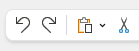
A separator in a toolbar
| Specification | Details |
|---|---|
| Base class | Native Separator. |
| Has key | No. |
| Has label | No. |
| Has image | No. |
| Has popup | No. |
| Is checkable | No. |
| Variant sizes | None. |
| Command support | None. |
| Key tip support | None. |
| Ribbon QAT support | None. |
| UI density support | None. |
| MVVM Library VM | BarSeparatorViewModel class. |
xmlns:bars="http://schemas.actiprosoftware.com/winfx/xaml/bars"
...
<bars:StandaloneToolBar>
	<bars:BarButton Key="Undo" />
	<bars:BarButton Key="Redo" />
	<bars:BarSeparator />
	<bars:BarButton Key="Cut" />
	<bars:BarButton Key="Copy" />
	<bars:BarButton Key="Paste" />
	...
</bars:StandaloneToolBar>
Menu Contexts
Use the BarMenuSeparator control to implement a separator within a menu context.
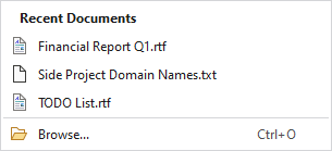
A separator in a menu
| Specification | Details |
|---|---|
| Base class | Native Separator. |
| Has key | No. |
| Has label | No. |
| Has image | No. |
| Has popup | No. |
| Is checkable | No. |
| Variant sizes | None. |
| Command support | None. |
| Key tip support | None. |
| Ribbon QAT support | None. |
| UI density support | None. |
| MVVM Library VM | BarSeparatorViewModel class. |
xmlns:bars="http://schemas.actiprosoftware.com/winfx/xaml/bars"
...
<bars:BarContextMenu>
	<bars:BarMenuItem Key="Undo" />
	<bars:BarMenuItem Key="Redo" />
	<bars:BarSeparator />
	<bars:BarMenuItem Key="Cut" />
	<bars:BarMenuItem Key="Copy" />
	<bars:BarMenuItem Key="Paste" />
	...
</bars:BarContextMenu>
Separators Surrounding Menu Galleries
By default, separators will automatically be rendered around menu galleries when there are neighboring menu items. This feature can be disabled by setting the RibbonGallery/BarComboBox.AreSurroundingSeparatorsAllowedOnMenu or BarMenuGallery.AreSurroundingSeparatorsAllowed property to false.
MVVM Support
The optional companion MVVM Library defines a BarSeparatorViewModel class that is intended to be used as a view model for separators.
This view model class maps over to the appropriate view controls described above based on usage context and configure all necessary bindings between the view models and the view controls.
Tip
See the MVVM Support topic for more information on how to use the library's view models and view templates to create and manage your application's bars controls with MVVM techniques.