Combobox
Combobox controls have a drop-down list of items that can be chosen, and can optionally have text entered directly into the control. A command executes when an item is selected in the drop-down, Enter is pressed, or the text is changed and focus is lost.
Note
This topic extends the Control Basics topic with additional information specific to the control types described below. Please refer to the base topic for more generalized concepts that apply to all controls, including this one.
Control Implementations
There are separate combobox concept control implementations based on the usage context.
Ribbon and Toolbar Contexts
Use the BarComboBox control to implement a combobox within a ribbon or toolbar context.
While many other controls in Bars inherit and augment native controls similar to their intended usage, BarComboBox is different and does not inherit native ComboBox in any way. The reason is that native ComboBox is limiting in how it only allows its drop-down items to be displayed in a standard list. BarComboBox on the other hand, is a gallery itself and uses an implicitly created menu gallery and optionally other menu items in its drop-down, which allows for advanced UI features and support for live preview. Being a gallery, BarComboBox can optionally support preview of gallery items as you type in their text representations.
In summary, a BarMenuGallery works very similarly to a RibbonGallery in that both controls inherit BarMenuGalleryHostBase and can display an implicitly created menu gallery from a drop-down button. Unlike RibbonGallery, BarComboBox does not display any gallery items inline itself and instead shows an optionally editable textbox. All the menu gallery features are fully available on the implicitly created BarMenuGallery hosted in the combobox drop-down. These features are configured via the numerous BarComboBox properties with "Menu" in their names.

A BarComboBox example
| Specification | Details |
|---|---|
| Base class | BarMenuGalleryHostBase, which indirectly inherits native Selector. |
| Has key | Yes, via the Key property. |
| Has label | Yes, via the Label property. Auto-generated from the Key value if not specified. |
| Has image | Yes, inline via the InlineImageSourcePath property or externally via the SmallImageSource property. |
| Has popup | Yes, which shows a BarMenuGallery with the same items, and optionally additional menu items. |
| Is checkable | No. |
| Variant sizes | None. |
| Command support | Yes, via the Command and UnmatchedTextCommand properties. |
| Key tip support | Yes, via the KeyTipText property. Auto-generated from the Label value if not specified. |
| Ribbon QAT support | Yes, via the CanCloneToRibbonQuickAccessToolBar property. |
| UI density support | None. |
| MVVM Library VM | BarComboBoxViewModel class. |
xmlns:bars="http://schemas.actiprosoftware.com/winfx/xaml/bars"
xmlns:themes="http://schemas.actiprosoftware.com/winfx/xaml/themes"
...
<bars:StandaloneToolBar>
	<!-- Label is auto-generated from Key -->
	<bars:BarComboBox
		Key="Employee"
		TextPath="Name"
		IsEditable="True"
		Command="{Binding EmployeeSelectedCommand}"
		UnmatchedTextCommand="{Binding EmployeeUnmatchedTextCommand}"
		ItemTemplate="{StaticResource EmployeeGalleryItemTemplate}"
		IsSynchronizedWithCurrentItem="True"
		ItemContainerStyle="{StaticResource {x:Static themes:BarsMvvmResourceKeys.BarGalleryItemStyle}}"
		ItemsSource="{Binding Employees}">

		<bars:BarComboBox.BelowMenuItems>
			<bars:BarMenuItem Label="Manage Employees..." Command="{Binding OpenEmployeesDialogCommand}" />
		</bars:BarComboBox.BelowMenuItems>
	</bars:BarComboBox>
	...
</bars:StandaloneToolBar>
Important
When defining a BarComboBox in XAML and binding the items source to instances of IBarGalleryItemViewModel from the MVVM Library, the ItemContainerStyle must be defined as shown in the sample above to establish important bindings between IBarGalleryItemViewModel and BarGalleryItem.
Menu Contexts
The BarComboBox control cannot be used in a menu context, but a BarMenuItem that binds its Items collection to the same BarComboBox.Items collection works great in a menu, effectively providing the same features as a non-editable combobox. This includes the ability to show a menu gallery in the popup menu.
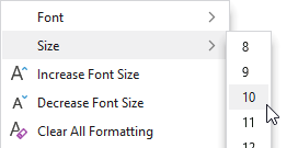
A combobox when in a menu
Note
See the Popup Button topic for more information on menu contexts since that is the approach used for comboboxes in a menu.
Appearance
There are several appearance-related properties that determine how the controls render.
Text
The Text property gets or sets the text that is displayed within the combobox.
The TextPath property specifies the path to a string-based property off the view model gallery item class to display in the combobox when a gallery item is selected.
Label
The control has a string Label that can be set, which is visible in UI. The label is not rendered by the control itself, but can show externally (such as when in a RibbonControlGroup), in screen tips, or in customization UI.
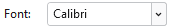
A BarComboBox with an external label
The Label can be auto-generated based on the control's Key property. For instance, a control with Key of "FontSize" will automatically assign "Font Size" as the Label value. The auto-generated default can be overridden by setting the Label property.
Images
An image from the selected gallery item can be displayed inline within the control, before the combobox text. This image will update when the combobox's selection is changed.
The InlineImageSourcePath property specifies the path to an ImageSource-based property off the view model gallery item class to display in the combobox when a gallery item is selected.
Alternatively, the control can display a static image via SmallImageSource that helps identify its function. The image is not tied to the selected item and is not rendered by the control itself, but can show externally (such as when in a RibbonControlGroup), or in customization UI.
Title
An optional string Title can be specified, which is intended to override the control's Label when displayed in screen tips and customization UI.
Requested Width and Star Sizing
It is recommended that textbox controls within ribbon and toolbar contexts specify a width. While the Width property can be set directly, it's better to set the RequestedWidth property. RequestedWidth will ideally measure to the requested width, thereby acting the same as setting Width, but can allow other widths such as in situations like star-sizing. Setting the Width property directly will not allow other possible widths, since it is explicitly forcing a width.
Star-sizing is a handy feature when the control is within a RibbonMultiRowControlGroup. If the BarComboBox.IsStarSizingAllowed property is set to true and the row the BarComboBox is on has some extra width available compared to the other rows, it will expand BarComboBox to fill that width. This makes the overall row widths equal for a more professional appearance. Only one control per row should enable star-sizing.
Placeholder Text
Placeholder text is a way to prompt the end user for the type of value that should be entered into the control when no value has been set. For instance, a combobox that lists a set of employees might set the placeholder text to "(employee)".
Placeholder text is faintly rendered when there is no value in the control, and can be designated via the PlaceholderText property.
Maximum Popup Height
The maximum height of the popup is dynamically calculated to be a majority of the current screen's height. The maximum popup height may be further restricted by setting the MaxPopupHeight property, which is similar to the MaxDropDownHeight property on a native ComboBox control.
Editability and Read-Only State
The IsEditable property determines if the combobox supports typing when it has focus. This property is false by default, which means that clicking on the text portion of the combobox will display the popup. When the property is true, any text value can be typed that may or may not match a combobox item. See the "Unmatched Text" section below for more information on handling unmatched text values.
The IsReadOnly property determines if the textbox within an editable combobox is read-only. This property is false by default.
Text Completion
An editable combobox supports text completion where typing text will display the rest of a matching item's text in a selection at the end of what is being typed. This is very handy for selecting items such as font names. Type a few characters and press Enter once the desired font name is completed to commit the full font name.
The text completion feature is enabled by default and can be disabled by setting the IsTextCompletionEnabled property to false. A font size combobox is a scenario where text completion should be disabled because it doesn't make sense to suggest a number string like "12" when a "1" value has been typed by the end user.
Unmatched Text
The IsUnmatchedTextAllowed property determines whether text that doesn't match a gallery item is allowed to be committed. This property is true by default, and when unmatched text is encountered, the UnmatchedTextCommand will be executed. If that command is not specified or if its can-execute returns true, the unmatched text will be committed. Otherwise, the original text value prior to any changes will be restored.
When the IsUnmatchedTextAllowed property is set to false and unmatched text is encountered, the original text value prior to any changes will always be restored and the UnmatchedTextCommand will not be examined.
Previewing Text-Matched Gallery Items
When text is typed in a combobox that matches an item, and if the gallery supports preview features, the matched gallery item will be previewed. Matched gallery item previews are only supported by default when the combobox's popup is open.
The IsPreviewEnabledWhenPopupClosed property can optionally be set to true to allow the combobox to also show matched gallery item previews as text is typed while the combobox's popup is closed. This feature is handy for comboboxes that contain font names, since the font name can be typed and completed to show a live preview of the font change in a related document without the combobox popup ever showing.
Key Tips
The controls support key tips. When a control's key tip is accessed, the control is focused.
The KeyTipText can be auto-generated based on the control's Label property. For instance, a control with Label of "Search" will automatically assign "S" as the KeyTipText value. The auto-generated default can be overridden by setting the KeyTipText property.
The KeyTipText properties designate the key tip text to use for the control.
See the Key Tips topic for more information on key tips.
Commands and Events
A commit is attempted by an editable BarComboBox when Enter is pressed while the control is focused, or the control's text changes and then focus is lost. As long as the IsTextSearchEnabled property is true, the commit logic will examine the gallery items and will look for an item that matches the typed text. IsTextSearchCaseSensitive determines whether a case-sensitive text search is made.
The attached TextSearch.Text property value from the gallery item (if it is a DependencyObject) will be examined first when looking for matches.
If no match is made on that, and the TextPath property specifies a property name on the item to examine, that property on the item will be looked at next for a match.
If a matching gallery item is located, the Command is executed and is passed the matching gallery item as a command parameter.
On the other hand, if no matching gallery item is located and the IsUnmatchedTextAllowed property is true, the combobox's UnmatchedTextCommand is executed with the unmatched text string as the command parameter. If the command's can-execute returns false, the unmatched text will not be accepted and the original text will be restored.
In either case, a TextCommitted event is raised whenever this process completes.
The PopupOpeningCommand command, if assigned, is executed prior to the popup opening. This command can be handled in a view model, allowing for a MVVM way to update the items on the popup prior to display.
See the Using Commands topic for more information on commands.
Focus Behavior
In cases where you wish for the combobox to remain focused after selecting an item or committing a value, set the BarComboBox.InvocationFocusBehavior property to Self.
Screen Tips
The controls support screen tips, which are formatted tool tips.
The control's Title is used as the default screen tip header, falling back to Label if no Title is available. The ScreenTipHeader property can override the default screen tip header value if desired.
If the control's ToolTip property is set to a value that doesn't derive from a native ToolTip control, such as a string, the value will be used in the screen tip's content area, with the screen tip header becoming bold. The screen tip's content area is where extended descriptions are displayed.
If the optional ScreenTipFooter property is specified, it will appear in a footer area of the screen tip.
See the Screen Tips topic for more information on screen tips.
MVVM Support
The optional companion MVVM Library defines a BarComboBoxViewModel class that is intended to be used as a view models for comboboxes.
This view model class maps over to the appropriate view controls described above based on usage context and configure all necessary bindings between the view models and the view controls.
Tip
See the MVVM Support topic for more information on how to use the library's view models and view templates to create and manage your application's bars controls with MVVM techniques.
Gallery Items
Since the BarComboBox control is a gallery itself and displays an implicitly created BarMenuGallery in its drop-down, all the details related to gallery and gallery item configuration apply to comboboxes as well.
The BarComboBox control changes the default value of the following inherited gallery property to a common setting for a combobox drop-down appearance:
- MaxMenuColumnCount =
1- Uses a single column for gallery items. - MenuResizeMode =
Vertical- Allows vertical gallery resizing and properly supports virtualization of gallery items, which aids in performance with large galleries.
See the Gallery topic for more information on galleries.