Context Menus
The BarContextMenu control implements a context menu that can host any Bars controls intended for menu contexts, including split menu items or graphically-rich menu galleries, and supports other advanced features like MVVM configuration of its items.
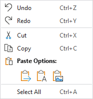
A sample context menu used for an edit control
Native ContextMenu Compatibility
Since the BarContextMenu class inherits the native ContextMenu class and its features, BarContextMenu may be used anywhere that a regular ContextMenu can be used.
Defining a Context Menu
A context menu is most often assigned to a control via its ContextMenu property. The control will automatically show the context menu when it is right-clicked or the keyboard's context menu key is pressed.
This sample code shows how to define a context menu for a TextBox:
xmlns:bars="http://schemas.actiprosoftware.com/winfx/xaml/bars"
...
<TextBox>
	<TextBox.ContextMenu>
		<bars:BarContextMenu>
			<!-- Labels are auto-generated from Command and Key -->
			<bars:BarMenuItem Command="ApplicationCommands.Undo" SmallImageSource="/Images/Icons/Undo16.png" />
			<bars:BarMenuItem Command="ApplicationCommands.Redo" SmallImageSource="/Images/Icons/Redo16.png" />
			<bars:BarMenuSeparator />
			<bars:BarMenuItem Command="ApplicationCommands.Cut" SmallImageSource="/Images/Icons/Cut16.png" />
			<bars:BarMenuItem Command="ApplicationCommands.Copy" SmallImageSource="/Images/Icons/Copy16.png" />
			<bars:BarMenuGallery
				Key="PasteOptions"
				AreSurroundingSeparatorsAllowed="False"
				CategoryHeaderTemplate="{StaticResource PasteOptionGalleryCategoryTemplate}"
				Command="{Binding PasteSpecialCommand}"
				IsSelectionSupported="False"
				ItemContainerStyle="{StaticResource BarGalleryItemStyle}"
				ItemsSource="{Binding PasteOptions}"
				ItemTemplate="{StaticResource PasteOptionGalleryItemTemplate}"
				MaxColumnCount="6"
				UseMenuItemIndent="True" />
			<bars:BarMenuSeparator />
			<bars:BarMenuItem Command="ApplicationCommands.SelectAll" />
		</bars:BarContextMenu>
	</TextBox.ContextMenu>
</TextBox>
Stay Open on Menu Item Click
Each control that derives from native MenuItem has a StaysOpenOnClick property that governs whether the containing menu closes when the menu item is clicked.
The default value for this property is false but can optionally be set to true to try and keep the containing menu open following a menu item click.
Input Gesture Text
Input gestures are keyboard shortcuts that provide access to a control's command. For instance, Ctrl+C is commonly associated with the clipboard copy command.
Input gesture text is a textual representation of a keyboard shortcut, allowing the end user to learn which keyboard shortcut executes a command. Input gesture text is shown in menu items and can be customized or hidden completely.
See the Control Basics topic for more information on input gesture text.
MVVM Support
By setting the BarContextMenu.ItemContainerTemplateSelector property to a template selector that can construct controls intended for a menu context, the context menu's ItemsSource can be bound to a collection of view-models.
The optional companion MVVM Library includes a BarControlTemplateSelector class that is designed for use with the ItemContainerTemplateSelector property, when the control view models from the library are the items being bound via the control's ItemsSource property.
xmlns:bars="http://schemas.actiprosoftware.com/winfx/xaml/bars"
...
<TextBox>
	<TextBox.ContextMenu>
		<bars:BarContextMenu
			ItemContainerTemplateSelector="{Binding ItemContainerTemplateSelector}"
			ItemsSource="{Binding ContextMenuItems}" />
	</TextBox.ContextMenu>
</TextBox>
Tip
See the MVVM Support topic for more information on how to use the library's view models and view templates to create and manage your application's bars controls with MVVM techniques.