Gallery
Galleries are graphically-rich list controls whose items are displayed in a scrollable list that can be optionally categorized and filtered. They can support selection of an item and/or can take an action when an item is clicked. They also offer live preview capabilities where hovering over a gallery item can preview its intended outcome.
Common usage scenarios for galleries include:
- Selection of colors, text styles, underline styles, bullet kinds, numbering kinds, etc.
- Insertion of shapes, symbols, tables, equations, etc.
Note
This topic extends the Control Basics topic with additional information specific to the control types described below. Please refer to the base topic for more generalized concepts that apply to all controls, including this one.
Control Implementations
There are separate gallery concept control implementations based on the usage context.
Expanded In-Ribbon Contexts
Use the RibbonGallery control to implement a gallery within a ribbon context that is expanded when space is available.
Tip
See the information on toolbar contexts below if you wish to have a Popup Button or Split Button in the ribbon that only shows the gallery when the button's popup menu is displayed.
An in-ribbon gallery
| Specification | Details |
|---|---|
| Base class | BarMenuGalleryHostBase, which indirectly inherits native Selector. |
| Has key | Yes, via the Key property. |
| Has label | Yes, via the Label property. Auto-generated from the Key value if not specified. |
| Has image | Yes, via the SmallImageSource, MediumImageSource, and LargeImageSource properties. |
| Has popup | Yes, which shows a BarMenuGallery with the same items, and optionally additional menu items. |
| Is checkable | No. |
| Variant sizes | Small (collapsed gallery popup button), Medium (several columns), Large (many columns). |
| Command support | Yes, via the Command property. The gallery item that is selected/previewed is passed as the command parameter. |
| Key tip support | Yes, via the KeyTipText property, for the More button when expanded and the collapsed gallery popup button. Auto-generated from the Label value if not specified. |
| Ribbon QAT support | Yes, via the CanCloneToRibbonQuickAccessToolBar property. |
| UI density support | Yes, via the UserInterfaceDensity property. |
| MVVM Library VM | BarGalleryViewModel class. |
xmlns:bars="http://schemas.actiprosoftware.com/winfx/xaml/bars"
xmlns:themes="http://schemas.actiprosoftware.com/winfx/xaml/themes"
...
<Application.Resources>
	<DataTemplate x:Key="ColorGalleryItemTemplate">
		<Border
			BorderBrush="{DynamicResource {x:Static themes:AssetResourceKeys.ContainerBorderMidLowBrushKey}}"
			BorderThickness="1" Width="32" Height="16">
			<Border.Background>
				<SolidColorBrush Color="{Binding Color}" />
			</Border.Background>
		</Border>
	</DataTemplate>
</Application.Resources>
...
<bars:Ribbon>
	<!-- Label is auto-generated from Key -->
	<bars:RibbonTabItem Key="Home">
		<bars:RibbonGroup Key="Colors">
			<bars:RibbonGallery
				Key="ColorPicker"
				LargeImageSource="/Images/ColorPicker32.png"
				SmallImageSource="/Images/ColorPicker16.png"
				Command="{Binding SetColorCommand}"
				ItemsSource="{Binding ColorItems}"
				ItemTemplate="{StaticResource ColorGalleryItemTemplate}"
				UseAccentedItemBorder="True"
				/>
		</bars:RibbonGroup>
	</bars:RibbonTabItem>
	...
</bars:Ribbon>
Ribbon and Toolbar Contexts
Galleries can be used in other ways within a ribbon, and in toolbar contexts as well. This is supported by placing a Popup Button or Split Button in the toolbar and then using a BarMenuGallery control (described below) in the popup menu.
xmlns:bars="http://schemas.actiprosoftware.com/winfx/xaml/bars"
...
<bars:StandaloneToolBar>
	<!-- Label is auto-generated from Key -->
	<bars:BarPopupButton Key="SetColor">
		<bars:BarMenuGallery
			Key="ColorPicker"
			Command="{Binding SetColorCommand}"
			ItemsSource="{Binding ColorItems}"
			ItemTemplate="{StaticResource ColorGalleryItemTemplate}"
			UseAccentedItemBorder="True"
			/>
		...
	</bars:BarPopupButton>
</bars:StandaloneToolBar>
Menu Contexts
Use the BarMenuGallery control to implement a gallery concept within a menu context.
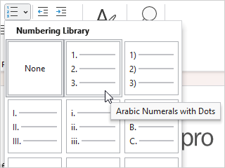
A list numbering gallery
| Specification | Details |
|---|---|
| Base class | BarGalleryBase, which inherits native Selector. |
| Has key | Yes, via the Key property. |
| Has label | Yes, via the Label property. Auto-generated from the Key value if not specified. |
| Has image | No. |
| Has popup | No. |
| Is checkable | No. |
| Variant sizes | None. |
| Command support | Yes, via the Command property. The gallery item that is selected/previewed is passed as the command parameter. |
| Key tip support | None. |
| Ribbon QAT support | Not directly. Ribbon logic will look for a containing Popup Button or Split Button to clone to the Quick Access Toolbar instead. |
| UI density support | None. |
| MVVM Library VM | BarGalleryViewModel class. |
xmlns:bars="http://schemas.actiprosoftware.com/winfx/xaml/bars"
...
<bars:BarContextMenu>
	<!-- Label is auto-generated from Key -->
	<bars:BarMenuGallery
		Key="ColorPicker"
		Command="{Binding SetColorCommand}"
		ItemsSource="{Binding ColorItems}"
		ItemTemplate="{StaticResource ColorGalleryItemTemplate}"
		UseAccentedItemBorder="True"
		/>
	...
</bars:BarContextMenu>
Appearance
There are several appearance-related properties that determine how the controls render.
Label
The controls have a string Label that can be set, which is sometimes visible in UI.
The Label can be auto-generated based on the control's Key property. For instance, a control with Key of "TextStyles" will automatically assign "Text Styles" as the Label value. The auto-generated default can be overridden by setting the Label property.
The RibbonGallery.Label is only rendered when the gallery is in a Small variant size, and it's displayed as a collapsed gallery Popup Button.
The BarMenuGallery.Label property isn't really used, other than in customization UI.
Images
RibbonGallery uses images, but only when the gallery is in a Small variant that renders a collapsed gallery popup button (see the Popup Button topic for image usage details), or if the gallery is in the Ribbon Quick Access Toolbar.
Title
An optional string RibbonGallery.Title and BarMenuGallery.Title can be specified, which are intended to override the control's Label when displayed in screen tips and customization UI.
Variant Sizes (RibbonGallery only)
RibbonGallery supports multiple variant sizes via its VariantSize property, which enables it to be resized through three distinct stages when used in a ribbon with Classic layout mode. The parent RibbonGroup updates the gallery's variant size to match its variant size.
In-ribbon gallery in a Small variant size
The first stage occurs when the parent group has a Small variant size, the RibbonGallery will render as a collapsed gallery Popup Button. Click the collapsed gallery popup button to see a popup menu containing the gallery items. This is the same popup menu that displays when the RibbonGallery is in a larger variant size, and its More button is clicked.
In-ribbon gallery in a Medium variant size
The second stage occurs when the parent group has a Medium variant size. When in this stage, the gallery will display a variable number of item columns within the ribbon. The range of item columns displayed is inclusively between the MinMediumColumnCount and MinLargeColumnCount property values and depends on available space. Set those two properties to the same value to prevent the gallery from resizing within a Medium variant.
In-ribbon gallery in a Large variant size
The final stage occurs when the parent group has a Large variant size. When in this stage, the gallery will again display a variable number of item columns within the ribbon. The range of item columns displayed is inclusively between the MinLargeColumnCount and MaxColumnCount property values and depends on available space.
When a ribbon is in Simplified layout mode, the RibbonGallery control will render in a Small variant size by default, which shows as a collapsed gallery popup button, and will collapse to an overflow menu when necessary. The ToolBarItemVariantBehavior property can be set to All to show gallery items inline when space permits. Alternatively, the ToolBarItemCollapseBehavior property can be set to Always to always have the gallery in the overflow menu.
While BarMenuGallery doesn't support variant sizes, it can be used in a menu that has resizing capabilities as described below.
See the Resizing and Variants topic for more information on ribbon's variant sizing features.
Item Rows (RibbonGallery only)
RibbonGallery automatically determines the number of rows displayed based on the gallery's height and the height of the items. There can be anywhere from one to three rows, each of which supports smooth row-by-row scrolling.
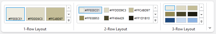
In-ribbon gallery row comparison
Columns Displayed on Menu
A minimum and maximum number of columns to display in a menu may be set for the menu gallery. When the menu is initially displayed, it will show at least the minimum number of columns specified, which defaults to 1. If the menu gallery is opened for a RibbonGallery More button, the popup menu will be stretched to cover the width of the in-ribbon gallery at a minimum. As the popup menu is sized larger, the number of columns displayed will range between the minimum and maximum specified. The default maximum number of columns to display in a menu is Int32.MaxValue but can be reduced if some other maximum should be used.
The RibbonGallery.MinMenuColumnCount and MaxMenuColumnCount properties set the menu column count range for the menu gallery displayed when the More button is clicked.
Whereas the BarMenuGallery.MinColumnCount and MaxColumnCount properties are used for menu galleries that are declared outside of a ribbon gallery.
Tip
Set BarMenuGallery.MaxColumnCount = 1 to create a menu gallery that has a single column. This setting is ideal for menu galleries that only have simple text as their content. Optionally also set UseMenuItemAppearance = true to have the menu gallery items render like normal menu items.
Menu Resizing
A menu that contains a menu gallery can optionally be resized. This feature can be enabled by assigning a ControlResizeMode value. The values of that enumeration are None, Horizontal, Vertical, or Both.
Menu galleries that show items in a single column, such as an underline gallery, should use a Vertical resize mode.
Menu galleries that contain many items displayed in multiple columns generally use a Both resize mode.
The RibbonGallery.MenuResizeMode and BarMenuGallery.ResizeMode properties set the resize mode for the containing menu to use.
Tip
For performance reasons in properly supporting virtualization, it is recommended that galleries that can grow vertically to more than a handful of rows should be set to either Vertical or Both resize mode, per the advice above.
Surrounding Separators on Menu
Menu galleries will automatically render a separator between them and surrounding menu items. In some scenarios, this may be undesired.
The automatic insertion of separators around a menu gallery can be disabled by setting the RibbonGallery.AreSurroundingSeparatorsAllowedOnMenu or BarMenuGallery.AreSurroundingSeparatorsAllowed property to false.
If a separator is only needed either above or below the menu gallery, disable automatic surrounding separators and then manually add a Separator either before or after the menu gallery as appropriate.
Item Spacing
Spacing added between gallery items
The ItemSpacing property sets the amount of spacing between items. By default, it is set to 0, meaning no space in between items, and is the recommended value for most galleries. Some galleries such as color picker galleries may wish to increase the item spacing to a larger value, like 4.
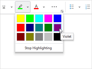
Accented Item Borders
The UseAccentedItemBorder property can be set to true to use an accented border for selected items. This is useful for gallery items that have vibrant content, such as color swatches.
Menu Item Indent (BarMenuGallery only)
A menu gallery generally fills the width of the menu, aligning the gallery items to the menu's edges. Sometimes a gallery may wish to indent its items such that they appear within the icon column on the left and spacer column on the right.
Menu item indent applied to the color swatch gallery in the menu
This can be achieved by setting the RibbonGallery.UseMenuItemIndent or BarMenuGallery.UseMenuItemIndent properties to true.
Menu Item Appearance (BarMenuGallery only)
When a gallery is solely presented within the menu of a containing Popup Button, Split Button, or Combobox, and the gallery has a single column of items with longer-width content, the gallery may wish to present these items with a menu item-like appearance. This feature will cause the BarGalleryItem container to use the same theme resource brushes that MenuItem uses.
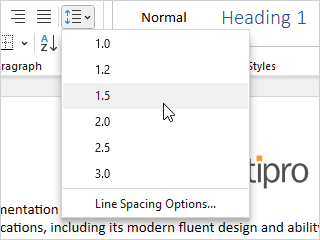
Menu item appearance applied to the line spacing menu gallery
This feature can be enabled by setting the RibbonGallery.UseMenuItemAppearance or BarMenuGallery.UseMenuItemAppearance property to true. It is recommended to restrict the gallery to a single column when using this feature. The "Columns Displayed on Menu" section above explains how to restrict the column count.
User Interface Density (RibbonGallery only)
The UserInterfaceDensity property can alter the appearance of the gallery, such as its size and padding used. This property is not generally set on the gallery instance itself, and is instead meant to be set on the root bar control to inherit down, such as with the Ribbon.UserInterfaceDensity property.
Key Tips
The RibbonGallery control support key tips. When its key tip is accessed, a click is simulated that will show its popup menu.
The KeyTipText can be auto-generated based on the control's Label property. For instance, a control with Label of "Styles" will automatically assign "S" as the KeyTipText value. The auto-generated default can be overridden by setting the KeyTipText property.
The RibbonGallery.KeyTipText property designates the key tip text to use for the control.
The BarMenuGallery control does not use key tips.
See the Key Tips topic for more information on key tips.
Commands and Events
The ICommand in the RibbonGallery.Command and BarMenuGallery.Command properties is executed when a gallery item is clicked.
An IPreviewableCommand interface is defined in the Shared Library that allows special ICommand implementations to support live preview features. A section below describes how to implement live preview.
The PopupOpeningCommand command, if assigned, is executed prior to the popup opening. This command can be handled in a view model, allowing for a MVVM way to update the items on the popup prior to display.
A RibbonGallery.SelectionChanged and BarMenuGallery.SelectionChanged event is raised when the gallery's selection changes.
See the Using Commands topic for more information on commands.
Focus Behavior
In cases where you wish for an in-ribbon gallery to remain focused after a click on one of its gallery items or the More button's popup menu items, set the RibbonGallery.InvocationFocusBehavior property to Self.
MVVM Support
The optional companion MVVM Library defines a BarGalleryViewModel class that is intended to be used as a view model for galleries.
This view model class maps over to the appropriate view controls described above based on usage context and configures all necessary bindings between the view model and the view control.
A IBarGalleryItemViewModel interface defines the common requirements for gallery item view models, and a BarGalleryItemViewModel<T> class is intended to be used directly, or as a base class for any gallery item view model. Each kind of gallery should define a separate view model class for its items. For instance, a gallery related to selection of a color defines a ColorBarGalleryItemViewModel class for its items, which inherits BarGalleryItemViewModel<Color>.
It is recommended to build a custom DataTemplateSelector that can be assigned to the gallery's ItemTemplateSelector property to apply a DataTemplate for the related gallery item view model type.
Tip
See the MVVM Support topic for more information on how to use the library's view models and view templates to create and manage your application's bars controls with MVVM techniques.
Gallery Items
Gallery items are often very visual in nature. Some galleries maintain a selection, while others do not, and take an action instead when an item is clicked.
Items Source
It is recommended to always use custom view model types for gallery items, and to bind an enumerable of view model instances to the gallery's ItemsSource property.
Note
If gallery categorizing or filtering support is desired, an ICollectionView instance must be bound to the gallery's ItemsSource property. The ICollectionView.GroupDescriptions collection should have a PropertyGroupDescription added to it that specifies the name of the category property on the gallery item view model Type. See the "Item Categorization" section below for more information.
Caution
There are several scenarios where multiple gallery controls may be created for the same conceptual set of gallery items. For instance, the RibbonGallery control has an implicitly created BarMenuGallery that appears in its More button's popup menu, and the BarComboBox control has an implicitly-created BarMenuGallery that appears in its drop-down menu. Galleries may also be cloned to the Quick Access Toolbar or cloned for overflow purposes.
Since multiple gallery control instances may be bound to the same core ItemsSource property, it is important that the property's resulting enumerable returns the same set of item instances. Avoid yielding new item instances on each call to the property so that selections can be tracked across the gallery controls properly. It's also a recommended practice to implement Equals overrides on the gallery item view model classes.
Item Selection
The gallery control classes indirectly inherit Selector and therefore support all the selection features from that base class. A gallery item will be selected when it is clicked, or the Enter key is pressed while the gallery item has focus. This updates the gallery's SelectedItem property and raises the SelectionChanged event. As described above, at this point the gallery's Command will be executed with the gallery item being passed as the parameter.
The gallery's SelectedItem property may be set at any time to alter the selected gallery item.
The IsSelectionSupported property, which defaults to true, can be set to false to prevent a selection from being retained when an item is clicked. It does this by automatically clearing the SelectedItem after a selection is made. This feature is handy for galleries that should take an action when an item is clicked, such as a gallery that inserts a symbol into a document based on the item that was clicked.
Automatically Scrolling to the Selected Item (RibbonGallery only)
The RibbonGallery.CanAutoScrollToSelectedItem property, which defaults to false, can be set to true to automatically scroll to the in-ribbon gallery's selected item when the selection changes. This ensures that external changes to the selection keep the newly-selected item visible in the user interface.
Item Templates
Gallery controls generate a BarGalleryItem container for each gallery item in the gallery's ItemsSource.
A DataTemplate for the view model type can be supplied via the BarGalleryBase.ItemTemplate property, or alternatively, a DataTemplateSelector-based class instance can be set to the gallery's ItemTemplateSelector property. These concepts are all fundamental to how any data-bound ItemsControl works.
Any UI elements can be placed in a DataTemplate, allowing you to make your gallery items' appearance as simple or complex as you wish.
Here's an example of a template for a font size view model that has a FontSize property and uses a basic TextBlock for display.
<DataTemplate x:Key="FontSizeGalleryItemTemplate" DataType="local:FontSizeBarGalleryItemViewModel">
	<TextBlock Margin="12,4" Text="{Binding FontSize}" />
</DataTemplate>
Note that no borders are usually necessary in a gallery item template since the containing BarGalleryItem will render the chrome of the item.
In the following example for an insert symbol gallery, we use a custom SymbolPresenter element. This element could be a custom templated Control itself. Or it could be a more basic element that overrides its OnRender method to render the content in code-behind via a DrawingContext.
<DataTemplate x:Key="SymbolGalleryItemTemplate" DataType="local:SymbolBarGalleryItemViewModel">
	<local:SymbolPresenter Width="30" Height="30" />
</DataTemplate>
While the template examples above only contain a single element, any complex element hierarchy can be placed within the template to achieve the look you desire.
Item Size Consistency
The item templates used for galleries can be any width/height, however the one rule to which you must adhere is that all items within the same gallery must be the same size. The layout routines rely on this assumption. Not only that, but it also makes for a better presentation to the end user. The best way to ensure this is to explicitly set a Width and Height on the root element of your item template and the gallery will take care of measuring the additional gallery item container border size and padding for you.
Item Live Preview
Galleries support live preview features where hovering the mouse over a gallery item after a delay can trigger a preview of the outcome of clicking the gallery item.
If the ICommand set to the gallery's Command property implements IPreviewableCommand, the gallery will notify the command when live preview is started or canceled. The PreviewableDelegateCommand<T> class inherits DelegateCommand<T> and implements IPreviewableCommand. That class will execute designated actions, one when preview starts and one when preview is canceled. This allows you to apply preview within your application temporarily while the end user hovers their mouse over a gallery item.
As an example, here's how a command could be set up to show live preview of a font size gallery:
public ICommand SetFontSizeCommand {
	get {
		if (setFontSizeCommand is null) {
			setFontSizeCommand = new PreviewableDelegateCommand<FontSizeBarGalleryItemViewModel>(
				executeAction: p => {
					OnRequestSaveAndExitPreviewMode();
					UpdateSelectionTextStyle(x => x.FontSize = p?.Size ?? FontSettings.DefaultFontSize);
				},
				canExecuteFunc: p => true,
				previewAction: p => {
					OnRequestActivatePreviewMode();
					UpdateSelectionTextStyle(x => x.FontSize = p?.Size ?? FontSettings.DefaultFontSize);
				},
				cancelPreviewAction: p => {
					OnRequestCancelPreviewMode();
				}
			);
		}
		return setFontSizeCommand;
	}
}
The gallery's InitialPreviewDelay property, which defaults to 300, sets the delay in milliseconds for preview mode to begin after an item is first highlighted. The BetweenPreviewDelay property, which defaults to 0, sets the delay in milliseconds between previewed item updates as a new item is highlighted.
Item Tool Tips
The BarGalleryItem.Label property is bound to the ScreenTipHeader property by default, meaning hovering over a gallery item will show its label in a tooltip.
It doesn't make sense for galleries that show a label within the item itself to also display a tooltip containing simple label content. For instance, a font size gallery shows the font size number, which is the label, in each gallery item. Having a tooltip that would show the same value is not helpful. For cases like this, set the attached BarControlService.IsLabelVisibleProperty property to true on BarGalleryItem. If you are using the MVVM Library, have the BarGalleryItemViewModel<T>.IsLabelVisible property return true, which will bind over to the attached property that prevents a simple tooltip from showing.
Set the BarGalleryItem.ToolTip property to a string to add an extended description for a gallery item. Alternatively, the value may be any ToolTip-derived class, including our ScreenTip class.
Item Categorization
Gallery items can be placed in categories. These categories will not show up in a RibbonGallery itself, but they can optionally be displayed in a BarMenuGallery using the properties described below.
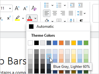
A color picker gallery with categorized colors
Menu gallery categorization requires that the gallery item view model collection is bound to the BarMenuGallery.ItemsSource property, and the collection must be an ICollectionView. The ICollectionView.GroupDescriptions collection must have a PropertyGroupDescription added to it that specifies the name of the category property on the gallery item view model Type. For instance, if using gallery item view models from our MVVM Library, the category property there is IBarGalleryItemViewModel.Category so a PropertyGroupDescription would specify "Category".
Here is a helper method on BarGalleryViewModel that shows how to set up an ICollectionView for categorizing a collection of gallery items:
public static ICollectionView CreateCollectionView(IEnumerable<IBarGalleryItemViewModel> items, bool categorize) {
	var viewSource = new CollectionViewSource();
	viewSource.Source = items;

	if (categorize)
		viewSource.GroupDescriptions.Add(new PropertyGroupDescription(nameof(IBarGalleryItemViewModel.Category)));

	return viewSource.View;
}
The RibbonGallery.CanCategorizeOnMenu or BarMenuGallery.CanCategorize property must also be set to true to support categorization, which is the default. The property can be set to false to turn off categorization for an ICollectionView-based ItemsSource. Binding ItemsSource to an IEnumerable that does not implement ICollectionView will also prevent categorization from working.
When categorization is active, a category header that displays the category name will appear above all items in the category. One exception is that if the category is null, no category header will be displayed.
A menu gallery that has category headers hidden, while still displaying menu separators
In a scenario where you wish for a gallery to break items into multiple categories with a separator in between, but not display a category header for any categories, set the RibbonGallery.HasCategoryHeadersOnMenu or BarMenuGallery.HasCategoryHeaders property to false.
Categorized Item Filtering (BarMenuGallery only)
If you have categorization enabled in your BarMenuGallery as described above, you can optionally add filtering capabilities. The filter is a button at the top of the gallery that, when clicked, shows a menu of available filters for selection.
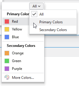
A menu gallery with filtering enabled
There is always an All option, and the rest of the options relate to the various category names. The All filter is used by default and does not perform any filtering. When a specific category is chosen as a filter, only the items in that category are displayed.
Set the RibbonGallery.CanFilterOnMenu or BarMenuGallery.CanFilter property to true to enable filtering features for the end user. The current category that is being filtered is available via the BarMenuGallery.SelectedFilterCategory property.
Additional Menu Items (RibbonGallery only)
RibbonGallery has the ability to display additional menu items above or below the menu gallery on its More button's popup menu. This can be achieved by adding menu items into its AboveMenuItems and BelowMenuItems collections.
xmlns:bars="http://schemas.actiprosoftware.com/winfx/xaml/bars"
...
<bars:RibbonGallery Key="TextStyles" ... >
	<bars:RibbonGallery.BelowMenuItems>
		<bars:BarMenuItem Key="MoreTextStyles" Command="{Binding MoreTextStylesCommand}" />
	</bars:RibbonGallery.BelowMenuItems>
</bars:RibbonGallery>
Size Selection Menu Gallery
The BarSizeSelectionMenuGallery control is a specialized implementation of a BarMenuGallery that displays a grid of squares and hot tracks which one the mouse is over. This is ideal for galleries that require a size to quickly be selected, such as an Insert Table gallery. All other features of menu galleries apply to BarSizeSelectionMenuGallery.
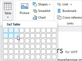
A size selection menu gallery
Its ColumnCount and RowCount properties indicate the size of the grid to display. They default to 10 and 8 respectively.
The items in the gallery are auto-generated based on the row/column counts. The protected virtual CreateItem method is called to create each item and is passed the zero-based row and column index for the item being created. The default implementation of that method will create a Size value with one-based versions of the row/column indices.
The gallery will show a default heading above the grid, such as "Insert Table". The heading text is set via the DefaultHeadingText property. As the mouse moves over the grid of gallery items, the heading text will be updated per the SizeHeadingTextFormat format string, such as "{0}x{1} Table". The parameters passed to the format string are the width and height based on the gallery item the mouse is currently over.
When a gallery item is clicked on, the command associated with the gallery will be executed and the related item (by default a one-based Size value) will be passed as the command parameter.
There is a BarSizeSelectionMenuGalleryViewModel class defined in the optional companion MVVM Library that can be used to work with this control.