BrushEditBox
The BrushEditBox control allows for the input of a Brush value. It uses the BrushPicker control in its popup.
Common Capabilities
Each of the features listed in the table below describe functionality that is common to most edit boxes. Please see the Edit Box Basics topic for details on each of these options and how to set them.
| Feature | Description |
|---|---|
| Has a spinner | No. |
| Has a popup | Yes, and can be hidden or its picker appearance customized. |
| Null value allowed | Yes, and can be prevented. |
| Read-only mode supported | Yes. |
| Non-editable mode supported | Yes. |
| Has multiple parts | No. |
| Placeholder text supported | Yes, and overlays the control. |
| Header content supported | Yes, and appears above the control. |
| Default spin behavior | No wrap. |
Alpha Transparency
The BrushEditBox.IsAlphaEnabled property can be set to false to prevent alpha transparency from being supported.
When false, the edit box will only allow selection of RGB colors instead of ARGB colors.
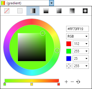
Gradient Support
The BrushEditBox.IsGradientAllowed property can be set to false to prevent gradient brushes from being supported.
When false, the edit box will only allow selection of solid color brushes.
Swatch Display
The BrushEditBox.HasSwatch property defaults to true, meaning that a small swatch will display the Brush value. Set the property to false to hide the swatch.
The CanSwatchStretch property determines if the swatch stretches horizontally when the HasText property is false.
The SwatchMargin property sets the margin thickness around the swatch.
Text Display
The BrushEditBox.HasText property defaults to true, meaning that the text representation of the Brush value will be displayed. Set the property to false to hide the text, which is useful if you only wish to show the swatch.
When hiding the text, be sure to also set the IsEditable property to false so that the control is treated more like a button instead of an edit control.
Reusing Brushes
By default, the brush instance will generally be reused when a component like gradient stop is updated. But this prevents the ValueChanged event from firing on certain component changes, and also bindings to the Value property from updating when using value converters. The CanReuseBrush property can be set to false to force a new brush to be created any time a component is updated, which works around those issues.
Sample XAML
This control can be placed within any other XAML container control, such as a Page or Panel with this sort of XAML:
<editors:BrushEditBox Value="{Binding Path=YourVMProperty, Mode=TwoWay}" />