Edit Box Basics
All of the edit box controls share a PartEditBoxBase
Designed for Keyboard, Mouse, and Touch Input
Unlike many other third-party editor controls, the Actipro Editors have been specifically designed to work great for whichever form of input (keyboard, mouse, or touch) is utilized by the end user.
Each editor's main appearance is similar to a standard TextBox, where the value can be typed in via a keyboard for maximum efficiency. Certain keyboard keys and the mouse wheel can often be used to increment/cycle values. See the related section below for more information.
Most editors also contain a default popup picker that is geared for mouse and touch-based input. The popup can easily be invoked by tapping the edit box's drop-down button, if it is optionally displayed.
Values
The Value property gets/sets the value that is being edited by the edit box. When using an edit box in your UI, you generally want to bind this property to your view model via two-way binding.
As the user types in a value, the temporary value derived from the text being typed is available in the IntermediateValue property. This intermediate value gets "committed" (or set to the Value property) by default when Enter is pressed, a spin occurs, or the control loses focus. The CommitTriggers property has enumeration flags to determine exactly what triggers a commit. Modify this property if you wish to commit immediately whenever typing occurs. There also is a Commit method that will programmatically commit the intermediate value. In the event that a typed value isn't desired, the user can press Esc to revert back to the last committed value.
When the Value property is changed, the ValueChanged event is raised.
Null Values
The IsNullAllowed property determines if a null value is permitted. It can be set to false to designate that a non-null value is required.
Many of the Value properties are implemented as nullable types. For instance, the Int32EditBox.Value property is of type Nullable<Int32>. When IsNullAllowed is false, an integer will always be returned in the Value property and the control will make its default value show 0 instead of blank text.
Value Validation
Value validation occurs when the user types in a value and attempts to commit it. In this scenario, the protected TryConvertFromString method is called and the edit box attempts to convert the typed text into a value. Then that value is checked via a call to the IsValidValue method. If no conversion is possible or if the value fails validation, the value is not committed.
Custom conversion and validation logic can be implemented by overriding the TryConvertFromString and its related ConvertToString method.
Incrementing/Cycling Values
Up Arrow/Down Arrow keys, PgUp/PgDn keys, and the mouse wheel can all be used to increment and decrement the value in many edit boxes.
The Up Arrow/Down Arrow keys and mouse wheel will cycle values by a small amount (in the case of numbers) and PgUp/PgDn keys will cycle values by a larger amount. For numbers, holding the Shift key while pressing the Up Arrow/Down Arrow keys or using the mouse wheel will also cycle values by a larger amount.
The SpinWrapping property determines the wrapping behavior used when spinning past a minimum or maximum value in the active part. See the documentation on the SpinWrapping enumeration for more information on the available options.
All edit boxes have a protected virtual CreateIncrementalChangeRequest method that is called when any kind of incremental change is requested. Each edit box's default implementation of that method creates an IncrementalChangeRequest
Moving Between Parts
Some edit boxes have multiple component parts. An example is the TimeEditBox, which generally has hour, minute, and AM/PM parts.

For these types of edit boxes, the IsArrowKeyPartNavigationEnabled property determines if the Left Arrow/Right Arrow keys move between parts. When true, pressing one of those arrow keys will move to the previous/next part and select its text. This makes it easy to quickly jump to a certain component of the value being edited and then either type over that component value or increment/cycle it.
Input Scope Hints
The InputScopeNameValue property accepts a value of type InputScopeNameValue, which provides a hint of how non-read-only edit boxes should display their soft keyboards. Edit boxes with number, date, and time values will default to a Number setting, while all others will use the Default setting.
Read-Only Mode
When the IsReadOnly property is true, the text in the edit box remains selectable but is read-only and can't be changed. Some edit boxes may still show a popup but the picker on the popup will remain read-only as well.
Non-Editable Mode
When the IsEditable property is false, the edit box converts its appearance and behavior to that of a standard ComboBox as long as the edit box indicates it has a popup. Tapping anywhere on the edit box will open an available popup, if there is one. The popup can be used to alter the value.
Up Arrow/Down Arrow keys, PgUp/PgDn keys, and the mouse wheel can be used to increment and decrement the value in non-editable edit boxes that have a single part.
When in non-editable mode, the standard clipboard keyboard shortcuts (Ctrl+C, Ctrl+X, and Ctrl+V) are available to get/set the text value of the edit box. Cut and paste will not modify the value if the control is in read-only mode.
Popups and Picker Customization
Most edit boxes have popups that can optionally be displayed, which contain pickers that are geared for mouse/touch data input. If a popup is available, a drop-down button will be displayed in the right side of the edit box. This drop-down button can be hidden by setting the HasPopup property to false.

Each edit box with a popup has a default picker control associated with it. For instance, the Int32EditBox control has a related separate Int32Picker control that is used in its popup. The edit box and pickers are named with the same prefix so that it's easy to know how they are paired up.
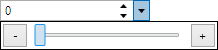
A custom picker style can be easily assigned to an edit box to give the picker a unique custom user interface. In the screenshot above, we've made a new Style for Int32Picker that uses a linear slider and assigned that style to the Int32EditBox.PopupPickerStyle property.
Placeholder Text
Edit boxes support placeholder text that is rendered when there is no value in the control. This text can be designated via the PlaceholderText property.

Disabling Undo/Redo
The IsUndoEnabled property, which defaults to true, can be set to false to prevent the text-editing portion of the control from supporting undo/redo.
Inline UI Elements
Edit boxes support the insertion of inline UI elements. For instance, you can inject a unit TextBlock in a DoubleEditBox, or a button that sets the current time in a TimeEditBox.
Inlines are specified via instances of the PartEditBoxInline class. The class requires that you set a DataTemplate to its ContentTemplate property. This DataTemplate will contain the UI elements for the inline.
The ContentPresenter that is generated behind the scenes to host the DataTemplate will have a WeakReference to the edit box as its Content/DataContext. We cannot pass the edit box control itself as Content since this ContentPresenter is inserted into the edit box, which could lead to issues with the framework. By passing a WeakReference, we can still provide the edit box as a data context while not triggering any framework issues. The distinction here is that you need to reference any properties on the edit box by prefixing the Path with "Target.", as in the example below.
This example shows how to insert a Now button into a TimeEditBox that uses the built-in SetValueToNowCommand.
<editors:TimeEditBox>
	<editors:TimeEditBox.Inlines>
		<editors:PartEditBoxInlineCollection>
			<editors:PartEditBoxInline>
				<DataTemplate>
					<Button Content="Now" Command="{Binding Target.SetValueToNowCommand}"
							Style="{StaticResource {x:Static themes:SharedResourceKeys.EmbeddedButtonBaseStyleKey}}"
							Padding="4,0" VerticalAlignment="Stretch" />
				</DataTemplate>
			</editors:PartEditBoxInline>
		</editors:PartEditBoxInlineCollection>
	</editors:TimeEditBox.Inlines>
</editors:TimeEditBox>
A similar SetValueToTodayCommand could also be used in a DateEditBox to change the value to today's date.
Appearances That Match Native Controls
The edit boxes have been carefully crafted to match the standard UI of related native controls found in Windows.

Above we see how a ColorEditBox fits right in with any standard Windows app TextBox or ComboBox.