ColorPicker
The ColorPicker control makes it easy for end users to select a color via touch or a mouse. It is generally intended for display within a popup, such as for the ColorEditBox control.
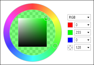
It combines an HsbColorPicker with edit boxes for RGB (red, green, blue). This allows the end user to select the color either via HSB (hue, saturation, brightness) or RGB values. In addition, a drop-down allows selection of an HSB text input mode, where HSB edit boxes are displayed in place of the RGB ones.
Alpha transparency selection is also optionally supported.
Alpha Transparency
The ColorPicker.IsAlphaEnabled property governs whether alpha transparency is supported.
When false, the edit box will only allow selection of an RGB color instead of an ARGB color.
Embedded ColorEditBox
The ColorPicker.HasColorEditBox property, which defaults to true, defines whether a ColorEditBox is embedded within the picker.
The edit box is used to display and allow editing of the hex color value.
Comparison Value
The ColorPicker.IsComparisonValueVisible property can be set to true to display a comparison color value on the left side of the hue ring's fill area. The color displayed is specified by the ComparisonValue property.
This is useful when setting up a comparison of old/new color values.
Sample XAML
This control can be placed within any other XAML container control, such as a Page or Panel with this sort of XAML:
<editors:ColorPicker Value="{Binding Path=YourVMProperty, Mode=TwoWay}" />