ColorEditBox
The ColorEditBox control allows for the input of a Color value. It uses the ColorPicker control in its popup.

Common Capabilities
Each of the features listed in the table below describe functionality that is common to most edit boxes. Please see the Edit Box Basics topic for details on each of these options and how to set them.
| Feature | Description |
|---|---|
| Has a spinner | Yes, and can be hidden or optionally displayed only when the control is active. |
| Has a popup | Yes, and can be hidden or its picker appearance customized. |
| Null value allowed | Yes, and can be prevented. |
| Read-only mode supported | Yes. |
| Non-editable mode supported | Yes. |
| Has multiple parts | Yes. |
| Placeholder text supported | Yes, and overlays the control. |
| Header content supported | Yes, and appears above the control. |
| Default spin behavior | No wrap. |
Alpha Transparency
The ColorEditBox.IsAlphaEnabled property can be set to false to prevent alpha transparency from being supported.
When false, the edit box will only allow selection of an RGB color instead of an ARGB color.
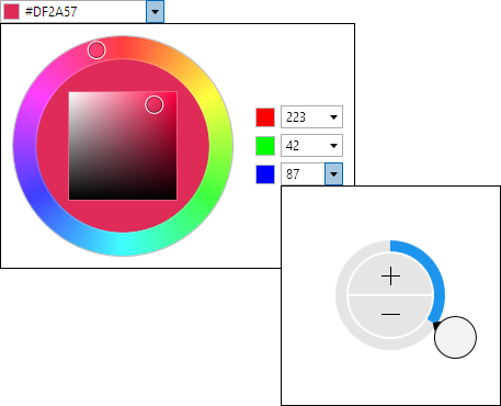
Initial Value Comparison on Popup
When the ColorEditBox.IsInitialValueComparedOnPopup property is set to true (the default), the initial color will display on the left side of the picker hue ring's fill area. The initial color is the edit box's value as the picker popup opens. The right side of the picker hue ring's fill area will contain the current color value being selected. This allows the old and new values to be compared side-by-side.
If the property is set to false, the picker hue ring's fill area will be completely filled by the current color value being selected.
Swatch Display
The ColorEditBox.HasSwatch property defaults to true, meaning that a small swatch will display the Color value. Set the property to false to hide the swatch.
The CanSwatchStretch property determines if the swatch stretches horizontally when the HasText property is false.
The SwatchMargin property sets the margin thickness around the swatch.
Text Display
The ColorEditBox.HasText property defaults to true, meaning that the text representation of the Color value will be displayed. Set the property to false to hide the text, which is useful if you only wish to show the swatch.
When hiding the text, be sure to also set the IsEditable property to false so that the control is treated more like a button instead of an edit control.
Parts and Incrementing/Decrementing
This edit box has multiple parts:
- A (optional)
- R
- G
- B
When the caret is over a part, the part value may be incremented or decremented. Please see the Edit Box Basics topic for information on how to do this.
Small value changes alter the current color component by a single unit. Large value changes alter the current color component by 16 units.
The DefaultValue property sets the value that will be set when incrementing or decrementing from a null value.
Sample XAML
This control can be placed within any other XAML container control, such as a Page or Panel with this sort of XAML:
<editors:ColorEditBox Value="{Binding Path=YourVMProperty, Mode=TwoWay}" />