Category Editors
Category editors provide a way to consume several properties within a category and provide a custom user interface for them.
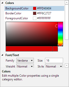
A property grid showing a category editor
Defining a Category Editor
The CategoryEditor class represents a category editor. Add each CategoryEditor instance that should be active to the PropertyGrid.CategoryEditors collection.
Category editors consist of three main aspects:
Standard display properties like Category (the category that the category editor should fall under), DisplayName, and Description.
A Properties collection of CategoryEditorProperty objects that are the properties to be consumed.
Editor
DataTemplateselection properties like EditorTemplate and EditorTemplateKey. TheDataTemplateprovides the user interface for the collection editor.
The Category property indicates which category the editor should be under.
Note
If the category associated with a CategoryEditor is not used, then the category editor will not be used.
Properties to be consumed by a category editor are defined in the Properties collection. Each CategoryEditorProperty object specifies the criteria used to match properties to be consumed, such as ObjectType, PropertyName, and/or PropertyType. When a property is consumed, it is not displayed in the property grid and the category editor is responsible for presenting it.
The data factory creates an ICategoryEditorModel whenever a category editor needs to be displayed. This model has a Children collection property that provides access to each of the consumed IPropertyModel objects. The collection is enumerable and can be indexed by property name as well. The DataTemplate used by a category editor can access any of the aggregated property models and their values through that collection, such as for binding to UI controls. Although there is no requirement that a category editor allow a property to be modified.
Example Category Editor
This code shows how category editor is used to consume all properties in a "Colors" category that have a return type of Color:
<grids:PropertyGrid DataObject="{Binding}">
	<grids:PropertyGrid.CategoryEditors>

		<grids:CategoryEditor Category="Colors" DisplayName="Colors" Description="Edit multiple Color properties using a single category editor.">
			<grids:CategoryEditor.Properties>
				<grids:CategoryEditorProperty PropertyType="Color" />
			</grids:CategoryEditor.Properties>
			<grids:CategoryEditor.EditorTemplate>
				<DataTemplate>
					<StackPanel>
						<ListBox x:Name="propertyListBox" BorderThickness="0" ItemsSource="{Binding Children}" SelectedIndex="0" HorizontalContentAlignment="Stretch" IsTabStop="False">
							<ListBox.ItemTemplate>
								<DataTemplate>
									<Grid Margin="0,-2">
										<Grid.ColumnDefinitions>
											<ColumnDefinition Width="*" />
											<ColumnDefinition Width="Auto" />
											<ColumnDefinition Width="*" />
										</Grid.ColumnDefinitions>

										<TextBlock Text="{Binding Name}" TextTrimming="CharacterEllipsis" VerticalAlignment="Center" />

										<Grid Grid.Column="1" Margin="5,3,3,3" Height="14" Width="14" Background="#ffffff" VerticalAlignment="Center">
											<Path Margin="1" Fill="#cccccc" Data="M4,0 L8,0 L8,4 L4,4 Z  M0,4 L4,4 L4,8 L0,8 Z  M8,4 L12,4 L12,8 L8,8 Z  M4,8 L8,8 L8,12 L4,12 Z" />

											<Border BorderThickness="1" BorderBrush="{DynamicResource {x:Static themes:AssetResourceKeys.BulletBorderDisabledBrushKey}}" SnapsToDevicePixels="True">
												<Border.Background>
													<SolidColorBrush Color="{Binding Value}" />
												</Border.Background>
											</Border>
										</Grid>

										<TextBlock Grid.Column="2" Text="{Binding ValueAsString}" TextTrimming="CharacterEllipsis" VerticalAlignment="Center" />
									</Grid>
								</DataTemplate>
							</ListBox.ItemTemplate>
						</ListBox>

						<shared:SpectrumColorPicker Margin="6,3" Width="Auto" Height="120" IsInitialColorVisible="False"
							SelectedColor="{Binding ElementName=propertyListBox, Path=SelectedItem.Value, Mode=TwoWay}" />
					</StackPanel>
				</DataTemplate>
			</grids:CategoryEditor.EditorTemplate>
		</grids:CategoryEditor>

	</grids:PropertyGrid.CategoryEditors>
</grids:PropertyGrid>