Edit Mode
The Breadcrumb control supports an edit mode, in which the user can manually type a new path or select an item from a drop-down list. The edit mode is supported using an embedded ComboBox, whose drop-down items can be fully customized. Typically, this list would include recently selected items and/or favorite items.
The user can enter edit mode by:
Pressing the
Spacekey when the breadcrumb has the keyboard focusClicking on the icon on the left
Clicking in the empty space on the right
Opening the drop-down list
The user can exit edit mode by:
Pressing the
Enterkey when the text box has the keyboard focusPressing the
Escapekey when the text box has the keyboard focus (any changes will be discarded)Selecting an item from the drop-down list
Moving focus away from the Breadcrumb control (any changes will be discarded)
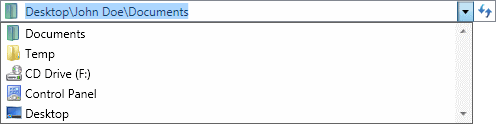
The Breadcrumb control using the Aero theme in edit mode and drop-down list open
Disabling Edit Mode
The edit mode can be disabled by setting the IsEditable property to false. When the edit mode is disabled, the drop-down list is hidden and the user cannot directly enter a path.
Populating the Drop-Down List
The embedded combo box drop-down list is populated using the ComboBoxItemsSource property. This property can be set in the same manner as the ComboBox.ItemsSource property.
Note
Logic to convert a combo box item to a trail must be provided. See the Item Conversion topic for more information.
Associated Members
The following Breadcrumb members are associated with edit mode:
| Member | Description |
|---|---|
| ComboBoxIsReadOnly Property | Gets or sets a value that enables selection-only mode, in which the contents of the embedded combo box are selectable but not editable. The default value is false. |
| ComboBoxItemContainerStyle Property | Gets or sets the Style that is applied to the ComboBoxItem elements generated for items in the embedded combo box. The default value is null. |
| ComboBoxItemContainerStyleSelector Property | Gets or sets custom logic for choosing a Style that can be applied to ComboBoxItem elements generated by the embedded combo box. The default value is null. |
| ComboBoxItemsSource Property | Gets or sets a collection used to generate the content of the embedded combo box. The default value is null. |
| ComboBoxItemTemplate Property | Gets or sets the DataTemplate used to display each item in the embedded combo box. The default value is null. |
| ComboBoxItemTemplateSelector Property | Gets or sets the custom logic for choosing a template used to display each item in the embedded combo box. The default value is null. |
| ComboBoxStaysOpenOnEdit Property | Gets or sets whether the drop-down control for the embedded combo box will remain open when a user clicks the text area. The default value is false. |
| IsEditable Property | Gets or sets a value indicating whether the breadcrumb control can enter edit mode. The default value is true. |
| IsEditing Property | Gets or sets a value indicating whether the breadcrumb control is currently in edit mode. The default value is false. |