Backstage / ApplicationMenu
The ribbon's application menu is displayed by clicking the large button in the upper left hand side of the ribbon. The application menu should generally be populated by application-wide menu items such as new, open, save file operations as well as other operations such as printing. Both the newer Backstage and traditional application menu styles are available.
Backstage Application Menu
The Backstage application menu was introduced in Office 2010 and is a large popup that occupies the entire Window when open, overlaying all content.
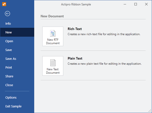
A Backstage application menu with styled buttons
The Backstage is organized such that buttons and tabs appear on the left side (the header area) and the selected tab's content appears on the right side (the content area).
Defining a Backstage
The Backstage application menu may be defined in XAML by setting a Backstage control to the Ribbon.ApplicationMenu property.
This code sample shows how to define a Backstage application menu for a ribbon. Combine it with the code in the following sections to define your buttons and tabs.
<ribbon:Ribbon>
	<ribbon:Ribbon.ApplicationMenu>
		<ribbon:Backstage>
			<ribbon:Button Label="Save" ImageSourceSmall="/Resources/Images/Save16.png" KeyTipAccessText="S" />
			<!-- More buttons above tabs go here -->

			<!-- Optional RecentDocumentMenu goes here -->

			<ribbon:BackstageTab Header="Info" KeyTipAccessText="I">
				<!-- Info tab content goes here -->
			</ribbon:BackstageTab>
			<!-- More tabs go here -->

			<!-- More buttons below tabs go here -->
			<ribbon:Button Label="Exit" ImageSourceSmall="/Resources/Images/CloseTab16.png" KeyTipAccessText="X" />
		</ribbon:Backstage>
	</ribbon:Ribbon.ApplicationMenu>
</ribbon:Ribbon>
Key Tip Access
The Backstage.KeyTipAccessText property can be set to define the key tip access text for the application button. It defaults to F, allowing the Alt+F key combination to open the application menu.
Defining Backstage Items
The Backstage control can contain these types of controls, which appear vertically in its header area: Button, BackstageTab, Separator, and RecentDocumentMenu.
Controls will appear in the order in which they are defined in the Backstage. This allows you to freely intermix the order of buttons, tabs and any recent document menu.
Button controls generally appear at the top and bottom of the Backstage header area. They are often set to the most common application commands such as Save, that can be easily executed with one click.
BackstageTab controls can be added when there are multiple configuration possibilities or there is data that needs to be displayed. For instance, an Info tab may provide information and statistics about the current document. A Recent tab might show a RecentDocumentMenu with its VariantSize property set to Large, allowing for recent documents to be selected. A New tab might show multiple options for creating new documents.
The header of the BackstageTab is what is rendered in the Backstage header area. This is typically just a string. The tab's content is what is displayed in the Backstage content area when the tab is selected.
If you wish to add recent document buttons to your Backstage header, a RecentDocumentMenu control can be added. The template for this control when in the Backstage header will render a separator followed by buttons for each of the filtered documents specified by the menu's RecentDocumentManager. It is a good idea to insert a Separator before the RecentDocumentManager.
Auto-Selecting a Tab When Backstage Opens
The Ribbon.IsApplicationMenuOpen property gets or sets whether the application menu is currently open. A related Ribbon.IsApplicationMenuOpenChanged event is raised whenever that property changes. This is an ideal place to initialize Backstage so that a certain tab is always selected when it opens.
The event handler for the Ribbon.IsApplicationMenuOpenChanged event can check to see if the application menu is being opened and if so, ensure the Backstage.SelectedItem property is set to the desired tab.
TaskTabControl
The TaskTabControl is a styled version of a native WPF TabControl that renders its tabs on the left side. The selected tab's content appears on the right side. This tab control is ideal for use on a BackstageTab since it provides a secondary level of tabs. It can be used external to Backstage as well.

A TaskTabControl with Separators and a Button on the selected tab
The items of a TaskTabControl can be either Separator or TaskTabItem controls. Separators should have their Label properties set, and they will appear as group headers for the tab items. TaskTabItem tab headers can be any content, but to render similarly to Office, they should show an image and a text label.
Button and PopupButton Styles
The Backstage content area can show large silver buttons. Both the Button and PopupButton controls have a special template that kicks in if their ControlBase.Context is set to BackstageItem and their ControlBase.VariantSize is set to Large
Use of those properties can trigger the style of buttons found in Office's Backstage, and as seen above.
Separator Styles
The Backstage content area can labeled separators. The Separator controls has a special template for use on Backstage that activates if their ControlBase.Context is set to BackstageItem.
Use of those properties can trigger the style of labeled separators found in Office's Backstage, and as seen above.
Preventing Backstage from Closing
The Backstage.CanClose property can be set to false which prevents the Backstage from closing by hiding the close button and blocking Esc from closing Backstage.
This is useful in scenarios where you are starting up an application and wish to block end user access to the main window until they create a new document or open a document. These or other actions can be presented on a non-closable Backstage.
Traditional Application Menu
The traditional application menu is a medium-sized popup that appears when the ribbon's application button is clicked. The left side of the popup contains application-wide menu items.

A traditional application menu with a RecentDocumentMenu control on it
A section at the bottom of the application menu can used for footer buttons. Generally items such as application options and application exiting are displayed there.
Any content can be placed on the right side of the application menu as well. Generally a RecentDocumentMenu control is used there.
Defining an Application Menu
The application menu may be defined in XAML by setting an ApplicationMenu control to the Ribbon.ApplicationMenu property.
This code sample shows how to define an application menu for a ribbon. Combine it with the code in the following sections to define your application menu and its items.
<ribbon:Ribbon>
	<ribbon:Ribbon.ApplicationMenu>
		<ribbon:ApplicationMenu>
			<!-- Items go here -->
		</ribbon:ApplicationMenu>
	</ribbon:Ribbon.ApplicationMenu>
</ribbon:Ribbon>
Key Tip Access
The ApplicationMenu.KeyTipAccessText property can be set to define the key tip access text for the application button. It defaults to F, allowing the Alt+F key combination to open the application menu.
Defining Menu Items
Menu items that appear on the left side of the application menu are defined via the ApplicationMenu's Items collection.
Control types that should be used here include: Button, PopupButton, SplitButton, and Separator.
This code defines the root items for a typical application menu. Note that some of the items have commands already tied to them and others are prototyped using XAML.
<ribbon:ApplicationMenu>
	<ribbon:SplitButton Command="ApplicationCommands.New" KeyTipAccessText="N" />
	<ribbon:Button Command="ApplicationCommands.Open" KeyTipAccessText="O" />
	<ribbon:Button Command="ApplicationCommands.Save" KeyTipAccessText="S" />
	<ribbon:SplitButton ImageSourceLarge="/Images/SaveAs32.png" Label="Save As" KeyTipAccessText="A" />
	<ribbon:Separator />
	<ribbon:SplitButton ImageSourceLarge="/Images/Print32.png" Label="Print" KeyTipAccessText="P" />
	<ribbon:MenuButton ImageSourceLarge="/Images/Prepare32.png" Label="Prepare" KeyTipAccessText="E" />
	<ribbon:MenuButton ImageSourceLarge="/Images/Send32.png" Label="Send" KeyTipAccessText="D" />
	<ribbon:MenuButton ImageSourceLarge="/Images/Publish32.png" Label="Publish" KeyTipAccessText="U" />
	<ribbon:Separator />
	<ribbon:Button Command="ApplicationCommands.Close" KeyTipAccessText="C" />
</ribbon:ApplicationMenu>
Defining Footer Buttons
Footer buttons that appear on the bottom of the application menu are defined via the ApplicationMenu.FooterButtons collection. This collection accepts any Button.
This code defines the footer buttons for a typical application menu. Note that buttons in this example are tied to commands defined in the sample project.
<ribbon:ApplicationMenu>
	<ribbon:ApplicationMenu.FooterButtons>
		<ribbon:Button Command="sample:ApplicationCommands.ApplicationOptions" KeyTipAccessText="I" />
		<ribbon:Button Command="sample:ApplicationCommands.ApplicationExit" KeyTipAccessText="X" />
	</ribbon:ApplicationMenu.FooterButtons>
</ribbon:ApplicationMenu>
Defining Additional Content (Right Side)
Any control may be set to the ApplicationMenu.AdditionalContent property to be displayed in the right side of the application menu.
This code defines a simple TextBlock as content for the right side of the application menu.
<ribbon:ApplicationMenu>
	<ribbon:ApplicationMenu.AdditionalContent>
		<TextBlock>My content here...</TextBlock>
	</ribbon:ApplicationMenu.AdditionalContent>
</ribbon:ApplicationMenu>
You can create your own complex custom control to fill this space. However, keep in mind that per the Microsoft requirements, you are not permitted to use vertical scrollbars in this area.
Many applications will want to place our RecentDocumentMenu control into the application menu's additional content. This control displays a list of recently-opened documents that can be maintained in code-behind and supports pinning of the documents so that they don't fall off the list when newer documents are opened.
This code defines a RecentDocumentMenu as the application menu's additional content.
<ribbon:ApplicationMenu>
	<ribbon:ApplicationMenu.AdditionalContent>
		<ribbon:RecentDocumentMenu>
			<shared:RecentDocumentManager x:Name="recentDocManager" />
		</ribbon:RecentDocumentMenu>
	</ribbon:ApplicationMenu.AdditionalContent>
</ribbon:ApplicationMenu>
Completely Hiding the Application Button
Although it usually isn't recommended, you can optionally hide the application button completely, blocking access to the application menu by the end user.

A ribbon with its application button hidden
To do this, set the Ribbon.IsApplicationButtonVisible property to false.
When in this mode, the QAT and tabs slide over to fill the space that was previously occupied by the application button.