Window Chrome
Actipro Themes includes a special class that is capable of rendering any WPF Window in a custom chrome that matches the current theme. Window chrome also supports an enormous number of customization features for the window, enabling window UI functionality that is not normally available.
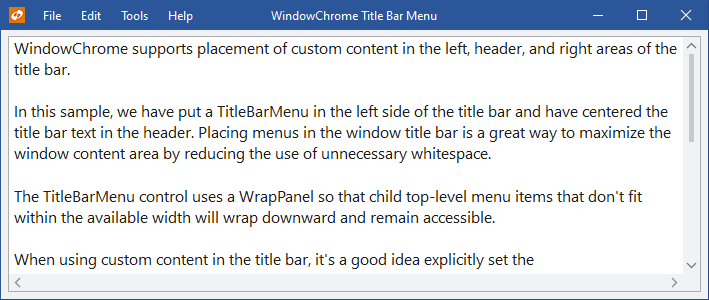
A menu placed in the window's title bar via WindowChrome
What is WindowChrome?
The WindowChrome class is a special class that is capable of applying a custom chrome to any normal WPF Window. It effectively hooks into a window and assumes all control of its rendering for the non-client area.
Features include:
- Matches current application theme
- Modern appearance support
- Ability to hide the title bar
- Capability of showing custom size icons
- Ability to set the margin around the icon
- Ability to hide the icon
- Ability to determine which title bar buttons are visible
- Ability to use different title text from the
Window.Title - Change the alignment of the title text (optionally center it)
- Ability to inject a custom header UI in place of default title bar text
- Ability to inject additional UI next to the title bar icon and/or buttons
- Ability to set the minimum title bar height
- Retrieve the final arranged title bar height, and left/right content widths
- Alternate title bar and title bar button styles
- Normal border, or single pixel-border with outer glow / drop shadow effects
- Outer glow / drop shadow areas support window resizing
- System-rendered rounded corner, border, and drop shadow support on Windows 11 or later
- System backdrop (Mica, Acrylic textures) support on recent Windows versions
- Snap layout menu support on Windows 11 or later
- Optionally extend the window content itself, or just the background, to render in the title bar area
- Full Aero-snap support
- Full interop (WinForms, etc.) and ClearType support
- Replacement of the Win32-based system menu with a themeable WPF one, whose menu items can be customized
- Support for animated overlay UI that temporarily overlays the entire window, such as for a home screen, Backstage, or processing indicator
- Support for preventing window activation when clicking a ribbon or toolbar
The ability to use semi-transparent border outer glow effects and still have full support for interop controls is rather unique, since normally windows with transparent backgrounds don't render interop controls in WPF. We have created special code to work around this. By default, only modern themes activate the outer glow effects.
It is highly recommended that native control themes are activated when using window chrome, so that everything blends well together.
Applying Window Chrome
If your app will be using our Metro theme, you may apply the chrome to any existing Window via XAML or dynamically via code.
Important
For the Ribbon product, do not apply the chrome onto RibbonWindow instances. Each RibbonWindow instance already has a pre-installed WindowChrome that is configured to support the QAT and other Ribbon features, and it will break functionality if changed. You can get that existing instance programmatically and alter its properties as needed via a call to WindowChrome.GetChrome.
The newer Bars RibbonWindow does not have this limitation, but it is recommended to assign an instance of RibbonWindowChrome.
Applying Via XAML
This code sample shows how to set a WindowChrome instance onto a Window and update the window to use a custom 24x24 icon (instead of the standard 16x16 icon). It also updates the margin around the icon.
<Window xmlns:themes="http://schemas.actiprosoftware.com/winfx/xaml/themes"
	...
	>
	<themes:WindowChrome.Chrome>
		<!-- This WindowChrome updates a Window so that it renders in a Metro style... custom-sized icons can even be used -->
		<themes:WindowChrome IconMargin="10,4,10,4" IconSource="/Resources/Images/ActiproMetro24.png" />
	</themes:WindowChrome.Chrome>
	...
</Window>
You could also apply a single chrome to multiple windows in an app by defining the chrome in your Application.Resources with an x:Key. Then reference that chrome in each Window's XAML like:
<Window xmlns:themes="http://schemas.actiprosoftware.com/winfx/xaml/themes"
	...
	themes:WindowChrome.Chrome="{StaticResource YourWindowChromeKeyHere}">
	...
</Window>
Note that if you choose to reuse a chrome instance among multiple windows, be sure to remove the instance from each window if the window is closed and will no longer be referenced.
This code sample shows how the chrome can be removed from within an OnClosed override of the Window.
WindowChrome.SetChrome(this, null);
The code above will prevent any possible memory leaks due to the chrome instance remaining alive.
Warning
WindowChrome installs a new Style onto the window instances that use it. Therefore, custom window styles cannot be assigned to a window that will be chromed. And thus, the window chrome cannot be assigned via a style setter since as soon as it is assigned, our built-in style would end up getting applied (which didn't have the chrome setter) and the chrome would then be removed. Set the chrome on each window instance as described above instead.
Applying Via Code
This code sample shows how to set a WindowChrome instance onto a Window programmatically instead, which can be done at run-time, such as after the Window's InitializeComponent call.
WindowChrome.SetChrome(this, new WindowChrome());
Removing Via Code
The custom WindowChrome can also be removed at run-time if needed, with a call such as this on the Window.
WindowChrome.SetChrome(this, null);
Once removed, the window will render using system defaults again.
Declaring Operating System Support
Important
Some features of WindowChrome are OS-specific and may require your application to explicitly declare support for the related operating system. Snap layouts menu support, for example, requires Windows 11 support to be explicitly declared.
Applications declare supported operating systems using an app.manifest file. Our Sample Browser application ships with an app.manifest file that can be used as an example. In general, the following code snippet can be added to the app.manifest file to declare support:
<assembly manifestVersion="1.0" xmlns="urn:schemas-microsoft-com:asm.v1">
	...
	<compatibility xmlns="urn:schemas-microsoft-com:compatibility.v1">
		<application>
			<!-- A list of the Windows versions that this application has been tested on and is
			is designed to work with. Uncomment the appropriate elements and Windows will
			automatically selected the most compatible environment. -->

			<!-- Windows 7 -->
			<supportedOS Id="{35138b9a-5d96-4fbd-8e2d-a2440225f93a}" />

			<!-- Windows 8 -->
			<supportedOS Id="{4a2f28e3-53b9-4441-ba9c-d69d4a4a6e38}" />

			<!-- Windows 8.1 -->
			<supportedOS Id="{1f676c76-80e1-4239-95bb-83d0f6d0da78}" />

			<!-- Windows 10/11 -->
			<supportedOS Id="{8e0f7a12-bfb3-4fe8-b9a5-48fd50a15a9a}" />

		</application>
	</compatibility>
	...
</assembly>
Title Bar Display
By default, the WindowChrome will display the window's title bar at the top of the window.
The HasTitleBar property can be set to false to hide the entire title bar.
Icon Display
By default, the WindowChrome will render the window's 16x16 icon.
However, if a custom-sized icon is desired (such as a 24x24 icon), its ImageSource can be set to the IconSource property. The margin around the icon can be adjusted with the IconMargin property.
The HasIcon property can be set to false to hide the icon in the title bar altogether.
System Title Bar Button Display
These properties on the WindowChrome instance govern which system title bar buttons display:
Rounded Corners (Windows 11 or later)
The CornerKind property allows rounded corners to be supported on Windows 11 or later. The default value of Rounded uses the Windows system to render rounded corners, along with a border and drop shadow that is consistent with all other normal windows. Similarly, a value of SmallRounded uses the system to render smaller rounded corners, a border, and drop shadow for tool windows.
Note
When the Windows system is rendering the drop shadows via one of the round corner kind settings, setting the HasOuterGlow property to false (not recommended for most themes) will not hide the drop shadow. The only effect it will have is that window resizing will not be supported when the pointer is in the shadow area outside of the outer window border.
The Square value does not use the Windows system to round any corners, render the border, or render a drop shadow. It uses WindowChrome rendering for the border and drop shadow instead.
Note
When on a Windows 10 or earlier system, the corner kind is coerced to Square, since the system rounded corner feature isn't available until Windows 11.
System Backdrop (Mica, Acrylic) Rendering
The BackdropKind property allows for a system-rendered backdrop to be displayed anywhere there is a transparent portion of a Window.
Various backdrops have different Windows version support as listed below, and no backdrops are rendered in high-contrast mode:
MainWindow- A background material rendered for main windows. On Windows 11 or later, this corresponds to the "Mica" material.TransientWindow- A background material rendered for transient (popup/menu) windows. On Windows 10 (May 2020 Update) or later, this corresponds to the "Acrylic" material.
When a backdrop is specified but the operating system doesn't support the backdrop, or high-contrast mode is active, no backdrop will be rendered, and a default opaque window background will be used.
Determining Backdrop Status
The attached WindowChrome.IsBackdropActive property (set on the Window instance) returns whether a backdrop is currently being rendered.
Backdrop in the Title Bar
The attached WindowChrome.IsTitleBarBackdropAllowed property (set on the Window instance) determines if a backdrop can be rendered in the title bar area of a window. This attached property is set by the current theme but can be overridden on the Window instance. While most themes allow backdrops to be rendered in the title bar, by default, themes with accented title bar backgrounds do not.
Title Bar Text Display
The attached WindowChrome.TitleBarHeader property (set on the Window instance) is what renders content in the center of the title bar. By default, the Window.Title string value is bound to this attached property so that the window title appears in the title bar.
This example shows how to display different title text in the window's title bar from the title text that shows in the Windows taskbar, which is useful when your window title bar should show more detail in the text.
<Window ...
	Title="Document1.txt - MyApp"
	themes:WindowChrome.TitleBarHeader="Document1.txt - Last modified: October 24">
	<themes:WindowChrome.Chrome>
		<themes:WindowChrome TitleBarHeaderAlignment="Center" />
	</themes:WindowChrome.Chrome>
	...
</Window>
Set the attached WindowChrome.TitleBarHeader property to null to hide the title bar text.
The TitleBarHeaderAlignment property allows a HorizontalAlignment to be specified that changes the horizontal alignment of the header where title text is displayed. While it defaults to Left, it can be changed to a value like Center to center-align the title text.
The TitleBarHeaderMargin property sets the margin around the header. This is useful for creating spacing between the header and other title bar elements.
Replacing Title Bar Text with Custom Header UI
Custom header UI can be injected in place of the default title bar text rendering. This feature allows UI such as a button to be used.
Behind the scenes, a ContentControl has its Content property set to the window's attached WindowChrome.TitleBarHeader property value, its ContentTemplate property set to the TitleBarHeaderTemplate property value. and its ContentTemplateSelector property set to the TitleBarHeaderTemplateSelector property value. Any of these properties can be customized to inject custom UI using MVVM techniques.
Note that the default value of the TitleBarHeaderTemplateSelector property is an instance of WindowChromeTitleBarHeaderTemplateSelector, which has a default template for string-based WindowChrome.TitleBarHeader values.
The object-based content property is an attached property because it is specific to a Window instance. The DataTemplate-based content template property is a normal chrome property because WindowChrome instances can be reused across multiple windows.
This example shows how the TitleBarHeaderTemplate property can be set to replace the default TextBlock-based rendering of title bar text. The data context of this template is the attached WindowChrome.TitleBarHeader property value, which defaults to Window.Title.
<Window ...>
	<themes:WindowChrome.Chrome>
		<themes:WindowChrome>
			<themes:WindowChrome.TitleBarHeaderTemplate>
				<DataTemplate>
					<Button
						Margin="20,0"
						Content="{Binding}"
						Focusable="False"
						Foreground="{Binding RelativeSource={RelativeSource TemplatedParent}, Path=(TextElement.Foreground)}"
						IsTabStop="False"
						MaxWidth="300"
						Style="{DynamicResource {x:Static themes:SharedResourceKeys.WindowTitleBarButtonBaseStyleKey}}"
						/>
				</DataTemplate>
			</themes:WindowChrome.TitleBarHeaderTemplate>
		</themes:WindowChrome>
	</themes:WindowChrome.Chrome>
	...
</Window>
This example shows how the attached WindowChrome.TitleBarHeader property can be set instead to accomplish the same sort of goal.
<Window x:Name="window" ...>
	<themes:WindowChrome.Chrome>
		<themes:WindowChrome />
	</themes:WindowChrome.Chrome>
	<themes:WindowChrome.TitleBarHeader>
		<Button
			Margin="20,0"
			Content="{Binding ElementName=window, Path=Title}"
			Focusable="False"
			Foreground="{Binding RelativeSource={RelativeSource AncestorType=ContentControl}, Path=(TextElement.Foreground)}"
			IsTabStop="False"
			Style="{DynamicResource {x:Static themes:SharedResourceKeys.WindowTitleBarButtonBaseStyleKey}}"
			MaxWidth="300"
			/>
	</themes:WindowChrome.TitleBarHeader>
	...
</Window>
Injecting Additional Content in the Title Bar
Custom UI can optionally be injected both on the left side (next to the icon) and right side (next to the system buttons) of the title bar. This feature can be used to insert any kind of controls such as title bar menus, other title bar buttons (back, help, etc.), or an app-wide search textbox.
Behind the scenes, two ContentControl instances are in the title bar, one on the left side and one on the right. The left-side ContentControl has its Content property set to the window's attached WindowChrome.TitleBarLeftContent property value, its ContentTemplate property set to the TitleBarLeftContentTemplate property value, and its ContentTemplateSelector property set to the TitleBarLeftContentTemplateSelector property value. The right-side ContentControl has its Content property set to the window's attached WindowChrome.TitleBarRightContent property value, its ContentTemplate property set to the TitleBarRightContentTemplate property value, and its ContentTemplateSelector property set to the TitleBarRightContentTemplateSelector property value. Any of these properties can be customized to inject custom UI using MVVM techniques.
The object-based content properties are attached properties because they are specific to a Window instance. The DataTemplate-based content template properties are normal chrome properties because WindowChrome instances can be reused across multiple windows.
Note
The attached WindowChrome.TitleBarLeftContent and TitleBarRightContent properties are generally bound to the Window's DataContext property when there is custom title bar UI in the related title bar side. This is useful when wanting to pass the same view-model object into the title bar data templates, but any other object can be passed in as well.
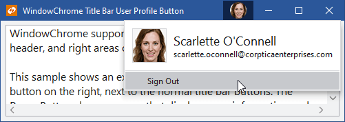
A user profile title bar button added via WindowChrome
This example shows how the TitleBarRightContentTemplate property can be set to inject a custom title bar button. The data context of this template is the attached WindowChrome.TitleBarRightContent property value, which we will bind to the Window.DataContext property, assumed to have a view-model with a CustomButtonCommand property on it.
<Window ... themes:WindowChrome.TitleBarRightContent="{Binding RelativeSource={RelativeSource Self}, Path=DataContext}">
	<themes:WindowChrome.Chrome>
		<themes:WindowChrome>
			<themes:WindowChrome.TitleBarRightContentTemplate>
				<DataTemplate>
					<Button
						Command="{Binding CustomButtonCommand}"
						Style="{DynamicResource {x:Static themes:SharedResourceKeys.WindowTitleBarButtonBaseStyleKey}}"
						themes:ThemeProperties.IsActive="{Binding RelativeSource={RelativeSource AncestorType={x:Type Window}}, Path=IsActive}"
						ToolTip="Custom TitleBar Button"
						>
						<Button.ContentTemplate>
							<DataTemplate>
								<Canvas Margin="6,0" Width="16" Height="16">
									<Path
										Canvas.Left="3"
										Canvas.Top="11"
										Fill="{Binding RelativeSource={RelativeSource Self}, Path=(TextElement.Foreground)}"
										Data="M 0,0 L 2,0 L 2,2 L 0,2 Z M 4,0 L 6,0 L 6,2 L 4,2 Z M 8,0 L 10,0 L 10,2 L 8,2 Z"
										/>
								</Canvas>
							</DataTemplate>
						</Button.ContentTemplate>
					</Button>
				</DataTemplate>
			</themes:WindowChrome.TitleBarRightContentTemplate>
		</themes:WindowChrome>
	</themes:WindowChrome.Chrome>
	...
</Window>
Tip
See the RibbonWindow topic for important information about how to customize the title bar when using RibbonWindow.
Title Bar Element Layout
Title bar elements consist of controls like the icon, left content (custom UI next to the icon), header (generally title bar text), right content (custom UI next to the system buttons), and system buttons (minimize, maximize, etc. buttons).
WindowChrome has some complex logic built into it to arrange all the title bar elements based on available width. The icon and system buttons are always rendered at full width when visible. There are three distinct layout phases that occur for the remaining title bar elements as available width changes.
All Elements Fit and Center-Aligned Header
This phase only occurs when the TitleBarHeaderAlignment property is set to Center, the header is able to be centered within the title bar without overlapping other elements, and all title bar elements fully fit at their desired widths. In this phase, all elements appear at their full size and the header is centered within the overall title bar.
All Elements Fit
This next phase occurs when the TitleBarHeaderAlignment property anything other than Center or the centered header would overlap other elements, and all title bar elements fully fit at their desired widths. In this phase, all elements appear at their full size.
Elements Don't All Fit
This final phase occurs when not all elements fit at their desired sizes. At this point the left-side and right-side content areas are allowed to take up to a percentage of available space designated by the TitleBarLeftContentMaxWidthOverflowPercentage and TitleBarRightContentMaxWidthOverflowPercentage properties. Any unused space is given to the header. As an example, if a wide menu control is injected into the title bar's left-side, then a wider TitleBarLeftContentMaxWidthOverflowPercentage like 0.5 (50%) should be used so that most of the menu can still be displayed at smaller window widths.
The TitleBarHeaderMinWidth property specifies the minimum width to try and make sure the header receives in this phase. The header will take space from the left and right content areas as needed to ensure it has this minimum width available. This ensures that a title bar text element in the header can take a higher display priority over the left/right content areas.
In this phase, the left/right content areas will generally be told to render at a width smaller than their desired width. It is the responsibility of the controls in the left/right content areas to handle that scenario and adjust their UI as appropriate. Some implementations may choose to hide elements that don't fit or move them to an overflow menu.
Using the TitleBarMenu Control
The TitleBarMenu control inherits the native Menu control but alters the top-level menu item appearance to render properly in title bar scenarios.
It will also wrap menu items that don't fit within the available width to new lines so that they all remain accessible. Note that when using a title bar menu, the WindowChrome.TitleBarLeftContentMaxWidthOverflowPercentage property should be set to a relatively high value to avoid the menu from wrapping its top-level menu items too early as available width decreases.
This is an example of using the TitleBarMenu control on the left side of a WindowChrome title bar.
<Window ...>
	<themes:WindowChrome.Chrome>
		<themes:WindowChrome
			x:Name="chrome"
			TitleBarHeaderAlignment="Center"
			TitleBarHeaderMinWidth="70"
			TitleBarLeftContentMaxWidthOverflowPercentage="0.75"
			TitleBarRightContentMaxWidthOverflowPercentage="0"
			/>
	</themes:WindowChrome.Chrome>
	<themes:WindowChrome.TitleBarLeftContent>
		<shared:TitleBarMenu x:Name="menu" Foreground="{Binding RelativeSource={RelativeSource AncestorType=ContentControl}, Path=(TextElement.Foreground)}">
			<MenuItem Header="File">
				<MenuItem Header="New" />
				<MenuItem Header="Open..." />
				<MenuItem Header="Exit" />
			</MenuItem>
			<MenuItem Header="Edit">
				<MenuItem Header="Cut" />
				<MenuItem Header="Copy" />
				<MenuItem Header="Paste" />
			</MenuItem>
			<MenuItem Header="Help">
				<MenuItem Header="Documentation" />
			</MenuItem>
		</shared:TitleBarMenu>
	</themes:WindowChrome.TitleBarLeftContent>
	...
</Window>
Using the AutoCollapseStackPanel Control
When elements don't all fit within their available space in the title bar, some of them may get clipped so that they only partially render. This isn't a good user experience and to help, we've built a small AutoCollapseStackPanel control that can be used in the title bar. This panel arranges child elements horizontally and only shows child elements that fit within the available space, collapsing the rest.
For instance, if you have two buttons that you wish to include in the title bar's right content area, wrap them with an AutoCollapseStackPanel instance and it will handle hiding the buttons when they don't fit.
Extending the Content Area Itself or Its Background into the Title Bar
The Window.Background brush is used to render the window's content area background. Many applications render the title bar area of the window with distinct backgrounds from the window's content area. This is also the default case with Actipro themes, where the title bar has its own background, even if the brush used to render the background is the same as the content area brush.
There are some scenarios where it's desirable to have the content area background extend to fill the title bar area as well. The TitleBarMergeKind property can be set to BackgroundOnly to achieve this. In this case, the normal theme title bar background isn't rendered, and the content area background is updated to include the title bar area.
The TitleBarMergeKind property can alternatively be set to Full to render the Window.Content in the title bar areas as well. In this scenario, the title bar elements still render on top of the content area elements.
Finally, the ContentOnly option keeps the content area background where it normally would render but extends the content area elements to render in the title bar.
Customizing the System Menu
A window's system menu displays when you right-click the title bar, or you click the icon in the title bar. WindowChrome replaces the default Win32-based system menu with a pure WPF-based one that is themeable. This is especially helpful if you are using a dark theme since the default Win32-based system menu is jarringly different in appearance from a dark theme menu.
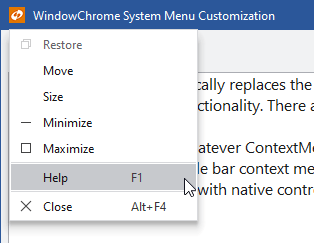
A themed system menu, with custom Help menu
The WindowChrome.WindowSystemMenuOpening event is raised when the system menu is opening, allowing for full customization. If you don't wish to use a custom WPF-based system menu that matches the current application theme, set e.Menu to a null reference in the event handler.
Adding Custom Menu Items
This code sample shows custom menu items can be added to the system menu.
private void OnWindowSystemMenuOpening(object sender, ContextMenuOpeningEventArgs e) {
	// If not allowing a custom system menu, clear e.Menu and quit
	if (!true.Equals(useCustomSystemMenuCheckBox.IsChecked)) {
		e.Menu = null;
		return;
	}

	var separator = e.Menu.Items.OfType<Separator>().LastOrDefault();
	var index = (separator != null ? e.Menu.Items.IndexOf(separator) : e.Menu.Items.Count);

	// Inject a Help menu item
	e.Menu.Items.Insert(index++, new Separator());
	e.Menu.Items.Insert(index++, new MenuItem() {
		Header = "Help",
		Command = ApplicationCommands.Help,
		CommandTarget = this,
		InputGestureText = "F1"
	});
}
Overlays
Overlays allow for temporary custom content to be positioned over the entire window. This could be a home screen, an Office-like Backstage, or a processing indicator.
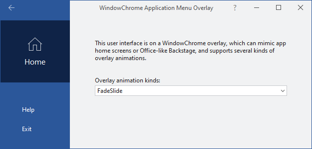
An application menu overlay
Overlay Content
Similar to how title bar customization works, behind the scenes, a ContentControl has its Content property set to the window's attached WindowChrome.OverlayContent property value, its ContentTemplate property set to the OverlayContentTemplate property value and its ContentTemplateSelector property set to the OverlayContentTemplateSelector property value. Any of these properties can be customized to inject custom UI using MVVM techniques.
Toggling Overlay Visibility
The overlay is not made visible until the attached WindowChrome.IsOverlayVisible property is set to true. Set the attached property back to false to hide the overlay.
It may be desired to bind the attached WindowChrome.IsOverlayVisible property to other properties or a view-model. The following example demonstrates how a view-model with the property IsWindowOverlayVisible can be bound to the attached WindowChrome.IsOverlayVisible property of a window, where the default DataContext is assumed to be an instance of the view-model:
<Window x:Name="window" ...
	themes:WindowChrome.IsOverlayVisible="{Binding IsWindowOverlayVisible}}">
	...
</Window>
For convenience, the static WindowChrome.SetIsOverlayVisible method can also be called from code to set the current value of the attached property.
An IsOverlayVisibleChanged event is raised when the property changes. This event handler to make any programmatic changes to the UI needed for an overlay visibility change, such as showing/hiding title bar controls that should only be visible when the overlay is displayed.
A static ToggleIsOverlayVisibleCommand property is available, which returns an ICommand that can toggle the WindowChrome.IsOverlayVisible property.
Choosing the Overlay Animation
The attached WindowChrome.OverlayAnimationKinds property can be set on a window to determine what kind of quick animation to use when opening and closing an overlay. The property value is of type OverlayAnimationKinds, with the default being Fade.
When building an Office-like Backstage overlay, use a value of FadeSlide. If you wish to disable animation altogether, use a value of None. Animation is automatically disabled on machines that don't have hardware acceleration.
Surface Area
The overlay covers the entire window but does sit in z-order behind the title bar's foreground. This allows for the title bar to continue supporting window dragging, right-click context menus, and for title bar buttons (like Close) to be accessible.
It also allows any custom title bar controls to be accessible, which may or may not be desired. If a custom title bar control should not be accessible when an overlay is visible, it should be hidden or disabled. The attached WindowChrome.IsOverlayVisible property on the window can be bound to using an appropriate value converter, or you can update the custom title bar control states programmatically in an IsOverlayVisibleChanged event handler.
Focus Scope
Overlays are designed by default to be focus scopes (similar to menus/toolbars), where their content can only temporarily be focused and the owner window will track which element previously had focus before the overlay displayed. This allows for focus to be easily returned to the previous element.
The attached WindowChrome.IsOverlayFocusScope property can be set on a window to specify if its overlay is a focus scope or not. The default is true but can be set to false when the overlay content should not be a separate focus scope.
Using an Alternate Title Bar Style
Actipro Themes include resources for two sets of title bar styles, which affect both the title bar and its title bar buttons. Most of the time, the two sets are the same. However, when using a theme with an accented title bar (like in Office Colorful themes), the "alternate" title bar style renders in a non-accented appearance. This is commonly seen on Office-like Backstage overlays.
Set the attached WindowChrome.UseAlternateTitleBarStyle property to true on a window using WindowChrome to activate the alternate title bar style. This property value updates the window template to use alternate colors for the title bar foreground and background, and binds the property value directly to attached UseAlternateStyleProperty properties on each title bar button.
When an attached UseAlternateStyleProperty value is set to true on a title bar button, it will render in the alternate style. If you define custom title bar buttons, you can manually set that attached property to determine which style to use.
It's a common practice with Office-like Backstage overlays to bind the attached UseAlternateStyleProperty property to the attached WindowChrome.IsOverlayVisible property value. This tells the title bar to use the alternate title bar style whenever the overlay is visible.
<Window x:Name="window" ...
	themes:WindowChrome.UseAlternateTitleBarStyle="{Binding RelativeSource={RelativeSource Self}, Path=(themes:WindowChrome.IsOverlayVisible)}">
	...
</Window>
Setting the Minimum Title Bar Height
The minimum title bar height can be set using the attached TitleBarMinHeightProperty property.
<Window x:Name="window" ...
	themes:WindowChrome.TitleBarMinHeight="28">
	...
</Window>
Getting the Title Bar Height
When using extending the window's content area into the title bar via TitleBarMergeKind, or when using overlays, it's handy to know the final arranged height of the title bar. This allows the content extended up into the title bar area to possibly have a top margin to place certain elements back where they would have appeared in the normal window content area.
The title bar arrange logic sets the attached WindowChrome.TitleBarHeight property to the final title bar height.
This code shows how the title bar height can be used as a top margin for a control:
<Window.Resources>
	<shared:ThicknessConverter x:Key="ThicknessConverter" />
<Window.Resources>
...
<Grid Margin="{Binding ElementName=window, Path=(themes:WindowChrome.TitleBarHeight), Converter={StaticResource ThicknessConverter}, ConverterParameter='Top'}">
	...
</Grid>
Preventing Window Activation When Clicking a Ribbon or ToolBar
The CanMouseActivateOverToolBar property can be set to false to prevent the Window from being activated when clicking a ribbon or toolbar control. This feature is useful when working with floating docking windows, such as in the Actipro Docking/MDI product.
See the Floating Dock Hosts topic for a detailed explanation of how to use this feature.
WindowChrome Samples
Please see the main sample project's Themes WindowChrome samples for several in-depth examples of using all the features described above. These examples show best practices for each feature, such as implementing various XAML bindings, etc.