Styles and Templates
Wizard makes extensive use of the style and template features provided in the WPF framework.
Everything from pages to the button container can be completely customized on multiple levels. You may choose to apply certain types of images and backgrounds to pages via our simple WizardPage-level properties. You may wish to define more of a theme for all the pages in your wizard. Or you may even want to redefine the way the pages or the button container look via templates. By doing this, you can determine which controls are in a page's header or in the button container and add your own as needed.
WizardPage Properties
The WizardPage has a couple properties that control the visual style of the header on the page. For an interior page, the header is the area that is at the top of the page. For an exterior page, the header is the watermark area on the left side of the page.
| Member | Description |
|---|---|
| HeaderBackground Property | Gets or sets the Brush used to draw the background that is displayed in the page header. |
| HeaderImage Property | Gets or sets the ImageSource that is displayed at the right side of the page header. |
This XAML code shows how to load a header image and header background for a page. Both images are specified using pack:// syntax (see the WPF documentation for more info). In this code snippet, the image HatLogo.png is a resource in an assembly named Sample and is in an Images folder. The image WelcomeBG.png is located in the same folder as a resource.
<wizard:WizardPage x:Name="welcomePage" HeaderImage="/Sample;component/Images/HatLogo.png">
	<wizard:WizardPage.HeaderBackground>
		<ImageBrush TileMode="Tile" Stretch="None" Viewport="0,0,164,450"
			ViewportUnits="Absolute" ImageSource="/Sample;component/Images/WelcomeBG.png" />
	</wizard:WizardPage.HeaderBackground>
</wizard:WizardPage>
Since the header background needs a Brush, the sample above says to tile the image if needed and to not stretch it. It also specifies the absolute size of the image, which is 164x450 so that tiling performs correctly.
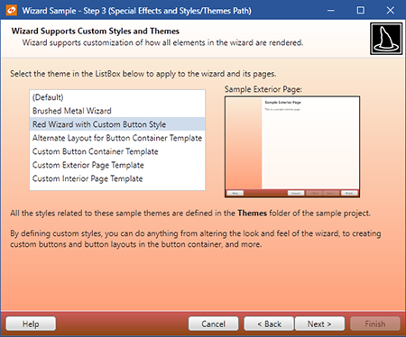
Applying Styles
The next level of customization is to apply styles to the parts of the wizard. The wizard parts that can be customized are the exterior page style, the interior page style, and the button container style.
Of course, the default styles of any other type of control can be updated. For instance you may wish to apply a new style to any Button in the button container that matches the new style you apply to the button container.
Styles allow for easy application of custom themes
The WPF documentation does a great job of explaining how styles may be applied to controls. In a nutshell, styles may be applied anywhere within a control hierarchy, at an application-level, or in a Generic.xaml resource dictionary.
Styling the Button Container
It's a little easier to style the button container. For that control, simply target the WizardButtonContainer type.
This XAML code shows a style for the button container to apply a gradient background and a new border:
<Style TargetType="{x:Type wizard:WizardButtonContainer}">
	<Setter Property="Background">
		<Setter.Value>
			<LinearGradientBrush StartPoint="0,0" EndPoint="0,1">
				<GradientStop Offset="0" Color="#EBEEFA" />
				<GradientStop Offset="0.4" Color="#D6DAE4" />
				<GradientStop Offset="0.41" Color="#C5C7D1" />
				<GradientStop Offset="1" Color="#D4D8E2" />
			</LinearGradientBrush>
		</Setter.Value>
	</Setter>
	<Setter Property="BorderBrush" Value="#6F7074" />
	<Setter Property="BorderThickness" Value="0,1,0,0" />
</Style>
Templates
Custom templates may be applied via styles for the wizard, pages or the button container.
The sample project contains numerous style/template examples in the Themes child folder. You may use those samples as a base for your own templates.
The real power of templates becomes apparent when you start rearranging where template child controls appear and add your own controls. For instance, perhaps you wish to have a Hyperlink back to your web site in the left part of the button container. No problem... just make a custom button container template.
Changing Button Positions (Next/Finish Button Shared Space)
Some developers prefer to have the Help button on the right side or the button container and others prefer to have the Next and Finish buttons share the same space. In this scenario, the Finish button is only visible on a finish page.
This code shows how to alter the WizardButtonContainer template:
<Style x:Key="{x:Type wizard:WizardButtonContainer}" TargetType="wizard:WizardButtonContainer">
	<Setter Property="Template">
		<Setter.Value>
			<ControlTemplate TargetType="wizard:WizardButtonContainer">
				<Border Background="{TemplateBinding Background}"
						BorderBrush="{TemplateBinding BorderBrush}"
						BorderThickness="{TemplateBinding BorderThickness}"
						Padding="{TemplateBinding Padding}"
						SnapsToDevicePixels="True">
					<StackPanel Orientation="Horizontal" HorizontalAlignment="Right">
						<Button x:Name="PART_CancelButton" Margin="0,0,7,0" MinWidth="75" Command="wizard:WizardCommands.Cancel"
							Content="{Binding RelativeSource={RelativeSource Mode=FindAncestor, AncestorType=wizard:Wizard}, Path=CancelButtonText}"
							Visibility="{Binding RelativeSource={RelativeSource Mode=FindAncestor, AncestorType=wizard:Wizard}, Path=(wizard:Wizard.SelectedPage).(wizard:WizardPage.CancelButtonVisibility)}" />
						<Button x:Name="PART_BackButton" MinWidth="75" Command="wizard:WizardCommands.PreviousPage"
							Content="{Binding RelativeSource={RelativeSource Mode=FindAncestor, AncestorType=wizard:Wizard}, Path=BackButtonText}"
							Visibility="{Binding RelativeSource={RelativeSource Mode=FindAncestor, AncestorType=wizard:Wizard}, Path=(wizard:Wizard.SelectedPage).(wizard:WizardPage.BackButtonVisibility)}" />
						<Button x:Name="PART_NextButton" MinWidth="75" Command="wizard:WizardCommands.NextPage"
							Content="{Binding RelativeSource={RelativeSource Mode=FindAncestor, AncestorType=wizard:Wizard}, Path=NextButtonText}"
							Visibility="{Binding RelativeSource={RelativeSource Mode=FindAncestor, AncestorType=wizard:Wizard}, Path=(wizard:Wizard.SelectedPage).(wizard:WizardPage.NextButtonVisibility)}" />
						<Button x:Name="PART_FinishButton" MinWidth="75" Command="wizard:WizardCommands.Finish"
							Content="{Binding RelativeSource={RelativeSource Mode=FindAncestor, AncestorType=wizard:Wizard}, Path=FinishButtonText}"
							Visibility="{Binding RelativeSource={RelativeSource Mode=FindAncestor, AncestorType=wizard:Wizard}, Path=(wizard:Wizard.SelectedPage).(wizard:WizardPage.FinishButtonVisibility)}" />
						<Button x:Name="PART_HelpButton" Margin="7,0,0,0" MinWidth="75" Command="wizard:WizardCommands.Help"
							Content="{Binding RelativeSource={RelativeSource Mode=FindAncestor, AncestorType=wizard:Wizard}, Path=HelpButtonText}"
							Visibility="{Binding RelativeSource={RelativeSource Mode=FindAncestor, AncestorType=wizard:Wizard}, Path=(wizard:Wizard.SelectedPage).(wizard:WizardPage.HelpButtonVisibility)}" />
					</StackPanel>
				</Border>
			</ControlTemplate>
		</Setter.Value>
	</Setter>
</Style>
Here are some tips for the Next/Finish button sharing space feature. Apply a custom button container template that makes the Next and Finish buttons either share the same space (as in a Grid) or stack them directly next to each other, perhaps with a StackPanel. Set the Wizard. FinishButtonVisible property to false, which means the Finish button will be hidden by default. Then on the finish page for the wizard, set WizardPage. FinishButtonVisible property to true to override the default value and set the WizardPage. NextButtonVisible property to false to hide the Next button on that page. That's it!