Badge
The Badge and NumericBadge controls can be used to provide contextual information for other elements or used on their own.
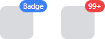
Badge and NumericBadge controls displayed as adorners to an element
Important
See the Getting Started topic for details on configuring themes for this control.
Content
The Content of Badge can be set to any value supported by ContentPresenter.
The following example demonstrates creating a Badge with the text "NEW!" as the content:
xmlns:actipro="http://schemas.actiprosoftware.com/avaloniaui"
...
<actipro:Badge>NEW!</actipro:Badge>
Alternatively, the ContentTemplate can also be used to define the content. The following example demonstrates defining one of the reusable glyph theme assets as the ContentTemplate.
xmlns:actipro="http://schemas.actiprosoftware.com/avaloniaui"
...
<actipro:Badge Padding="0" ContentTemplate="{actipro:GlyphTemplate SmallCheck16}" />
Showing and Hiding
The visibility of a Badge is primarily managed by the IsActive property instead of the IsVisible property. This is necessary to properly support animations when hiding the badge. The IsActive property defaults to true.
Warning
Explicitly setting IsVisible to false will prevent the badge from being displayed even when IsActive is true.
Animation
When shown (IsActive = true), the badge will animate into position using a "pop" animation. A similar but opposite animation is used when hiding (IsActive = false).
Animations are automatically enabled. To turn off animations, set the IsAnimationEnabled property to false.
NumericBadge
The NumericBadge control derives from the Badge and is purpose-built to automatically generate content based on the current value of the Count property.
The following example demonstrates how to define a NumericBadge:
xmlns:actipro="http://schemas.actiprosoftware.com/avaloniaui"
...
<actipro:NumericBadge Count="5" />
Important
The NumericBadge automatically manages the Content and IsActive properties, so any values explicitly assigned to either of these properties will be ignored.
Automatically Show and Hide
By default, the NumericBadge will be shown when the current Count property is greater than 0. Optionally, set the IsActiveWhenZero property to true and badge will also be shown when the count is 0. The badge will always be hidden when the count is negative.
Overflow
When the current value of the Count property exceeds the value of the OverflowCount property (which defaults to 99), the content will be displayed in an overflow format like "99+".
Use the OverflowStringFormat property to customize how overflowed counts are formatted. The default value is "{0}+", where {0} is the placeholder for the current value of OverflowCount.
Overflow behavior can be disabled by setting OverflowCount to 0.
Warning
When specifying a custom OverflowStringFormat value in XAML, prefix the actual value with {} to ensure the XAML parser doesn't interpret the open curly braces of the format string as a meaningful XAML delimiter.
The following example demonstrates how to define a NumericBadge that overlows at 9 and uses a custom string format of "{0}*":
xmlns:actipro="http://schemas.actiprosoftware.com/avaloniaui"
...
<actipro:NumericBadge Count="5" OverflowCount="9" OverflowStringFormat="{}{0}*" />
Using as an adornment
A common scenario for a badge is to be used as an adornment to another element. Examples include showing availability status on a user's avatar or a count of unread messages.
Adornments are managed using attached properties of the BadgeService class.
Defining
To define a badge as an adornment to an element, assign a Badge or NumericBadge to the BadgeService.Badge attached property.
The following example demonstrates adding a NumericBadge adornment to a button to indicate a count of unread notifications:
xmlns:actipro="http://schemas.actiprosoftware.com/avaloniaui"
...

<Button Content="Notifications">

	<!-- Set any Badge or NumericBadge as an adornment -->
	<actipro:BadgeService.Badge>
		<actipro:NumericBadge Count="5" />
	</actipro:BadgeService.Badge>

</Button>
Alignment
By default, a badge adornment is displayed with the center of the adornment over the center of the top-right edge of the adorned element. The following attached properties on BadgeService can be used to configure the alignment:
| Attached Property | Description |
|---|---|
| HorizontalAlignment | Set to one of the AdornmentHorizontalAlignment values to alter the horizontal alignment. (Default = CenterOnTargetRightEdge ) |
| HorizontalOffset | An explicit offset to be applied after alignment. Positive values shift to the right while negative values shift to the left. |
| VerticalAlignment | Set to one of the AdornmentVerticalAlignment values to alter the vertical alignment. (Default = CenterOnTargetTopEdge ) |
| VerticalOffset | An explicit offset to be applied after alignment. Positive values shift down while negative values shift up. |
Important
When used as an adornment, a badge does not affect layout. When setting the location of the adornment, make sure there is enough room to fully display the badge when it is active.
The following example demonstrates aligning the adornment inside the bottom right corner with an additional horizontal and vertical offset to allow space between the adornment and the adorned element's edge:
xmlns:actipro="http://schemas.actiprosoftware.com/avaloniaui"
...

<Button ...
	actipro:BadgeService.HorizontalAlignment="InsideOfTargetRightEdge"
	actipro:BadgeService.VerticalAlignment="InsideOfTargetBottomEdge"
	actipro:BadgeService.HorizontalOffset="-4"
	actipro:BadgeService.VerticalOffset="-4"
	>

	<actipro:BadgeService.Badge>
		<actipro:Badge Content="Custom Alignment" />
	</actipro:BadgeService.Badge>

</Button>
Notes on Avalonia Adorner Issues
Warning
The Avalonia adorner system may not properly clip adornments when the adornment is outside the bounds of the adorned element.
The Avalonia adorner system may not properly clip adornments based on the clip regions of ancestors of the adorned element. A symptom of this issue can sometimes be seen when a badge adornment is used on an adorned element, that adorned element is scrolled out of view within a ScrollViewer, and the badge adornment remains visible.
We believe that current releases of Avalonia (starting with v11.3) have resolved this issue in most scenarios. If this scenario is still encountered, one workaround is to position the adornment within the bounds of the adorned element so clipping can be enabled. Another option is to not use BadgeService, thereby avoiding use of the Avalonia adorner system. Place the adorned element and the badge element in a Panel instead and apply the HorizontalAlignment, VerticalAlignment, and RenderTransform properties on the badge to position it.
<Panel>
	<actipro:Avatar Width="64" CornerRadius="10" Description="User Name" />
	<actipro:Badge Classes="accent" Kind="Dot" DotLength="20"
		HorizontalAlignment="Right" VerticalAlignment="Bottom" RenderTransform="translate(5px, 5px)" />
</Panel>
Badge Kind
A badge can either display its content or, alternatively, always display as a "dot" without content.
The Dot kind is useful for smaller elements that do not have enough room to adequately display badge content. It can also be useful if the mere existence of the badge is all that is needed, and content is not necessary.
The following values can be assigned to the Kind property:
| Value | Description |
|---|---|
| Default | If the Content and ContentTemplate properties are null, the Dot kind will be used; otherwise, the Content kind will be used. |
| Content | The badge will attempt to display content and may not render ideally if content is undefined. |
| Dot | The badge will always display as a dot even if content is defined. |
In the following example, both badges will appear as a "dot":
xmlns:actipro="http://schemas.actiprosoftware.com/avaloniaui"
...

<!-- No content, so 'Default' kind will effectively display as a 'Dot' -->
<actipro:Badge />

<!-- Explicit 'Dot' kind even though content is available -->
<actipro:Badge Kind="Dot" Content="Ignored" />
Padding
By default, the Padding is uniformly set to 0 unless the badge is displaying String-based content.
For String-based content, the default control template will set the padding based on the BadgeStringContentPadding theme resource. This theme resource is dynamically updated based on the current User Interface Density. See the Theme Generator topic for more details on customizing theme resources.
Themes and Semantic Color Variants
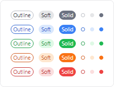
Badge controls in the outline, soft, and solid themes showing neutral and semantic color variants
The badge controls support the accent, success, warning, and danger style class names for semantic variants.
The following control themes are also supported:
- BadgeBase - Base control theme used by several others.
- BadgeOutline (
theme-outline) - Has an outline appearance. - BadgeSoft (
theme-soft) - Has a soft fill appearance. - BadgeSolid (
theme-solid) - Has a solid appearance.
The following example demonstrates how to define a badge using the outline theme and danger variant:
xmlns:actipro="http://schemas.actiprosoftware.com/avaloniaui"
...
<actipro:Badge Classes="theme-outline danger" />
Accessibility
The Badge and NumericBadge controls are non-interactive decorations and, as such, intentionally do not appear in the default user interface automation (UIA) views used by most screen readers or automation tools.
For any information displayed in a badge, developers should consider adding equivalent information to the associated element using one or more of the attached properties on the AutomationProperties class; e.g., AutomationProperties.ItemStatus.
Pseudo-classes
The following pseudo-classes are available and can be used when styling the control:
| Class | Description |
|---|---|
:content-string |
Added when the badge Content is a String. |
:dot |
Added when the badge is effectively displayed as a "dot". |
:hide |
Added when the badge becomes inactive and can be used to trigger a hide animation. |
:show |
Added when the badge becomes active and can be used to trigger a show animation. |
Theme Resources
The following theme resources are available for customizing the appearance of the control:
| Theme Resource | Description |
|---|---|
| BadgeBorderThickness | The default BorderThickness. |
| BadgeCornerRadius | The default CornerRadius. |
| BadgeDotLength | The default DotLength for when the badge is displayed as a "dot". |
| BadgeStringContentPadding | The default Padding applied to String-based content. |
See the Theme Assets topic for more details on working with theme resources.