DynamicImage
The DynamicImage control is a drop-in replacement for Image that is the primary UI mechanism for interfacing with ImageProvider and its features, supporting:
- Chromatic adaptation (color shifting) for images, which allows images designed for light themes to be automatically adjusted for use in dark themes.
- Conversion of a monochrome vector image to render in the current foreground color.
- Automatic conversion of an image to grayscale with optional transparency when the control is disabled.
- Conversion of monochrome images to use the current foreground color.
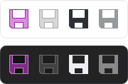
A single raster image that is altered to show normal, disabled, monochrome, and monochrome disabled states in both light and dark themes
Relationship with ImageProvider
The DynamicImage control makes heavy use of ImageProvider and its functionality to adapt vector and raster images for use in various scenarios. All image adaptations (grayscale, monochrome, and chromatic) are performed by an ImageProvider. Most scenarios will utilize a shared default instance of ImageProvider, but individual IImage sources can also be configured to use a specific provider.
Important
Please see the Image Provider topic for more detail on how image providers work and how DynamicImage ties into image provider features.
Disabled State
Set the IsEnabled property to false and the image content will be rendered in grayscale.
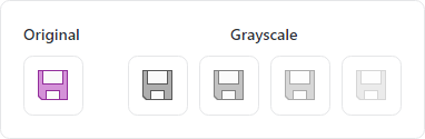
A single image that is altered to appear as grayscale with varying degrees of opacity
To further emphasize the disabled state, use the DisabledOpacity property to blend the image content into the background. The default value is 1.0, meaning the opacity is not changed when disabled.
Note
The DisabledOpacity is relative to the control's Opacity. So if the DisabledOpacity is set to 0.5 and the control's Opacity is 0.8 then the effective opacity when disabled will be 0.4.
Monochrome Adaptation
Image content can be rendered in monochrome by setting the UseMonochrome property to true.
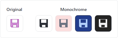
A single image that is altered to appear as monochrome based on a foreground color
When true, the resulting monochrome image will be in the control's current Foreground color, which is an IBrush inherited from ancestor controls.
Chromatic Adaptation
Chromatic adaptation allows images designed for light themes to be automatically adjusted (color shifted) for use with different background colors, especially dark backgrounds.
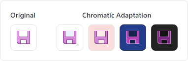
A single image that is altered to adapt to the current background color
Important
To support chromatic adaption, the associated ImageProvider must have its corresponding ChromaticAdaptationMode property set to Always or DarkThemes.
The current theme's default background color is used for chromatic adaptation. When using ImageChromaticAdaptationMode.Always, the DynamicImage.BackgroundHint property can be optionally set to an IBrush that defines a background color to use instead of the current theme's default background color.
Examples
The following examples demonstrate how to define a DynamicImage that will utilize the default ImageProvider:
xmlns:actipro="http://schemas.actiprosoftware.com/avaloniaui"
...

<!-- Standard image -->
<actipro:DynamicImage Width="32" Height="32" Source="/Images/Icons/Save32.png" />

<!-- Disabled image with 50% opacity -->
<actipro:DynamicImage Width="32" Height="32" Source="/Images/Icons/Save32.png" IsEnabled="False" DisabledOpacity="0.5" />

<!-- Monochrome image -->
<actipro:DynamicImage Width="32" Height="32" Source="/Images/Icons/Save32.png" UseMonochrome="True" />
Please see the Image Provider topic for more examples.