Image Provider
The ImageProvider class has logic to manipulate images for various scenarios. Features include:
- Chromatic adaptation (color shifting) for images, which allows images designed for light themes to be automatically adjusted for use in dark themes.
- Converting a monochrome vector image to render in the current foreground color.
- Conversion of images to grayscale.
- Conversion of images to monochrome, in a specified color.
While all the image adaptation logic is contained within the ImageProvider class and can be called programmatically, the DynamicImage control is generally used within the user interface to access the image provider's functionality.
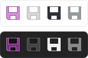
A single raster image that is altered to show normal, disabled, monochrome, and monochrome disabled states in both light and dark themes
Important
ImageProvider can only adapt image types for which it has logic to handle. The supported image types are DrawingImage and Bitmap. Other non-Avalonia native image types are not currently supported, other than SVG images from the Svg.Controls.Skia.Avalonia NuGet package through a special SvgImageProvider class that is described below in this topic.
Usage Scenarios for ImageProvider
Common scenarios for using an image provider (and generally DynamicImage controls) are:
- Your application designed images for a light theme, and you want them adapted to look good in a dark theme.
- You have monochrome vector icons and want to render them in the current foreground color instead of their designed color.
- You want images adapted to grayscale.
- You want images adapted to monochrome.
DynamicImage and ImageProvider
The DynamicImage control calls into the ImageProvider.GetImageSource method to adapt the IImage set to its Source property.
It watches for theme changes and updates the image adaptation appropriately.
Note
The native Image control from which DynamicImage inherits does not include any functionality to interact with ImageProvider.
Assigning a Non-Default ImageProvider to an Image
An ImageProvider instance is created and assigned to the static ImageProvider.Default property by default.
When the DynamicImage control needs to adapt an image, it examines the IImage set to its Source property. When the source is an instance of an AvaloniaObject (like DrawingImage), it checks to see if a value is returned for the ImageProvider.Provider attached property. If no specific ImageProvider instance was set via that attached property on the image, then the static instance defined by ImageProvider.Default will be used for adaptation.
The following example shows how a non-default ImageProvider instance available as a static resource could be applied be applied to a DrawingImage. The DrawingImage will then use that non-default image provider for its adaptation logic instead of the one available via ImageProvider.Default.
xmlns:actipro="http://schemas.actiprosoftware.com/avaloniaui"
...
<UserControl.Resources>
	<!-- ImageProvider with dark theme chromatic adaptation -->
	<actipro:ImageProvider x:Key="DarkThemeImageProvider" ChromaticAdaptationMode="DarkThemes" />
</UserControl.Resources>
...

<!-- Vector image -->
<actipro:DynamicImage Width="32" Height="32">
	<DrawingImage actipro:ImageProvider.Provider="{StaticResource DarkThemeImageProvider}">
		<DrawingGroup>
			<GeometryDrawing Geometry="M 2 0 L 30 0 L 30 30 L 2 30 Z" Brush="Black" />
		</DrawingGroup>
	</DrawingImage>
</actipro:DynamicImage>

<!-- Raster image  -->
<actipro:DynamicImage Width="32" Height="32">
	<DrawingImage actipro:ImageProvider.Provider="{StaticResource DarkThemeImageProvider}">
		<ImageDrawing ImageSource="/Images/Icons/Save32.png" Rect="0,0,32,32" />
	</DrawingImage>
</actipro:DynamicImage>
Important
See the "Working with Raster Images" section below for more detail on why a DrawingImage is used with attached properties in the example instead of a Bitmap object.
In summary, if you want all the DynamicImage control instances in your application to use the same image provider configuration, simply set that configuration on the ImageProvider.Default instance. If, instead, you want some images to have an alternate configuration, define another ImageProvider instance and set that on each applicable DrawingImage via the ImageProvider.Provider attached property.
Chromatic Adaptation
Chromatic adaptation is the process of converting colors in an image so that they render well on a specific background color. This is especially useful when your application has images designed for a light theme, and you wish for your application to support a dark theme. An image provider can automatically convert them for you so that you don't have to design dark themed variations.
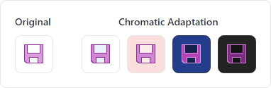
A single image that is altered to adapt to the current background color
Important
The standard configuration of the ImageProvider.Default instance is not configured for chromatic adaptation by default, but can be enabled as shown below.
Tip
For best results, the source images should be designed for a light theme and use a minimal number of colors (i.e., avoid gradients).
Dark Themes
The most common scenario for chromatic adaptation is to support dark themes. The following example shows the configuration for the default ImageProvider to support adaptation of all images when in a dark theme.
using ActiproSoftware.UI.Avalonia.Media;
...
// Set this configuration during application startup before UI elements are loaded
ImageProvider.Default.ChromaticAdaptationMode = ImageChromaticAdaptationMode.DarkThemes;
xmlns:actipro="http://schemas.actiprosoftware.com/avaloniaui"
...
<actipro:DynamicImage Width="32" Height="32" Source="/Images/Save32.png" />
All Themes
Chromatic adaptation can also be applied in all themes (i.e., light or dark). The following example shows the configuration for the default ImageProvider to support adaptation of all images, regardless of theme.
using ActiproSoftware.UI.Avalonia.Media;
...
// Set this configuration during application startup before UI elements are loaded
ImageProvider.Default.ChromaticAdaptationMode = ImageChromaticAdaptationMode.Always;
xmlns:actipro="http://schemas.actiprosoftware.com/avaloniaui"
...
<actipro:DynamicImage Width="32" Height="32" Source="/Images/Save32.png" />
While the ImageChromaticAdaptationMode.Always mode is supported, it's generally enough to use the DarkThemes mode instead. DarkThemes mode doesn't perform any adaptation processing when in light themes.
Tip
The current theme's default background color will be used for adaptation. When using Always mode, the DynamicImage.BackgroundHint property can be set to an IBrush that defines an alternate color to use for adaptation.
Predefined Monochrome Vector Image Adaptation
Vector images designed in a single color (monochrome) can be adapted to render using the DynamicImage control's current foreground color. This feature is extremely useful when vector images need to be used on a variety of controls, each with different foregrounds and backgrounds.
The following example shows the configuration for an ImageProvider to support adaptation of vector images designed with a single color (in this case black) so that they dynamically update to match the current foreground color instead of always being black.
using ActiproSoftware.UI.Avalonia.Media;
...
// Set this configuration during application startup before UI elements are loaded
ImageProvider.Default.DesignForegroundColor = Colors.Black;
xmlns:actipro="http://schemas.actiprosoftware.com/avaloniaui"
...
<actipro:DynamicImage Width="32" Height="32" Source="{StaticResource MonochromeCheckVectorDrawing}" />
Grayscale Adaptation
Images are often converted to grayscale when their containing controls are disabled.
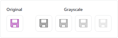
A single image that is altered to appear as grayscale with varying degrees of opacity
The following example shows a DynamicImage containing an image that will render in semi-transparent grayscale when disabled.
xmlns:actipro="http://schemas.actiprosoftware.com/avaloniaui"
...
<actipro:DynamicImage Width="32" Height="32" Source="/Images/Save32.png" IsEnabled="False" DisabledOpacity="0.5" />
Monochrome Adaptation
Images are often converted to monochrome when displayed on intense backgrounds, or when going for a flat appearance.
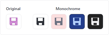
A single image that is altered to appear as monochrome based on a foreground color
The following example shows a DynamicImage containing a raster image that will render in monochrome. The monochrome color will match the color derived from the inherited foreground property.
xmlns:actipro="http://schemas.actiprosoftware.com/avaloniaui"
...
<actipro:DynamicImage Width="32" Height="32" Source="/Images/Save32.png" UseMonochrome="True" />
The following example shows a DynamicImage containing a raster image that will render in monochrome. The monochrome color will be red.
xmlns:actipro="http://schemas.actiprosoftware.com/avaloniaui"
...
<actipro:DynamicImage Width="32" Height="32" Source="/Images/Save32.png" UseMonochrome="True" Foreground="Red" />
Preventing Portions of an Image from Being Adapted
Sometimes a DrawingImage may include portions within it that should not be adapted.
A common scenario of this case is a fill color image, where the image shows a paint bucket and a swatch rectangle underneath it that contains the current foreground color. For this scenario, we only want the root portion of the image (the paint bucket) to be adapted and we do not want the swatch rectangle to be touched by adaptation logic in any way.
To prevent adaptation on a DrawingImage (or a Drawing within a DrawingImage), set the attached ImageProvider.CanAdapt property to false on that object. It will be skipped during the image adaptation process.
The following example shows how the attached ImageProvider.CanAdapt property can be used to prevent an entire image from being adapted.
xmlns:actipro="http://schemas.actiprosoftware.com/avaloniaui"
...
<actipro:DynamicImage Width="32" Height="32">
	<DrawingImage actipro:ImageProvider.CanAdapt="False">
		<ImageDrawing ImageSource="/Images/Icons/Save32.png" Rect="0,0,32,32" />
	</DrawingImage>
</actipro:DynamicImage>
Working with Raster Images (Bitmap)
A Bitmap object for raster images does not derive from AvaloniaObject, so that means it does not support attached properties like ImageProvider.Provider or ImageProvider.CanAdapt. When these attached properties need to be set for a raster image, use an ImageDrawing within a DrawingImage instead of a Bitmap, as shown below:
xmlns:actipro="http://schemas.actiprosoftware.com/avaloniaui"
...
<actipro:DynamicImage Width="32" Height="32">
	<DrawingImage actipro:ImageProvider.Provider="{StaticResource DarkThemeImageProvider}">
		<ImageDrawing ImageSource="/Images/Icons/Save32.png" Rect="0,0,32,32" />
	</DrawingImage>
</actipro:DynamicImage>
This is only necessary if attached properties must be used to configure adaptation. Otherwise, a Bitmap may be used as an image source.
Warning
Raster images must be encoded using PixelFormats.Bgra8888 or PixelFormats.Rgba8888 to support adaptation. Any other pixel formats will result in the original image being used without adaptation.
Working with SVG Vector Images
SVG images are not natively supported in Avalonia but can be used in Avalonia via a third-party "Svg.Controls.Skia.Avalonia" NuGet package. Since SVG images are external to Avalonia itself, the default implementation of ImageProvider does not support their adaptation.
A special SvgImageProvider class that inherits ImageProvider and implements adaptation of SVG images from that NuGet package is available. This class is open source and included in the sample project's "Shared Library / Dynamic Image (SVG)" sample. Its source can be copied to your own application and used to adapt SVG images.
This code shows how to configure the default image provider to support SVG files.
using ActiproSoftware.UI.Avalonia.Media;
...
ImageProvider.Default = new SvgImageProvider();  // See sample for full class source
The following code to set Skia options should be set in app build logic to work around an issue where SVGs may not apply opacity correctly.
public static AppBuilder BuildAvaloniaApp()
	=> AppBuilder.Configure<App>()
		// Required to work around a Skia issue for SVG opacity rendering
		.With(new SkiaOptions { UseOpacitySaveLayer = true })
		...
An alternative to that app-wide setting is to selectively set the RenderOptions.RequiresFullOpacityHandling attached property to true at the root of a hierarchy that will contain the SVG images. The control the attached property is set on must be an ancestor visual of the control that displays the SVG.