Native Control Themes
Control themes are included for all native Avalonia controls that share the same design aesthetic as Actipro's own controls, allowing all controls to seamlessly mix within an application. The native control themes are enabled by default, and many support a variety of design options, along with semantic color variants.
Native Controls
Nearly all native Avalonia controls have control themes in the ActiproSoftware.Controls.Avalonia NuGet package. The only exceptions are the native ColorPicker and DataGrid controls since they are shipped by the Avalonia team in separate optional NuGet packages of their own.
Configuring
As described in the Getting Started topic, when adding a ModernTheme instance to the Application.Styles collection, native control themes will be enabled by default. They can be disabled by setting the AreNativeControlThemesEnabled property to false.
This example of adding ModernTheme to the Application.Styles collection automatically enables native control themes.
<Application ... xmlns:actipro="http://schemas.actiprosoftware.com/avaloniaui">
	<Application.Styles>

		<actipro:ModernTheme />

	</Application.Styles>
</Application>
Several theme definition options allow for selection of which control theme to use by default. The following example shows how to tell the theme to render tabs using a Subtle appearance instead of Outline.
<Application ...
	xmlns:actipro="http://schemas.actiprosoftware.com/avaloniaui"
	xmlns:generation="using:ActiproSoftware.UI.Avalonia.Themes.Generation">
	<Application.Styles>

		<actipro:ModernTheme>
			<actipro:ModernTheme.Definition>
				<generator:ThemeDefinition TabAppearanceKind="Subtle" />
			</actipro:ModernTheme.Definition>
		</actipro:ModernTheme>

	</Application.Styles>
</Application>
Color Variants

Most native controls support multiple semantic color variants. Use one of the following style class names to alter the semantic color variant of supported controls:
accent- Uses the theme's accent color ramp, which defaults to blue.success- Uses the theme's success color ramp, which defaults to green.warning- Uses the theme's warning color ramp, which defaults to orange.danger- Uses the theme's danger color ramp, which defaults to red.
Control Theme Kinds
The ControlThemeKind enumeration has a value for all controls supported by Actipro's themes, including many native control themes.
Tip
See the Theme Assets topic for information on how to reference and use specific control themes, which is important when a control should have a non-default theme (e.g., a Solid button instead of an Outline button in a certain scenario), or when making a custom control theme that should be based on one of the Actipro control themes.
The lists below show the various control theme kind options for each type, and in parentheses indicate any style class names that can be specified to trigger the control theme.
This example shows how to render a solid accented button:
<Button Classes="theme-solid accent" Content="Accented Solid Button" />
Button Controls
Most button control themes support the accent, success, warning, and danger style class names for semantic color variants.

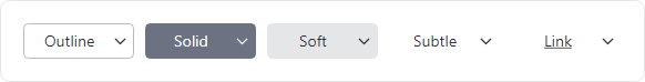
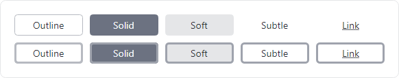
Button, DropDownButton, and SplitButton controls in the outline, solid, and soft themes showing semantic color variants
Button Type

Button controls in the outline, solid, soft, subtle, and link control themes with neutral colors
- ButtonBase - Base control theme used by several others.
- ButtonInvisible (
theme-invisible) - Completely transparent but can be clicked. - ButtonLink (
theme-link) - Has a link-like appearance (unrelated toHyperlinkButtoncontrol). - ButtonOutline (
theme-outline) - Has an outline appearance. - ButtonSoft (
theme-soft) - Has a soft fill appearance. - ButtonSolid (
theme-solid) - Has a solid appearance. - ButtonSubtle (
theme-subtle) - Has a subtle fill appearance, only on pointer over.
DropDownButton Type
DropDownButton controls in the outline, solid, soft, subtle, and link control themes with neutral colors
- DropDownButtonBase - Base control theme used by several others.
- DropDownButtonLink (
theme-link) - Has a link-like appearance. - DropDownButtonOutline (
theme-outline) - Has an outline appearance. - DropDownButtonSoft (
theme-soft) - Has a soft fill appearance. - DropDownButtonSolid (
theme-solid) - Has a solid appearance. - DropDownButtonSubtle (
theme-subtle) - Has a subtle fill appearance, only on pointer over.
HyperlinkButton Type
HyperlinkButton is a special button with a link-like appearance that can show alternate colors if a link has already been visited and open a URI when clicked. Due to the specific nature of this control and the base need for two distinct colors (visited and un-visited), this button type does not support the control themes discussed in the "Button Type" section or semantic color variants.
If theme and semantic color variant capabilities are desired, an alternative to HyperlinkButton is to use a standard Button with the theme-link theme. This will achieve a similar appearance as HyperlinkButton, although without URI navigation or distinct color options for visited links.
RepeatButton Type
RepeatButton uses the same control themes as Button. See the "Button Type" section for details.
SplitButton Type

SplitButton controls in the outline, solid, soft, subtle, and link control themes with neutral colors
- SplitButtonBase - Base control theme used by several others.
- SplitButtonLink (
theme-link) - Has a link-like appearance. - SplitButtonOutline (
theme-outline) - Has an outline appearance. - SplitButtonSoft (
theme-soft) - Has a soft fill appearance. - SplitButtonSolid (
theme-solid) - Has a solid appearance. - SplitButtonSubtle (
theme-subtle) - Has a subtle fill appearance, only on pointer over.
ToggleButton Type
ToggleButton controls in the outline, solid, soft, subtle, and link control themes with neutral colors with unchecked (top) and checked (bottom) states
- ToggleButtonLink (
theme-link) - Has a link-like appearance. - ToggleButtonOutline (
theme-outline) - Has an outline appearance. - ToggleButtonSoft (
theme-soft) - Has a soft fill appearance. - ToggleButtonSolid (
theme-solid) - Has a solid appearance. - ToggleButtonSubtle (
theme-subtle) - Has a subtle fill appearance, only on pointer over.
Calendar Controls
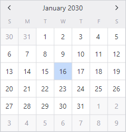
Calendar control in the default theme
The following default control themes are defined for their respective control types:
Edit Controls
All primary edit control themes support the accent, success, warning, and danger style class names for color variants.
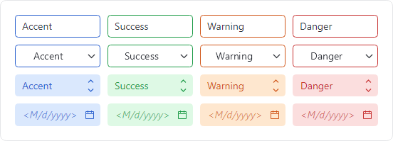
TextBox, ComboBox, ButtonSpinner, and CalendarDatePicker controls in the outline and soft themes showing semantic color variants
AutoCompleteBox Type

AutoCompleteBox controls in the outline and soft control themes with neutral colors
- AutoCompleteBoxBase - Base control theme used by several others.
- AutoCompleteBoxOutline (
theme-outline) - Has an outline appearance. - AutoCompleteBoxSoft (
theme-soft) - Has a soft fill appearance.
These style class names trigger special behaviors:
has-clear-buttonorclearButton- Renders a Clear button in the control when it is non-empty and has focus.
ButtonSpinner Type

ButtonSpinner controls in the outline and soft control themes with neutral colors
- ButtonSpinnerBase - Base control theme used by several others.
- ButtonSpinnerOutline (
theme-outline) - Has an outline appearance. - ButtonSpinnerSoft (
theme-soft) - Has a soft fill appearance.

ButtonSpinner controls with vertical and horizontal button orientations
Set the ThemeProperties.SpinnerHasHorizontalOrientation attached property on a ButtonSpinner to true to arrange spinner buttons horizontally instead of vertically. Horizontal arrangement is better for touch-friendly user interfaces since each button gets twice the amount of surface area. Theme Definitions also provide a global default value for this attached property that can be altered.
The following additional control theme is available for the Button used by the default control theme:
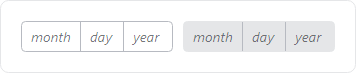
CalendarDatePicker Type

CalendarDatePicker controls in the outline and soft control themes with neutral colors
- CalendarDatePickerBase - Base control theme used by several others.
- CalendarDatePickerOutline (
theme-outline) - Has an outline appearance. - CalendarDatePickerSoft (
theme-soft) - Has a soft fill appearance.
The following additional control theme is available for the embedded Button:
- TextBoxCalendarButton - Control theme for the embedded Calendar button that opens the picker.
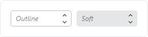
ComboBox Type

ComboBox controls in the outline and soft control themes with neutral colors
- ComboBoxBase - Base control theme used by several others.
- ComboBoxOutline (
theme-outline) - Has an outline appearance. - ComboBoxSoft (
theme-soft) - Has a soft fill appearance.
ComboBoxItem Type
- ComboBoxItem - Default control theme.
DatePicker Type
DatePicker controls in the outline and soft control themes with neutral colors
- DatePickerBase - Base control theme used by several others.
- DatePickerOutline (
theme-outline) - Has an outline appearance. - DatePickerSoft (
theme-soft) - Has a soft fill appearance.
DatePickerPresenter Type
- DatePickerPresenter - Default control theme.
The following additional control theme is used by the default control theme:
- DateTimePickerScrollButton -
RepeatButtoncontrols used for scrolling date parts.
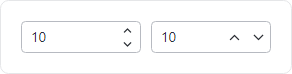
NumericUpDown Type
NumericUpDown controls in the outline and soft control themes with neutral colors
- NumericUpDownBase - Base control theme used by several others.
- NumericUpDownOutline (
theme-outline) - Has an outline appearance. - NumericUpDownSoft (
theme-soft) - Has a soft fill appearance.
NumericUpDown controls with vertical and horizontal button orientations
Set the ThemeProperties.SpinnerHasHorizontalOrientation attached property on a NumericUpDown to true to arrange spinner buttons horizontally instead of vertically. Horizontal arrangement is better for touch-friendly user interfaces since each button gets twice the amount of surface area. Theme Definitions also provide a global default value for this attached property that can be altered.
TextBox Type

TextBox controls in the outline and soft control themes with neutral colors
- TextBoxBase - Base control theme used by several others.
- TextBoxOutline (
theme-outline) - Has an outline appearance. - TextBoxSoft (
theme-soft) - Has a soft fill appearance. - TextBoxEmbeddedOutline - For a
TextBoxembedded in a control that has an outline appearance. - TextBoxEmbeddedSoft - For a
TextBoxembedded in a control that has a soft fill appearance.
These style class names trigger special behaviors:
has-clear-buttonorclearButton- Renders a Clear button in the control when it is non-empty and has focus.has-reveal-password-buttonorrevealPasswordButton- Renders a Reveal Password button in the control when it is non-empty and is configured for passwords.
The following additional control themes are used by the TextBox control themes:
- TextBoxButtonBase - Base control theme for
Buttoncontrols embedded in aTextBox. - TextBoxCalendarButton - Control theme for the Calendar button.
- TextBoxClearButton - Control theme for the Clear button.
- TextBoxRevealPasswordToggleButton - Control theme for the Reveal Password button.
TimePicker Type
- TimePickerBase - Base control theme used by several others.
- TimePickerOutline (
theme-outline) - Has an outline appearance. - TimePickerSoft (
theme-soft) - Has a soft fill appearance.
TimePickerPresenter Type

TimePicker controls in the outline and soft control themes with neutral colors
- TimePickerPresenter - Default control theme.
The following additional control theme is used by the default control theme:
- DateTimePickerScrollButton -
RepeatButtoncontrols used for scrolling time parts.
List Controls
ItemsControl Type
- ItemsControl - Default control theme.
- ItemsControlScrollable - Uses an inline (
theme-scroll-inline) or overlay (theme-scroll-overlay)ScrollViewer.
ListBox Type
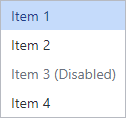
ListBox control in the default theme
- ListBox - Default control theme.
ListBoxItem Type
- ListBoxItem - Default control theme.
TreeView Type
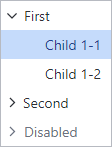
TreeView control in the default theme
- TreeView - Default control theme.
TreeViewItem Type
- TreeViewItem - Default control theme.
The following additional control theme is used by the default control theme:
- TreeViewItemToggleButton - Control theme for the
ToggleButtonthat expands/collapses aTreeViewItem.
Menu Controls
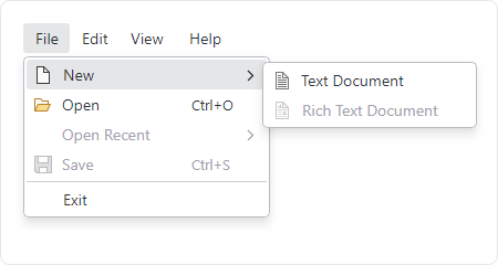
Menu control in the default theme with sub menus open
ContextMenu Type
- ContextMenu - Default control theme.
Menu Type
- Menu - Default control theme.
MenuFlyoutPresenter Type
- MenuFlyoutPresenter - Default control theme.
- MenuFlyoutPresenterHorizontal - Control theme used for horizontal flyout menus.
MenuItem Type
- MenuItem - Default control theme.
- MenuItemHeading (
theme-menuitem-heading) - Bold heading that is a disabled menu item. - MenuItemTopLevel - A menu item directly within a menu bar.
- MenuItemHorizontal - A menu item used within a horizontal flyout menu.
Separator Type
- Separator - Default control theme.
Other Menu Control Themes
The following additional control themes are used by the menu control themes:
- MenuScrollViewer - Used by
ScrollViewerof scrollable menus. - MenuScrollViewerLineButton - Used by
RepeatButtonto scroll up/down inMenuScrollViewercontrol theme.
Scroll Controls
Scrollbars can optionally toggle the visibility of line buttons. See the Scrolling topic for more details.
ScrollBar Type
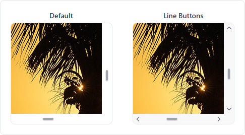
ScrollBar controls in the default and line buttons control themes
- ScrollBar - Default control theme.
The following additional control themes are used by the default control theme:
- ScrollBarLineButton - The control theme for the
RepeatButtoninstances on the scrollbar that increase/decrease the scroll position by small values. - ScrollBarPageButton - The control theme for the invisible
RepeatButtoninstances on the scrollbar track that increase/decrease the scroll position by large values. - ScrollBarThumb - The control theme for the
Thumbcontrol when not using line buttons. - ScrollBarThumbBetweenButtons - The control theme for the
Thumbcontrol when using line buttons.
ScrollViewer Type

ScrollViewer controls in the default and overlay control themes
- ScrollViewerBase - Base control theme used by several others.
- ScrollViewer - The scrollbars do not overlay the content.
- ScrollViewerOverlay (
theme-scroll-overlay) - The scrollbars overlay the content.
Switch Controls
All switch control themes support the accent, success, warning, and danger style class names for semantic color variants.

CheckBox, RadioButton, ToggleSwitch, and Slider controls in the outline and solid themes showing semantic color variants
The CheckBox, RadioButton, and ToggleSwitch control type themes automatically adjust their size to match the control's font size. For example, a CheckBox at a 24pt font size will render a larger check UI element than one with a 12pt font size. The relative size of those controls can be explicitly set using one of following style class names:
size-xs- Sizes the control consistent with an extra-small font size.size-sm- Sizes the control consistent with a small font size.size-md- Sizes the control consistent with a normal font size.size-lg- Sizes the control consistent with a large font size.size-xl- Sizes the control consistent with an extra-large font size.
CheckBox Type
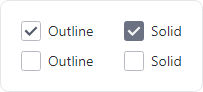
CheckBox controls in the outline and solid control themes with neutral colors in checked and unchecked states
- CheckBoxBase - Base control theme used by several others.
- CheckBoxOutline (
theme-outline) - Has an outline appearance. - CheckBoxSolid (
theme-solid) - Has a solid appearance. - CheckBoxMenuIndicator - (Deprecated) Used within
MenuItem.Iconto indicate checked state. This theme is no longer necessary sinceMenuItemadded built-in support for toggle indicators.
RadioButton Type

RadioButton controls in the outline and solid control themes with neutral colors in checked and unchecked states
- RadioButtonBase - Base control theme used by several others.
- RadioButtonOutline (
theme-outline) - Has an outline appearance. - RadioButtonSolid (
theme-solid) - Has a solid appearance. - RadioButtonMenuIndicator - (Deprecated) Used within
MenuItem.Iconto indicate checked state. This theme is no longer necessary sinceMenuItemadded built-in support for toggle indicators.
Slider Type

Slider controls in the outline and solid control themes with neutral colors
- SliderBase - Base control theme used by several others.
- SliderOutline (
theme-outline) - Has an outline appearance. - SliderSolid (
theme-solid) - Has a solid appearance.
The following additional control themes are used by the Slider control themes:
- SliderThumb - The control theme for the
Thumbcontrol. - SliderTrackButton - The control theme for the
RepeatButtoninstances on the track that change the value.
ToggleSwitch Type
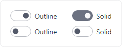
ToggleSwitch controls in the outline and solid control themes with neutral colors in on and off states
- ToggleSwitchBase - Base control theme used by several others.
- ToggleSwitchOutline (
theme-outline) - Has an outline appearance. - ToggleSwitchSolid (
theme-solid) - Has a solid appearance.
Set the ThemeProperties.ToggleSwitchHasFarAffinityProperty attached property on a ToggleSwitch to true to arrange the knob/track on the right side of the control instead of the left side (assuming left-to-right culture). See the Theme Definitions topic for details on how to change the global default.
Tab Controls
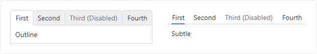
TabControl controls in the outline and subtle control themes (TabStrip has the same appearance)
Tab controls do not support semantic color variants.
TabControl Type
- TabControlBase - Base control theme used by several others.
- TabControlOutline (
theme-outline) - Has an outline appearance. - TabControlSubtle (
theme-subtle) - Has a subtle appearance with accent underline for selection.
TabItem Type
- TabItemOutline (
theme-outline) - Has an outline appearance. - TabItemSubtle (
theme-subtle) - Has a subtle appearance with accent underline for selection.
TabStrip Type
- TabStripBase - Base control theme used by several others.
- TabStripOutline (
theme-outline) - Has an outline appearance. - TabStripSubtle (
theme-subtle) - Has a subtle appearance with accent underline for selection.
TabStripItem Type
- TabStripItemOutline (
theme-outline) - Has an outline appearance. - TabStripItemSubtle (
theme-subtle) - Has a subtle appearance with accent underline for selection.
Typography Controls
All typography control themes support the accent, success, warning, and danger style class names for semantic color variants.

TextBlock controls in the default, heading, body, and code themes showing semantic color variants
Each typography control type defines "body", "code", and "heading" control themes. The relative font size of these control themes can be explicitly set using one of following style class names:
size-xs- An extra-small font size.size-sm- A small font size.size-md- A normal font size.size-lg- A large font size.size-xl- An extra-large font size.
Label Type
- LabelBase - Base control theme used by several others.
- Label - Default control theme.
- LabelBody (
theme-text-body) - Uses a font family and size for body text. - LabelCode (
theme-text-code) - Uses a font family and size for code text. - LabelHeading (
theme-text-heading) - Uses a font family and size for heading text. - LabelFormControlLabel (
theme-form-control-label) - Formatted as the label for a form control. - LabelFormControlMessage (
theme-form-control-message) - Formatted as the message for a form control (typically shown below the control).
SelectableTextBlock Type
- SelectableTextBlockBase - Base control theme used by several others.
- SelectableTextBlock - Default control theme.
- SelectableTextBlockBody (
theme-text-body) - Uses a font family and size for body text. - SelectableTextBlockCode (
theme-text-code) - Uses a font family and size for code text. - SelectableTextBlockHeading (
theme-text-heading) - Uses a font family and size for heading text. - SelectableTextBlockFormControlLabel (
theme-form-control-label) - Formatted as the label for a form control. - SelectableTextBlockFormControlMessage (
theme-form-control-message) - Formatted as the message for a form control (typically shown below the control).
TextBlock Type
- TextBlock - Default control theme.
- TextBlockBody (
theme-text-body) - Uses a font family and size for body text. - TextBlockCode (
theme-text-code) - Uses a font family and size for code text. - TextBlockHeading (
theme-text-heading) - Uses a font family and size for heading text. - TextBlockFormControlLabel (
theme-form-control-label) - Formatted as the label for a form control. - TextBlockFormControlMessage (
theme-form-control-message) - Formatted as the message for a form control (typically shown below the control).
Other Controls
DataValidationErrors Type
- DataValidationErrors - Default control theme that shows errors below a control.
- ToolTipDataValidationErrors - Default control theme that shows errors in a tooltip.
Expander Type
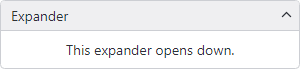
Expander control in the default theme expanded down
- Expander - Default control theme.
The following additional control themes are available for the ToggleButton used by the default control theme:
- ExpanderToggleButtonBase - Base control theme used by several others.
- ExpanderToggleButtonDown - Toggle button that opens down.
- ExpanderToggleButtonLeft - Toggle button that opens to the left.
- ExpanderToggleButtonRight - Toggle button that opens to the right.
- ExpanderToggleButtonUp - Toggle button that opens up.
NotificationCard Type
- NotificationCard - Default control theme with color variants based on the notification type.
Page-Based Navigation Types
- CarouselPage - Default control theme.
- CommandBar - Default control theme.
- CommandBarButton - Default control theme.
- CommandBarOverflowButton - Default control theme for the
Buttonused to open the overflow menu on aCommandBar. - CommandBarSeparator - Default control theme.
- CommandBarToggleButton - Default control theme.
- ContentPage - Default control theme.
- DrawerPage - Default control theme.
- NavigationPage - Default control theme.
- TabbedPage - Default control theme.
- TabbedPageTabControl - Default control theme for a
TabControlused within aTabbedPage. - TabbedPageTabItem - Default control theme for a
TabItemused within aTabbedPage.
ProgressBar Type
The default control theme supports the accent, success, warning, and danger style class names for semantic color variants.

ProgressBar controls in the default theme with neutral and semantic color variants
- ProgressBar - Default control theme.
Additional Types with Default Themes
The following default control themes are defined for their respective control types:
- AdornerLayer
- Carousel
- EmbeddableControlRoot
- EmbeddableCoFlyoutPresenterntrolRoot
- GridSplitter
- GroupBox
- HeaderedContentControl
- ManagedFileChooser
- OverlayPopupHost
- PathIcon
- PipsPager
- PopupRoot
- RefreshContainer
- RefreshVisualizer
- SplitView
- ThemeVariantScope
- ToolTip
- TransitioningContentControl
- Window
- WindowDrawnDecorations
- WindowNotificationManager
ColorPicker Control
The native ColorPicker control is shipped in its own NuGet package by the Avalonia team and is optional. When used in your application, a couple extra steps are required to support Actipro themes for the control.
Configuring
First, a reference to the ActiproSoftware.Controls.Avalonia.Themes.ColorPicker NuGet package must be added to your project.
Then as described in the Getting Started topic, the ModernTheme.Includes property must specify either the NativeColorPicker or All option, as in the following example.
<Application ... xmlns:actipro="http://schemas.actiprosoftware.com/avaloniaui">
	<Application.Styles>

		<actipro:ModernTheme Includes="NativeColorPicker, NativeDataGrid" />

	</Application.Styles>
</Application>
Related Controls
ColorPicker Type
The ColorPicker control theme supports the accent, success, warning, and danger style class names for semantic color variants.
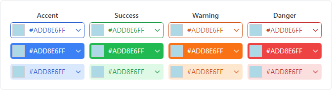
ColorPicker controls in the default theme and optional value display with outline, solid, and soft class styles and semantic color variants
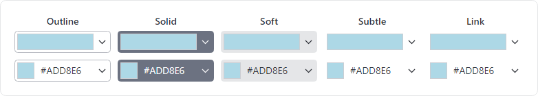
ColorPicker controls in the default theme (top) and optional value display (bottom) with outline, solid, soft, subtle, and link class styles and neutral colors
- ColorPicker - Default control theme. Use
theme-outline,theme-solid,theme-soft,theme-subtle, andtheme-linkstyle class names for a different appearance. Usehas-value-textstyle class name to display the current hex value.
ColorView Type

- ColorView - Default control theme.
Other Types
The following default control themes are defined for their respective control types and embedded within the ColorView default control theme:
DataGrid Control
DataGrid control in the default theme
The native DataGrid control is shipped in its own NuGet package by the Avalonia team and is optional. When used in your application, a couple extra steps are required to support Actipro themes for the control.
Configuring
First, a reference to the ActiproSoftware.Controls.Avalonia.Themes.DataGrid NuGet package must be added to your project.
Then as described in the Getting Started topic, the ModernTheme.Includes property must specify either the NativeDataGrid or All option, as in the following example.
<Application ... xmlns:actipro="http://schemas.actiprosoftware.com/avaloniaui">
	<Application.Styles>

		<actipro:ModernTheme Includes="NativeColorPicker, NativeDataGrid" />

	</Application.Styles>
</Application>
Related Controls
The following default control themes are defined for their respective control types: