Extensible Rendering
All the bar controls use an extensible rendering model that is based on our common object model. The object model centers around the use of a renderer class. The renderer measures and draws all of the elements within the control. This is a great design because it allows you to use our pre-defined renderers or create your own.
This object model allows for three levels of rendering customization. Choose which level of customization you wish to use:
- Use Built-In Renderers As-Is - Use the built-in rendering styles without any changes, which include several Metro, Visual Studio, and Office styles.
- Modify Properties on Built-In Renderers - Use the built-in renderers but modify the various properties on the renderers to easily create a customized appearance.
- Create Custom Renderers - Implement the IBarRenderer or IStatusBarRenderer interfaces or inherit our BarRenderer or StatusBarRenderer classes to do all the measuring and drawing of the controls and their elements yourself.
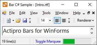
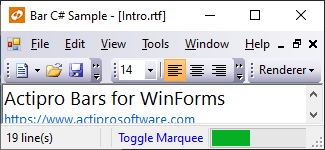
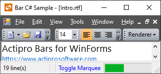
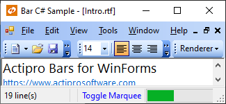
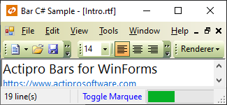
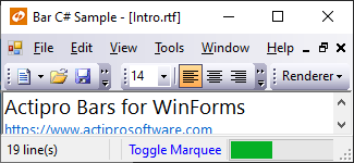
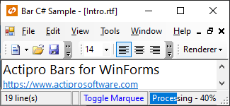
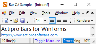
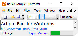
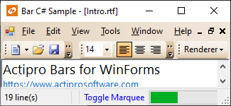
These are some sample rendering styles that come with BarManager and StatusBar:
Use Built-In Renderers As-Is
Bars includes these built-in renderers, which support Metro, Visual Studio, Office, and other classic styles:
| Renderer | Description |
|---|---|
| MetroBarRenderer | Capable of drawing Metro styles (Light and Dark) for bar controls. To change to a different style, change the BaseColorSchemeType. |
| MetroStatusBarRenderer | Capable of drawing Metro styles (Light and Dark) for statusbar controls. To change to a different style, change the BaseColorSchemeType. |
| OfficeClassicBarRenderer | Capable of drawing all Office classic styles (Blue, Silver, Black), Luna styles (Blue, Olive Green, Silver), and Windows Classic, as well as the Visual Studio classic style for bar controls. To change to a different style, change the BaseColorSchemeType. |
| OfficeClassicStatusBarRenderer | Capable of drawing all Office styles for statusbar controls. |
| VisualStudioBarRenderer | Capable of drawing Visual Studio bar controls. |
| VisualStudioClassicStatusBarRenderer | Capable of drawing Visual Studio classic statusbar controls. |
| WindowsClassicBarRenderer | Capable of drawing Windows classic bar controls. |
| WindowsClassicStatusBarRenderer | Capable of drawing Windows classic statusbar controls. |
Color Tinting Color Schemes
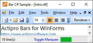
With one line of code, any WindowsColorScheme can be tinted so that all of the colors are altered. For instance, you can easily create a tan or red color scheme and then use those color schemes with the OfficeClassicBarRenderer class like this:
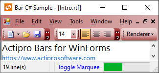
This code shows how to load a custom tan-tinted color scheme (displayed in the screenshot above) that is based on the built-in Luna blue theme:
var scheme = new WindowsColorScheme("Tan", WindowsColorSchemeType.LunaBlue, Color.Tan);
barManager.Renderer = new OfficeClassicBarRenderer(scheme);
Customizing Specific Colors in a Color Scheme
Each color property on the WindowsColorScheme class has a getter and setter. This means that after a base color scheme is selected for use, you may alter specific colors as needed.
This code shows how change the background of menus to be LightBlue for the built-in Windows Classic color scheme.
WindowsColorScheme.WindowsClassic.MenuBack = Color.LightBlue;
Important
Any renderers created before the color settings were changed may need to be refreshed for the color changes to take effect in the renderer.
Modify Properties on Built-In Renderers
Select a base built-in renderer to use by following the steps above. Then use the designer to change its properties. You can change fonts, colors, backgrounds, measuring parameters, etc. Our built-in renderers give you a lot of options that you can use to customize the look and feel of the controls.
Create Custom Renderers
For the most flexibility over what is measured and rendered, create a class that implements the IBarRenderer or IStatusBarRenderer interfaces. Alternatively, you can create a class that inherits our BarRenderer or StatusBarRenderer, or one of their descendants. The renderer interface has methods that measure and draw the controls and their elements.
After your custom renderer class has been created, assign it to the Renderer property of each BarManager, or the Renderer property of each StatusBar that should use it for drawing.
Customizing Individual Statusbar Panels
Renderer settings affect the rendering of all the controls that use the renderer. However, there are other properties on each StatusBarPanel that allow for customization of that particular instance. These are the properties that can be used to customize a specific panel:
| Member | Description |
|---|---|
| BackgroundFill Property | Gets or sets the page-specific BackgroundFill for the panel. |
| Border Property | Gets or sets the page-specific SimpleBorder for the panel. |