Checkbox
Checkboxes are controls that can be clicked, which then executes a command or raises an event.
Note
This topic extends the Control Basics topic with additional information specific to the control types described below. Please refer to the base topic for more generalized concepts that apply to all controls, including this one.
Control Implementations
There are separate checkbox concept control implementations based on the usage context.
Ribbon and Toolbar Contexts
Use the BarCheckBox control to implement a checkbox within a ribbon or toolbar context. This control class inherits BarToggleButton and all its features but renders the control with a more traditional checkbox appearance.
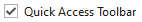
A BarCheckBox example
| Specification | Details |
|---|---|
| Base class | BarToggleButton, which indirectly inherits native Button. |
| Has key | Yes, via the Key property. |
| Has label | Yes, via the Label property. Auto-generated from the Key value if not specified. |
| Has image | No. |
| Has popup | No. |
| Is checkable | Yes. |
| Variant sizes | None. |
| Command support | Yes, via the Command property. |
| Key tip support | Yes, via the KeyTipText property. Auto-generated from the Label value if not specified. |
| Ribbon QAT support | Yes, via the CanCloneToRibbonQuickAccessToolBar property. |
| UI density support | None. |
| MVVM Library VM | BarCheckBoxViewModel class. |
xmlns:bars="http://schemas.actiprosoftware.com/winfx/xaml/bars"
...
<bars:StandaloneToolBar>
	<!-- Label is auto-generated from Key -->
	<bars:BarCheckBox
		Key="ShowWhitespace"
		Command="{Binding ShowWhitespaceCommand}"
		/>
	...
</bars:StandaloneToolBar>
Menu Contexts
Use the BarMenuItem control to implement a checkbox concept within a menu context.
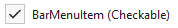
A checkable BarMenuItem example in checked state
| Specification | Details |
|---|---|
| Base class | Native MenuItem. |
| Has key | Yes, via the Key property. |
| Has label | Yes, via the Label property. Auto-generated from the Key value if not specified. |
| Has image | Yes, via the SmallImageSource and LargeImageSource properties. |
| Has popup | Not when a checkbox concept is desired. |
| Is checkable | Yes, when the IsCheckable property is set to true. |
| Variant sizes | None, but has a UseLargeSize property that triggers a large height and displays an extended Description. |
| Command support | Yes, via the Command property. |
| Key tip support | Yes, via the KeyTipText property. Auto-generated from the Label value if not specified. |
| Ribbon QAT support | Yes, via the CanCloneToRibbonQuickAccessToolBar property. |
| UI density support | None. |
| MVVM Library VM | BarCheckBoxViewModel class. |
xmlns:bars="http://schemas.actiprosoftware.com/winfx/xaml/bars"
...
<bars:BarContextMenu>
	<!-- Label is auto-generated from Key -->
	<bars:BarMenuItem
		Key="ShowWhitespace"
		IsCheckable="True"
		Command="{Binding UndoCommand}"
		/>
	...
</bars:BarContextMenu>
Appearance
There are several appearance-related properties that determine how the controls render.
Label
The controls have a string Label that can be set, which is visible in UI.
The Label can be auto-generated based on the control's Key property. For instance, a control with Key of "FormatPainter" will automatically assign "Format Painter" as the Label value. The auto-generated default can be overridden by setting the Label property.
The BarCheckBox.Label is rendered next to the actual checkable box within the control.
The BarMenuItem.Label is rendered on the menu item as its primary content.
Images
BarCheckBox instances do not display any images.
BarMenuItem instances can optionally define a SmallImageSource that appears in the menu's icon column. When UseLargeSize is set to create a large menu item, the LargeImageSource property is used instead. When the menu item is checked, a highlight box will appear around the image. If no image is specified, a standard check glyph will be used in place of the image.
Description (BarMenuItem only)
When UseLargeSize is set to create a large menu item, the Description property's string value is displayed under the menu item's bold label as an extended description.
Title
An optional string BarCheckBox.Title and BarMenuItem.Title can be specified, which are intended to override the control's Label when displayed in screen tips and customization UI.
Variant Sizes
BarCheckBox does not support variant sizes.
While BarMenuItem doesn't support variant sizes, it does have a UseLargeSize property that can be set to show a large version of the menu item. This large version uses a large image and can display an extended Description.
Checked State
The controls support a checked state.
Set the BarCheckBox.IsChecked or BarMenuItem.IsChecked property to true to render the control in a checked state.
Key Tips
The controls support key tips. When a control's key tip is accessed, a click is simulated.
The KeyTipText can be auto-generated based on the control's Label property. For instance, a control with Label of "Copy" will automatically assign "C" as the KeyTipText value. The auto-generated default can be overridden by setting the KeyTipText property.
The BarCheckBox.KeyTipText and BarMenuItem.KeyTipText properties designate the key tip text to use for the control.
See the Key Tips topic for more information on key tips.
Commands and Events
The ICommand in the BarCheckBox.Command and BarMenuItem.Command properties is executed when the control is clicked or a key tip accesses the control.
A BarCheckBox.Click and BarMenuItem.Click event is also raised in these scenarios.
See the Using Commands topic for more information on commands.
Input Gesture Text
The control can have input gesture text associated with it that describes a related keyboard shortcut, and is displayed in the screen tip for the control or in the menu item itself.
This input gesture text is automatically derived from commands that inherit RoutedCommand and have a KeyGesture set.
Or input gesture text can be specified in the BarCheckBox.InputGestureText and BarMenuItem.InputGestureText properties.
Input gesture text may be hidden altogether in UI by setting the BarCheckBox.IsInputGestureTextVisible and BarMenuItem.IsInputGestureTextVisible properties to false.
Screen Tips
The controls support screen tips, which are formatted tool tips.
The control's Title is used as the default screen tip header, falling back to Label if no Title is available. The BarCheckBox.ScreenTipHeader and BarMenuItem.ScreenTipHeader properties can override the default screen tip header value if desired.
If the control's ToolTip property is set to a value that doesn't derive from a native ToolTip control, such as a string, the value will be used in the screen tip's content area, with the screen tip header becoming bold. The screen tip's content area is where extended descriptions are displayed.
If the optional BarCheckBox.ScreenTipFooter and BarMenuItem.ScreenTipFooter properties are specified, they will appear in a footer area of the screen tip.
See the Screen Tips topic for more information on screen tips.
MVVM Support
The optional companion MVVM Library defines a BarCheckBoxViewModel class that is intended to be used as a view model for regular buttons.
This view model class maps over to the appropriate view controls described above based on usage context and configures all necessary bindings between the view model and the view control.
Tip
See the MVVM Support topic for more information on how to use the library's view models and view templates to create and manage your application's bars controls with MVVM techniques.