Key Tips
Ribbon supports key tips, which are small decorations that pop up over each control indicating a key or series of keys that may be typed to access each control via the keyboard.
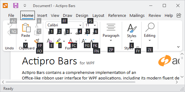
Key tips displayed for the Home tab
Key Tip Text
Key tip access text must be defined for each control that is used throughout the ribbon, generally via a KeyTipText property. By doing so, the end user doesn't require a mouse to access functionality. Key tips also allow for very fast execution of common commands via 2-3 keystrokes.
So, what is key tip text? It is generally a one- or two-character string that indicates text that can be typed to access the control when its parent key tip scope is active. For instance, on the Home tab in the screenshot above, the current key tip scope is the Home tab. It is currently displaying the key tips of all controls that are accessible via key tips. Note that the Paste item has a key tip access text of V and the Font Family combobox has a key tip access text of FF.
Important
Key tips are so important to accessibility that most controls will automatically generate a key tip from the corresponding Label property. See the Label and Key Tip Generation topic for more details on auto-generated key tips.
Navigating Key Tip Scopes
Pressing and releasing either the Alt or F10 keys will activate key tip mode. This initially places the key tip scope on the ribbon itself, allowing access to the application menu, quick access toolbar items, tabs, or tab row toolbar. Note that when not in key tip mode, you can also jump right to a tab's key tip scope by pressing Alt and its key tip access text. For instance, to jump directly to the Home tab's key tip scope, you can press Alt+H.
The default key tip text for the Application Button is "F", and activating this key tip will display either a Backstage or Application Button, depending on the configuration, and activate its key tip scope. When an application menu becomes the active key tip scope, you can access its menu items or its footer buttons. When a backstage becomes the active key tip scope, you can access its buttons and tab items.
When a Tab becomes the active key tip scope, you can access all of its child controls. Collapsed groups can be displayed by typing the group's key tip access text. By typing a group's dialog launcher key tip access text, you can access the groups dialog launcher.
Tip
The key tips of controls in collapsed groups are accessible even if not currently visible. This ensures that a control in a collapsed group can always be accessed with the same key tip sequence even if the window size has caused its containing group to collapse. This feature is only available in Classic layout mode.
When a control with a popup becomes the active key tip scope, you can access any of its items.
To return to any parent key tip scope, press the Esc key. Once back at the root ribbon key tip scope, press the Esc key to quit key tip mode.
Pressing any non-letter/digit key or clicking the mouse will also quit key tip mode.
General Implementation
All Bars controls have a KeyTipText property (such as BarButton.KeyTipText) that sets the key tip text for the control. So, for most controls, setting up key tip access for them is as simple as setting a value for that property.
Note
If a key tip is not unique within the current scope, sequential numbers will be automatically appended to the key tip to ensure a unique key sequence.
This code sample shows how to assign key tip text for a BarButton.
xmlns:bars="http://schemas.actiprosoftware.com/winfx/xaml/bars"
...
<bars:BarButton KeyTipText="V" Command="ApplicationCommands.Paste" />
KeyTipService
The KeyTipService provides numerous attached properties for working with key tips and manages key tip display and behavior. In fact, each control's local KeyTipText property is mapped to KeyTipService.KeyTipTextProperty.
It has these important properties:
| Member | Description |
|---|---|
| IsKeyTipBoundaryProperty Attached Property | Gets or sets whether the element to which it is applied is a key tip boundary. When an element is a key tip boundary, upon navigating to it, it will show key tips for all its children. Tabs are a good example of a control that is a key tip boundary. |
| IsRootKeyTipScopeProperty Attached Property | Gets or sets whether the element to which it is applied is a root key tip scope. When key tips are first activated, the root key tip scope determines the element whose children will have their key tips displayed. Typically the main toolbar control (e.g., a Ribbon) is configured as the root scope. If multiple elements on a window are configured as the root, the key tips of all root elements are combined and displayed together. |
| KeyTipOpeningEvent Routed Event | Gets the event that is raised when a key tip is opening. The KeyTipOpeningEventArgs data can be used to position key tips differently than the default location. |
| KeyTipTextProperty Attached Property | Gets or sets the key tip text for the element to which it is applied. All Bars controls that support key tips wrap this attached property with a KeyTipText property. |
Warning
The Bars KeyTipService class name is ambiguous with Microsoft Ribbon's Sytem.Windows.Controls.KeyTipService class and may require using a fully-qualified domain name to resolve the ambiguity. In XAML, you must use a namespace prefix as shown below:
xmlns:bars="http://schemas.actiprosoftware.com/winfx/xaml/bars"
...
<bars:StandaloneToolBar bars:KeyTipService.IsRootKeyTipScope="True" ... />
Key Tip Mode Shortcuts
By default, pressing an Alt or F10 key will toggle key tip mode on or off. Sometimes keys like F10 may be assigned as keyboard shortcuts for other features in an application. In this case, it is useful to be able to prevent the key tip service from watching for F10.
The KeyTipService.AllowedKeyTipModeShortcuts property can be set to a flags KeyTipModeShortcuts value indicating which keys can toggle key tip mode.