Footer
Ribbon includes a built-in footer for displaying additional content below the ribbon. The footer can be set to any content and is a great place to display tips or notifications.
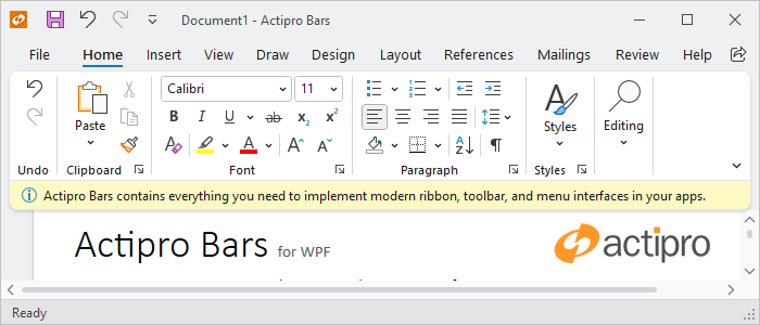
A ribbon with a footer
Defining a Footer
The footer can be defined in XAML or code-behind by assigning a RibbonFooterControl control instance to the Ribbon.FooterContent property.
Note
See the "MVVM Support" section below for details on alternatively using this property to define the footer via MVVM techniques.
The following example demonstrates defining a footer message with an icon.
xmlns:bars="http://schemas.actiprosoftware.com/winfx/xaml/bars"
xmlns:shared="http://schemas.actiprosoftware.com/winfx/xaml/shared"
...
<bars:RibbonContainerPanel>
	<bars:Ribbon>
		<bars:Ribbon.FooterContent>
			<bars:RibbonFooterControl>
				<DockPanel>
					<shared:DynamicImage
						DockPanel.Dock="Left" Width="16" Height="16" Margin="0,0,5,0"
						Stretch="Uniform" StretchDirection="DownOnly" Source="/Images/Info16.png"
						HorizontalAlignment="Center" VerticalAlignment="Center"
						SnapsToDevicePixels="True" UseLayoutRounding="True" />
					<TextBlock VerticalAlignment="Center" TextWrapping="Wrap" Text="Footer message here."/>
				</DockPanel>
			</bars:RibbonFooterControl>
		</bars:Ribbon.FooterContent>
	</bars:Ribbon>
</bars:RibbonContainerPanel>
MVVM Support
The footer may also be defined by setting the Ribbon.FooterContent property to a view model that generates a RibbonFooterControl control via the ribbon's ItemContainerTemplateSelector.
The optional companion MVVM Library defines a RibbonFooterViewModel class that is intended to be used as a view model for a RibbonFooterControl control, and the BarControlTemplateSelector class in the library generates a RibbonFooterControl for that view model.
Simple Content
A RibbonFooterSimpleContentViewModel instance may be assigned to the RibbonFooterViewModel.Content property. This simple content view model supports easy definition of an image and text message for the footer.
InfoBar Content
A RibbonFooterInfoBarContentViewModel instance may be assigned to the RibbonFooterViewModel.Content property. This view model supports configuring an InfoBar for the footer.
Important
The RibbonFooterViewModel.Padding property should be set to 0 when using RibbonFooterInfoBarContentViewModel as the content so the InfoBar can render edge-to-edge.
Tip
See the MVVM Support topic for more information on how to use the library's view models and view templates to create and manage your application's bars controls with MVVM techniques.
Showing / Hiding the Footer
The ribbon will display the footer as long as the Ribbon.FooterContent property is defined. To show the footer, set the FooterContent property to the desired content. To hide the footer, set the FooterContent property to null or invoke the command defined by the ClearFooterCommand property.
Important
The ribbon has an altered appearance based on the presence of the footer, so changing the Visibility property of a footer control is not sufficient to properly hide the footer.
Changing the Background Color
By default, the footer background will use a color that is consistent with the ribbon theme, but any brush can be assigned to the RibbonFooterControl.Background property to customize the appearance. For example, a different color might be used to indicate the severity of a message or to simply draw attention to the footer area.
Instead of setting the Background property directly, the RibbonFooterControl.Kind property can be set one of the RibbonFooterKind values to trigger a pre-defined background brush. This is the recommended approach for customizing the background since the resulting brush asset will be consistent with the current theme.
See the Reusable Assets topic for details on customizing the pre-defined brush assets used by a footer kind.
Using InfoBar in the Footer
The InfoBar is specifically designed to display non-intrusive user messages and is a natural fit for use in the footer, but some properties should be changed to optimally display the control.
- BorderThickness - Set InfoBar.
BorderThicknessto0since the footer already defines a border. - IsAnimationEnabled - The ribbon already animates when a footer is opened/closed, so set InfoBar.IsAnimationEnabled to
false.
Padding
Since the InfoBar should fill the entire area of the footer, it is important to set the RibbonFooterControl.Padding to 0. Any changes to padding should be assigned to InfoBar.Padding.
Background Color
The default background color for InfoBar (at the default InfoBarSeverity) is different than the default footer background color. It is recommended to apply a Style to InfoBar that changes the Background property to Transparent when the default InfoBarSeverity is used as this will allow the footer's own Background to be shown.
Important
Setting the Background property directly will prevent the background color from changing to match the current InfoBarSeverity.
Closing
When InfoBar.CanClose is set to true, a Close Button is displayed. By default, clicking this button will hide the InfoBar (i.e., set Visibility to Collapsed), but hiding the control does not effectively hide the ribbon's footer. As noted in the "Showing / Hiding the Footer" section above, the footer must be set to null to properly hide the footer.
The easiest solution is to bind the InfoBar.CloseButtonCommand to the ancestor Ribbon.ClearFooterCommand so clicking the Close Button will clear the footer. Otherwise, use a custom command or listen to the InfoBar.CloseButtonClick event and clear the footer as noted in the "Showing / Hiding the Footer" section above.
Example
The following example fully demonstrates one way to use an InfoBar on a footer:
xmlns:bars="http://schemas.actiprosoftware.com/winfx/xaml/bars"
xmlns:shared="http://schemas.actiprosoftware.com/winfx/xaml/shared"
...
<bars:RibbonContainerPanel>
	<bars:Ribbon>
		<bars:Ribbon.Resources>

			<!-- Set defaults for any InfoBar -->
			<Style TargetType="{x:Type shared:InfoBar}" BasedOn="{StaticResource {x:Type shared:InfoBar}}">
				<Setter Property="BorderThickness" Value="0" />
				<Setter Property="IsAnimationEnabled" Value="False" />
				<Setter Property="CloseButtonCommand" Value="{Binding RelativeSource={RelativeSource AncestorType={x:Type bars:Ribbon}}, Path=ClearFooterCommand}" />
				<Style.Triggers>
					<Trigger Property="Severity" Value="Information">
						<Setter Property="Background" Value="Transparent" />
					</Trigger>
				</Style.Triggers>
			</Style>

		</bars:Ribbon.Resources>

		<bars:Ribbon.FooterContent>

			<!-- Configure individual InfoBar footer -->
			<bars:RibbonFooterControl Padding="0">
				<shared:InfoBar
					Title="InfoBar"
					Message="Use an info bar for essential app messages."
					Severity="Success"
					CanClose="True" />
			</bars:RibbonFooterControl>

		</bars:Ribbon.FooterContent>
	</bars:Ribbon>
</bars:RibbonContainerPanel>
Tip
See the "Footer" Bars Ribbon QuickStart of the Sample Browser application for a full demonstration of working with the ribbon footer.