Overview
Actipro Bars includes a standalone toolbar control that has many features beyond what the native ToolBar control offers.
Standalone Toolbars
The StandaloneToolBar control is meant to be a replacement for a native ToolBar control. It supports horizontal and vertical orientation, can make use of all the Bars controls and their features (including menu galleries), and overflows items to a popup. As with the other root bar controls, it can be fully configured via MVVM.

A standalone toolbar is ideal as a main toolbar instead of a ribbon in apps with fewer commands
See the Standalone Toolbars topic for more information.
Dockable Toolbars
Each DockableToolBar control within a DockableToolBarHost is a toolbar that can be dragged to any side of the host, or even floated. Dockable toolbars are very common in IDE applications and can be used in complex line of business applications as well, in scenarios where a ribbon may not be appropriate.

Multiple dockable toolbars in various placements around their host
Any toolbar controls, including popup buttons with galleries, can be used on a dockable toolbar. Variant sizes from medium (showing label) to small (no label) to collapsed (moved to overflow popup) are all supported for each control within the toolbar. The entire host and its toolbars can be configured via MVVM.
See the Dockable Toolbars topic for more information.
Mini-Toolbars
The MiniToolBar control is intended for display in a popup, providing a compact set of controls that can alter the current selection or state of a target control. Any toolbar controls, including popup buttons with galleries, can be used on the mini-toolbar.
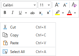
A context menu with a multi-row mini-toolbar
See the Mini-Toolbars topic for more information.