Overview
The MiniToolBar control is intended for display in a popup, providing a compact set of controls that can alter the current selection or state of a target control. Any toolbar controls, including popup buttons with galleries, can be used on the mini-toolbar.
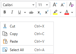
A context menu with a multi-row mini-toolbar
Usage Scenarios
In a Context Menu
A mini-toolbar can be paired and displayed with a context menu. Normally the mini-toolbar appears above the context menu. If a menu item on the context menu is chosen, both the context menu and mini-toolbar close. Alternatively, if the end user clicks a control on the mini-toolbar, the mini-toolbar remains open but the context menu closes. After this point the mini-toolbar behaves as if it was opened standalone.
This sample code shows how to define a context menu with a mini-toolbar for a TextBox:
xmlns:bars="http://schemas.actiprosoftware.com/winfx/xaml/bars"
...
<TextBox>
	<TextBox.ContextMenu>
		<bars:BarContextMenu>
			<!-- Labels are auto-generated from Command -->
			<bars:BarMenuItem Command="SelectAll" SmallImageSource="/Images/Icons/SelectAll16.png" />
			...
			<bars:BarContextMenu.MiniToolBarContent>
				<bars:MiniToolBar>
					<bars:BarButton Command="ApplicationCommands.Cut" SmallImageSource="/Images/Icons/Cut16.png" />
					<bars:BarButton Command="ApplicationCommands.Copy" SmallImageSource="/Images/Icons/Copy16.png" />
					<bars:BarButton Command="ApplicationCommands.Paste" SmallImageSource="/Images/Icons/Paste16.png" />
					<bars:BarSeparator />
					<bars:BarButton Command="ApplicationCommands.Undo" SmallImageSource="/Images/Icons/Undo16.png" />
					<bars:BarButton Command="ApplicationCommands.Redo" SmallImageSource="/Images/Icons/Redo16.png" />
					...
				</bars:MiniToolBar>
			</bars:BarContextMenu.MiniToolBarContent>
		</bars:BarContextMenu>
	</TextBox.ContextMenu>
</TextBox>
The BarContextMenu.MiniToolBarContent property can be set to a MiniToolBar control instance directly, or to a view model (see the "MVVM Support" section below) that will generate a MiniToolBar instance. In either case, the resolved MiniToolBar control is returned in the read-only BarContextMenu.MiniToolBar property.
Child Controls
The toolbar can host all Bars controls that are meant for a toolbar context. A powerful feature is the ability to use a popup button or split button to show a graphically-rich menu gallery in its popup menu.
Most controls define a ToolBarItemVariantBehavior property (e.g., BarButton.ToolBarItemVariantBehavior) that determines the allowed variant sizes of a control when it is displayed in a toolbar. The property defaults to AlwaysSmall, causing controls to display in a Small variant, which often means icon only.
Since the mini-toolbar doesn't dynamically adjust child control variants as space decreases like a ribbon does, it only uses each child's ToolBarItemVariantBehavior property as a guideline for what single variant size to support for that child. Therefore as an example, to display an icon and label for a particular button, set the BarButton.ToolBarItemVariantBehavior property to AlwaysMedium.
Multi-Row Layouts
A mini-toolbar will arrange its child controls in a single row by default. Set the MiniToolBar.CanUseMultiRowLayout property to true to use two rows for child controls.
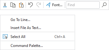
A context menu with a single-row mini-toolbar
When a multi-row layout is in effect, the mini-toolbar will attempt to split the controls such that the rows have as equal width as possible, while still maintaining the same child control order. If the mini-toolbar doesn't contain any separators, it will split the rows between two controls. If the mini-toolbar does contain separators, it will split the rows at a separator.
Screen Tips
The child controls support screen tips, which are formatted tool tips. Screen tips attempt to display below the MiniToolBar.
See the Screen Tips topic for more information on screen tips.
MVVM Support
The mini-toolbar may be defined in a context menu by setting the BarContextMenu.MiniToolBarContent property to a view model that generates a MiniToolBar control via the context menu's ItemContainerTemplateSelector.
The optional companion MVVM Library defines a MiniToolBarViewModel class that is intended to be used as a view model for a MiniToolBar control, and the BarControlTemplateSelector class in the library generates a MiniToolBar for that view model.
Tip
See the MVVM Support topic for more information on how to use the library's view models and view templates to create and manage your application's bars controls with MVVM techniques.
Customizing the Toolbar Style
The MiniToolBar instance can be customized by setting a Style to the BarContextMenu.MiniToolBarStyle property. This Style is applied to the control when it is added to the context menu.