Overview
The StandaloneToolBar control is meant to be a replacement for a native ToolBar control. It supports horizontal and vertical orientation, can make use of all the Bars controls and their features (including menu galleries), and overflows items to a popup. As with the other root bar controls, it can be fully configured via MVVM.
Usage Scenarios
Main Toolbar
The StandaloneToolBar control can be made to render similar to a ribbon in Simplified layout mode where there is a single row of child controls. This appearance is great when the main window has system backdrop enabled and there is a single primary toolbar.

A standalone toolbar is ideal as a main toolbar instead of a ribbon in apps with fewer commands
The main difference between the toolbar and a Simplified ribbon is in how overflow is achieved. The toolbar does not alter variant sizes of child controls and will overflow its items to a chevron popup when necessary. Whereas a Simplified ribbon can alter variant sizes of child controls when width is changed and overflows its items to popup menus when necessary.
The toolbar's Background, BorderBrush, BorderThickness, CornerRadius, HasShadow, ItemSpacing, Padding, and UserInterfaceDensity properties can be set to achieve an appearance like above.
Tool Window Toolbar
StandaloneToolBar also works great out-of-the-box as a toolbar that can be placed in another container, such as within a tool window from the Actipro Docking/MDI product.

A standalone toolbar in a tool window
In this usage scenario, it's generally better to use the default appearance that is more compact.
xmlns:bars="http://schemas.actiprosoftware.com/winfx/xaml/bars"
xmlns:docking="http://schemas.actiprosoftware.com/winfx/xaml/docking"
xmlns:themes="http://schemas.actiprosoftware.com/winfx/xaml/themes"
...
<docking:DockSite>
	<docking:SplitContainer>
		<docking:Workspace />
		<docking:ToolWindowContainer>
			<docking:ToolWindow Title="Tool Window">
				<DockPanel>
					<bars:StandaloneToolBar
						DockPanel.Dock="Top"
						Background="{DynamicResource {x:Static themes:AssetResourceKeys.ContainerBackgroundLowBrushKey}}"
						BorderThickness="0">

						<!-- Labels are auto-generated from Key -->
						<bars:BarButton Key="Undo" SmallImageSource="/Images/Undo16.png" Command="{Binding UndoCommand}" />
						<bars:BarButton Key="Redo" SmallImageSource="/Images/Redo16.png" Command="{Binding RedoCommand}" />
						<bars:BarSeparator />
						<bars:BarButton Key="Cut" SmallImageSource="/Images/Cut16.png" Command="{Binding CutCommand}" />
						<bars:BarButton Key="Copy" SmallImageSource="/Images/Copy16.png" Command="{Binding CopyCommand}" />
						<bars:BarButton Key="Paste" SmallImageSource="/Images/Paste16.png" Command="{Binding PasteCommand}" />
						...
					</bars:StandaloneToolBar>
					...
				</DockPanel>
			</docking:ToolWindow>
		</docking:ToolWindowContainer>
	</docking:SplitContainer>
</docking:DockSite>
Orientation
The toolbar can arrange its child controls either horizontally (default) or vertically by setting the Orientation property.
Overflow Behavior
The StandaloneToolBar control will not alter the variant size of child controls as available size changes. If a child control is unable to fit in the available space, it will be overflowed to a chevron popup menu from where it can be fully accessed.
The IsOverflowed property returns whether the toolbar is currently in an overflowed state.
Child Controls
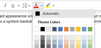
The toolbar can host all Bars controls that are meant for a toolbar context. A powerful feature is the ability to use a popup button or split button to show a graphically-rich menu gallery in its popup menu.

A standalone toolbar with a gallery open
Most controls define a ToolBarItemVariantBehavior property (e.g., BarButton.ToolBarItemVariantBehavior) that determines the allowed variant sizes of a control when it is displayed in a toolbar. The property defaults to AlwaysSmall, causing controls to display in a Small variant, which often means icon only.
Since the standalone toolbar doesn't dynamically adjust child control variants as space decreases like a ribbon in Simplified layout mode does, it only uses each child's ToolBarItemVariantBehavior property as a guideline for what single variant size to support for that child. Therefore as an example, to display an icon and label for a particular button, set the BarButton.ToolBarItemVariantBehavior property to AlwaysMedium.
Key Tips
Key tips in child controls are supported, but are not active by default and must be enabled by setting the attached BarControlService property to true.
xmlns:bars="http://schemas.actiprosoftware.com/winfx/xaml/bars"
...
<bars:StandaloneToolBar ... bars:KeyTipService.IsRootKeyTipScope="True">
	...
</bars:StandaloneToolBar>
After the toolbar is marked as a root key tip scope, pressing keys like Alt will activate key tip mode the same as with a ribbon.
See the Key Tips topic for more information on key tips.
Screen Tips
The child controls support screen tips, which are formatted tool tips. Screen tips attempt to display below the StandaloneToolBar when horizontally oriented or to the far side when vertically oriented.
See the Screen Tips topic for more information on screen tips.
MVVM Support
The optional companion MVVM Library defines a StandaloneToolBarViewModel class that is intended to be used as a view model for a StandaloneToolBar control.
If a StandaloneToolBarViewModel instance is bound to the StandaloneToolBar.DataContext, a built-in Style with resource key BarsMvvmResourceKeys.StandaloneToolBarStyle can be applied to configure bindings for all the view model's properties:
xmlns:bars="http://schemas.actiprosoftware.com/winfx/xaml/bars"
xmlns:themes="http://schemas.actiprosoftware.com/winfx/xaml/themes"
...
<bars:StandaloneToolBar ...
	DataContext="{Binding ToolBar}"
	Style="{StaticResource {x:Static themes:BarsMvvmResourceKeys.StandaloneToolBarStyle}}"
	>
	...
</bars:StandaloneToolBar>
Tip
See the MVVM Support topic for more information on how to use the library's view models and view templates to create and manage your application's bars controls with MVVM techniques.