Tabbed MDI
Tabbed MDI is the default type of MDI found in most modern applications and is fully supported by Actipro Docking & MDI.
Tabbed MDI without any tool windows active
With tabbed MDI, the Workspace area is filled with one or more tab controls (implemented by TabbedMdiContainer) where each tab provides access to its related docking window.
Implementation and Hierarchy
At design-time, the MDI area can be instantiated via XAML code. The Control Hierarchy topic has a diagram showing the controls that are needed to implement this type of MDI from XAML. But essentially, to have tabbed MDI features available in your docking layout, you must place a TabbedMdiHost control directly as the Content of the Workspace within the dock site.
At run-time, you can use the common document framework (shared with standard MDI) to manage the documents in the MDI area. The Working with Documents topic describes how to interact with this common document framework to open and close documents along with performing other common tasks. But before doing so, please ensure that a TabbedMdiHost control is the direct Content of the Workspace within the dock site.
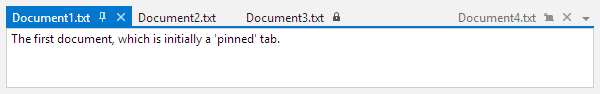
Tab Layout Kinds (Pinned, Normal, Preview)
There are three kinds of tabs available: pinned, normal, and preview.
The three kinds of tabs
- Normal tabs are the default kind of tab and render normally.
- Pinned tabs are tabs that have been pinned by the end user and align to the leftmost end of the tab strip. They also render like normal tabs other than having an Unpin button visible.
- Preview tabs render on the far-right side of the tab strip, generally in a slightly faded-out appearance. They have a Keep Open button visible that, when clicked, will make the tab a normal tab. While multiple preview tabs are supported, it is advisable to only have a single preview tab in the UI at any given time.
Switching Kinds
The DockingWindow.TabbedMdiLayoutKind property specifies which kind of tab to use for the docking window when in tabbed MDI.
The end user can use context menus and tab buttons, when appropriate, to alter the tab layout kind. You can toggle it manually by setting the above property.
Behavior Options
Tabbed MDI has numerous behavior capability options that are available. Several of these are global settings (like TabbedMdiHost.CanDocumentsAttach) and can be overridden by related window-instance settings on the DockingWindow class.
| Member | Description |
|---|---|
| TabbedMdiHost.CanDocumentsAttach Property | Gets or sets the global setting for whether documents may be attached to another document, creating a tabbed grouping. The default value is true. |
| TabbedMdiHost.CanDocumentsCloseOnMiddleClick Property | Gets or sets a value indicating whether documents can be closed by clicking the tab with the middle pointer button. The default value is true. |
| TabbedMdiHost.CanDocumentTabsDrag Property | Gets or sets the global setting for whether document tabs may be dragged to another location. The default value is true. |
Tab Close Buttons
By default, a Close button appears directly on the tabs. This feature can be disabled by setting the TabbedMdiHost.HasTabCloseButtons property to false.
Tab Pin Buttons
By default, no pin button appears directly on Normal tabs. This feature can be enabled by setting the TabbedMdiHost.HasTabPinButtons property to true. That option will force a Pin button to show on Normal tabs when the pointer is over the tab.
Title vs. Tab Text
The DockingWindow.Title property is normally set to determine the title text that is rendered in tabs as well as in title bars and on the standard switcher. In some cases, it might be desirable to have longer text for the Title, such as "Properties - Document1.txt", while having shorter text that renders on tabs, such as "Properties". This allows your title to provide more extensive contextual information.
By setting the TabText property to a non-null value, its value will be used to render the tab text instead of the Title value. In that scenario, the Title value will still be used in title bars and on the standard switcher when the window is selected.
Tab Tool Tip
The DockingWindow.TabToolTip property is automatically bound to the Title property for tool windows and to the FileName property for document windows. Override the TabToolTip property to set alternate tool tip content.
Tab Images
By default, the DockingWindow.ImageSource image will not appear on document tabs.
You can force the image to display on the tabs by setting the TabbedMdiHost.HasTabImages property to true.
Tab Contextual Content
Tabbed MDI tabs can display any context-related content to the right of the tab title. This content is set via the DockingWindow.TabbedMdiTabContextContentTemplate property.
See the Contextual Content topic for some more information.
Tab Strip Placement
By default, the document tabs will appear above their content, but can be changed to appear on any side of the content.
You can alter the location of the document tabs by changing the value of the TabbedMdiHost.TabStripPlacement property.
Tab Overflow Behavior
There are numerous options from the TabOverflowBehavior enumeration for selecting what happens when the tabs overflow the available tab strip space.
By default, a menu button is displayed that lists all open documents for a container when clicked. This can be changed via the TabbedMdiHost.TabOverflowBehavior property.
Tab Insertion Order
The DockSite.AreNewTabsInsertedBeforeExistingTabs property determines whether new tabs are inserted at the start of a tabbed MDI container. It defaults to true and may be set to false to add new tabs at the end of the container instead.
New Tab Buttons
The TabbedMdiHost.ContainersHaveNewTabButtons property can be set to true to display a New Tab button. When this button is clicked, the DockSite.NewWindowRequested event is raised. A handler of this event should activate a new document.
This feature is useful for browser-like applications and works best when the TabOverflowBehavior is set to Shrink or ShrinkWithMenu.
Content for Empty MDI Hosts
The TabbedMdiHost.EmptyContentTemplate property can be set to a DataTemplate that should be displayed in the MDI host whenever there are no documents open. If additional data needs to be passed into the data template, set it to the EmptyContent property.
Tip
This is a great place to include a company/application logo or give end users instructions on what to do next to open a document.
Listing All Documents in the MDI Host
The TabbedMdiHost.GetDocuments method returns a list of all documents that are within the MDI host.
Cascading Documents
Call the TabbedMdiHost.Cascade method to automatically cascade the documents into a single TabbedMdiContainer.
Alternatively, the DockSite.CascadeDocuments method provides access to the same functionality but for all MDI hosts, including those on primary and floating dock hosts.
Tiling Documents
The tiling of documents makes more efficient use of space and will position each document so that it is visible within the workspace.
Call the TabbedMdiHost.TileHorizontally method to tile documents horizontally. Likewise, the TabbedMdiHost.TileVertically method will tile documents vertically.
Alternatively, two methods on DockSite, TileDocumentsHorizontally and TileDocumentsVertically, provide access to the same functionality but for all MDI hosts, including those on primary and floating dock hosts.
Switching to Tabbed MDI at Run-Time
You can easily switch to tabbed MDI mode at run-time by setting the DockSite.MdiKind property to Tabbed, as long as a Workspace is defined in the dock site.
Floating Documents
While disabled by default, document windows can be floated, similar to tool windows.
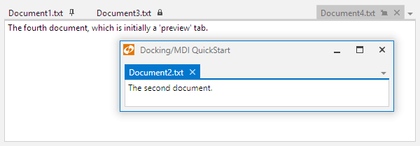
Tabbed MDI with a floating document
To float a document window, click on the associated tab and drag it away from the tabbed MDI host. A floating dock host is created with its own tabbed MDI host that contains the dragged document. The document can be redocked at any time.
To enable this feature and allow document windows to be floated, set the DockSite.CanDocumentWindowsFloat property to true.
Tab Control Custom Styling
The TabbedMdiHost.TabControlStyle property can be set to a custom Style for the AdvancedTabControl that is used within the templates of TabbedMdiContainer controls in the host.
This code shows a custom Style assigned to the TabbedMdiHost.TabControlStyle property to give the tabs a unique appearance:
<Style TargetType="docking:AdvancedTabControl">
	<Setter Property="TabCornerRadius" Value="2,7,7,2" />
	<Setter Property="TabSpacing" Value="2" />
</Style>
The TabbedMdiHost.TabItemContainerStyle property can be set to a custom Style for the AdvancedTabItem controls that render the tabs within those AdvancedTabControl controls.
Use these properties to customize the appearance of the tab controls and their tabs.
This code shows the default XAML assigned to the TabbedMdiHost.TabItemContainerStyle property:
<Style TargetType="docking:AdvancedTabItem">
	<Setter Property="Header" Value="{Binding TabTextResolved}" />
	<Setter Property="HeaderTemplate">
		<Setter.Value>
			<DataTemplate>
				<TextBlock Text="{Binding}" TextTrimming="CharacterEllipsis" VerticalAlignment="Center" />
			</DataTemplate>
		</Setter.Value>
	</Setter>
</Style>
Keyboard Shortcuts
The Alt+- keyboard shortcut shows the context menu for the currently selected document in the active tabbed MDI container.
The Ctrl+Alt+Down Arrow keyboard shortcut shows the document list menu for the active tabbed MDI container.
Other keyboard shortcuts allow you to jump directly to a tab. Ctrl+1 will activate the first tab in a normal state, with Ctrl+2 activating the second normal tab, and so on. Ctrl+Alt+1 will activate the first tab in a pinned state, with Ctrl+Alt+2 activating the second pinned tab, and so on.