DecimalEditBox
The DecimalEditBox control allows for the input of a Decimal (floating-point number) value. It uses the DecimalPicker control in its popup.
Common Capabilities
Each of the features listed in the table below describe functionality that is common to most edit boxes. Please see the Edit Box Basics topic for details on each of these options and how to set them.
| Feature | Description |
|---|---|
| Has a spinner | Yes, and can be hidden or optionally displayed only when the control is active. |
| Has a popup | Yes, and can be hidden or its picker appearance customized. |
| Null value allowed | Yes, and can be prevented. |
| Read-only mode supported | Yes. |
| Non-editable mode supported | Yes. |
| Has multiple parts | No. |
| Placeholder text supported | Yes, and overlays the control. |
| Header content supported | Yes, and appears above the control. |
| Default spin behavior | No wrap. |
| Input filtering | Yes, as noted below. |
Number Formats
Standard .NET numeric formats are supported via the Format property and affect the textual value display. These formats are recommended:
"C"(currency)"F""Fx", where x is the number of decimal places (e.g.,"F1")"G""N""Nx", where x is the number of decimal places (e.g.,"N1")"P"(percentage)
Composite numeric formats are also supported, such as:
"{0:0.0#} ft"
Minimum and Maximum Values
Minimum and maximum values may be assigned via the Maximum and Minimum properties.
No values can be committed that lay outside of the inclusive range created by those properties.
Parts and Incrementing/Decrementing
This edit box has a single part.
When the caret is over a part, the part value may be incremented or decremented. Please see the Edit Box Basics topic for information on how to do this.
Small value changes alter the current number component by 1, which is the default for the SmallChange property. Large value changes alter the current number component by 5, which is the default for the LargeChange property.
The CanSnapToChangePrecision property determines whether the value should be snapped to the precision of the incremental change value prior to applying the increment.
The DefaultValue property sets the value that will be set when incrementing or decrementing from a null value.
Rounding Decimal Places
The RoundingDecimalPlace property determines the maximum decimal place at which to round floating-point numbers. It defaults to 8 but can be set to any value in the range 0 to 15. Or set the value to null to prevent rounding.
Built-in Picker Kinds
This edit box has multiple built-in picker kinds that can be set via the DecimalEditBox.PickerKind property, which is of type DecimalEditBoxPickerKind.
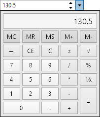
The default value in is Calculator.
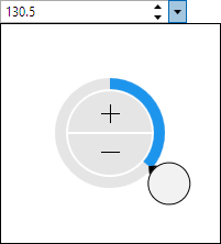
The Default picker kind renders using a radial slider, while the Calculator picker kind utilizes the Calculator control.
Input Filtering
When IsInputFilteringEnabled is set to true, the allowed input is limited to numeric text based on the current format.
Please see the Edit Box Basics topic for additional details input filtering.
Sample XAML
This control can be placed within any other XAML container control, such as a Page or Panel with this sort of XAML:
<editors:DecimalEditBox Value="{Binding Path=YourVMProperty, Mode=TwoWay}" />
Sample XAML for Currency Input

This control is great for currency input, which can be implemented with this XAML:
<editors:DecimalEditBox Format="C" Value="{Binding Path=YourVMProperty, Mode=TwoWay}" />