TimeEditBox
The TimeEditBox control allows for the input of a DateTime value's time component. It uses the TimePicker control in its popup.
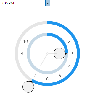
Common Capabilities
Each of the features listed in the table below describe functionality that is common to most edit boxes. Please see the Edit Box Basics topic for details on each of these options and how to set them.
| Feature | Description |
|---|---|
| Has a spinner | Yes, and can be hidden or optionally displayed only when the control is active. |
| Has a popup | Yes, and can be hidden or its picker appearance customized. |
| Null value allowed | Yes, and can be prevented. |
| Read-only mode supported | Yes. |
| Non-editable mode supported | Yes. |
| Has multiple parts | Yes, and supports optional arrow key navigation. |
| Placeholder text supported | Yes, and overlays the control. |
| Header content supported | Yes, and appears above the control. |
| Default spin behavior | Wrap. |
| Input filtering | Yes, as noted below. |
Formats
Standard time formats are supported via the Format property and affect the textual value display. These formats are recommended:
"t""T""hh:mm tt""h:mm:ss tt""HH:mm:ss""HH:mm"
Minimum and Maximum Values
Minimum and maximum values may be assigned via the Maximum and Minimum properties.
No values can be committed that lay outside of the inclusive range created by those properties.
Parts and Incrementing/Decrementing
This edit box has multiple parts:
- Hour
- Minute
- Second
- AM/PM
When the caret is over a part, the part value may be incremented or decremented. Please see the Edit Box Basics topic for information on how to do this.
Input Filtering
When IsInputFilteringEnabled is set to true, only the following text may be entered into the edit box:
- Valid input for the active time part.
- The current culture date separator (e.g.,
/). - The current culture time separator (e.g.,
:). - The characters of any literal text defined by the current format (e.g., custom date/time separators) when the text selection start offset matches the position of a literal part.
Please see the Edit Box Basics topic for additional details input filtering.
Sample XAML
This control can be placed within any other XAML container control, such as a Page or Panel with this sort of XAML:
<editors:TimeEditBox Value="{Binding Path=YourVMProperty, Mode=TwoWay}" />