Avatar
Avatar controls are used to represent people or objects. They can render a full-size image, a centered glyph, a person's initials, or text.
Avatars with generic profile glyph, text initials, and image
Important
See the Getting Started topic for details on configuring themes for this control.
Description
The Description property should be set to a short description of the data represented by the avatar (e.g., a person's full name). In many scenarios, this may be the only property that needs to be populated because the Description will define the tooltip and will also auto-generate shorter text to be displayed as the Avatar Content.
The following example shows how to define an Avatar with a Description:
xmlns:actipro="http://schemas.actiprosoftware.com/avaloniaui"
...

<actipro:Avatar Description="Luke Skywalker" />
Content
The Content of Avatar can be set to any value supported by ContentPresenter, but the most common content will be text, an image, or a glyph.
Automatic Initials from Description
When not explicitly set, the Content is automatically derived from the Description property by attempting to parse one or two initials from Description. For example, a description of "Luke Skywalker" will generate the initials "LS".
The following rules are applied when attempting to parse the initials:
- Any characters after
@are ignored unless it is the first character (i.e., ignores the domain portion of an e-mail address). - Only letters or digits are eligible for initials (as defined by
Char.IsLetterOrDigit). - The first initial is based on the first eligible character.
- The second initial is based on the first eligible character (if any) of the last "word part" where the characters space, period (
.), and comma (,) are used to split the description into multiple parts. - If no eligible characters are found, the first character will be used.
- The final value is converted to upper-case.
The following table provides some examples (both good and bad) of initials automatically coerced from descriptions:
| Description | Initials |
|---|---|
"First Last" |
"FL" |
"First Middle Last" |
"FL" |
"Last, First" |
"LF" |
"Prefix First Last" |
"PL" |
"First Last Suffix" |
"FS" |
"Some Hyphenated-Name" |
"SH" |
"first.last@domain.com" |
"FL" |
"name@domain.com" |
"N" |
"@username" |
"U" |
Note
As illustrated in the table above, the automatically generated initials may not align with expectations since the Description can be any freeform text. It may be necessary for a developer to explicitly set the Content to the desired text if the auto-generated initials are not sufficient.
Text Content
Avatars at different sizes with auto-scaled font
Since an Avatar can be displayed at any size, the text must also adapt to the available size. By default, any string-based Content is presented using the AvatarTextPresenter which will automatically
scale its font based on the space available but will never scale lower than a minimally legible font size.
Tip
Since text-based content is automatically coerced from the Description, setting the Content to a string is typically only necessary if the auto-generated text will not be used.
The following example demonstrates how to define an Avatar with a Description and explicit text-based content instead of the auto-generated initials:
xmlns:actipro="http://schemas.actiprosoftware.com/avaloniaui"
...

<actipro:Avatar Description="Luke Skywalker" Content="Luke" />
Image Content
Since an Avatar offers little space for text, an image is often more appropriate for Content.
The following examples demonstrate multiple ways to use an image as the Content:
xmlns:actipro="http://schemas.actiprosoftware.com/avaloniaui"
...

<!-- Use an Image control -->
<actipro:Avatar Description="Luke Skywalker">
	<Image Source="/Images/ProfilePhotos/Luke.png" />
</actipro:Avatar>

<!-- Bind to an IImage -->
<actipro:Avatar Description="Luke Skywalker" Content="{StaticResource ProfileImageLuke}" />
Warning
When Content is set to an IImage , it is presented, by default, using the DynamicImage control. If an application is configured to support dark themes and also uses photo-realistic images for avatars, those images typically should not be adapted to dark themes.
See the Image Provider topic for more details on chromatic adaptation and how to prevent an image from being adapted.
Alternatively, bypass the DynamicImage control and set the Content to an instance of a properly configured Image control instead.
Glyph Content
Like an image, the Content can also be set to a glyph. By placing a glyph inside a Viewbox, the glyph will be allowed to scale up or down with the size of the Avatar.
The following example demonstrates how to use one of the reusable Actipro glyph assets as the Content of an Avatar:
xmlns:actipro="http://schemas.actiprosoftware.com/avaloniaui"
...

<actipro:Avatar Description="Tech Support">
	<Viewbox>
		<ContentPresenter Margin="6" ContentTemplate="{actipro:GlyphTemplate Help16}" />
	</Viewbox>
</actipro:Avatar>
Tip
Glyphs with built-in margins in the image content can reduce the ContentPresenter.Margin attribute value or remove it altogether when appropriate.
Empty Content
When the current Content is resolved as either null or an empty string, a generic user glyph will be displayed by default.
The EmptyContentTemplate property can be set to a custom IDataTemplate to change the default presentation. The following example demonstrates showing a custom image instead of the default glyph:
xmlns:actipro="http://schemas.actiprosoftware.com/avaloniaui"
...

<actipro:Avatar ... >
	<DataTemplate>
		<Image Source="/Images/Icons/EmptyAvatar.png" />
	</DataTemplate>
</actipro:Avatar>
Note
The value of the Content property is used to determine if an Avatar is considered empty. If a custom ContentTemplate is used to define content instead of setting the Content property, the Avatar may inadvertently display the EmptyContentTemplate instead. In this scenario, set the Content to any arbitrary value that is neither null nor an empty string to prevent the empty content from being displayed.
Automatic Color Brushes
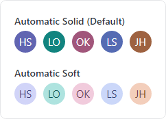
Avatars with two kinds of auto-generated foreground and background brushes
An Avatar is most distinctive when using image-based content, so text-based content can be harder to differentiate.
When the TextAppearanceKind kind property is set to AutomaticSolid (the default) or AutomaticSoft, the Foreground and Background brushes are automatically randomized using an algorithm based on the value of the text-based content. While some colors combinations may still be repeated, this greatly improves the visual appeal of a text-based Avatar by varying the colors used across control instances.
To use explicit Foreground and Background brushes, set TextAppearanceKind to Manual and the brushes from the corresponding properties will be used instead of the automatically derived brushes.
Using Avatar as a Button
Avatar derives from Button, so it supports the same Command model and Click event as Button. Unlike a Button, though, not all instances of Avatar will be interactive and the control has been configured to appear non-interactive by default.
When adding a Command or Click handler to an Avatar, the following changes should also be made:
- Set the
Focusableproperty totrueto allow the control to be reached using keyboard-based navigation. - Since there is no default hover effect for an Avatar, it is also recommended to set the
Cursorproperty toHandso users will understand the control can be clicked.
Pseudo-classes
The following pseudo-classes are available and can be used when styling the control:
| Class | Description |
|---|---|
:empty |
Added when Content (or its coerced value) is null or an empty string. |
Theme Resources
The following theme resources are available for customizing the appearance of the control:
| Theme Resource | Description |
|---|---|
| AvatarBackgroundBrushSolid | The default Background and BorderBrush when automatic colors are not used. |
| AvatarForegroundBrushSolid | The default Foreground when automatic colors are not used. |
See the Theme Assets topic for more details on working with theme resources.