Popup Button
Popup buttons are controls that can be clicked to show a popup menu.
Note
This topic extends the Control Basics topic with additional information specific to the control types described below. Please refer to the base topic for more generalized concepts that apply to all controls, including this one.
Control Implementations
There are separate popup button concept control implementations based on the usage context.
Ribbon and Toolbar Contexts
Use the BarPopupButton control to implement a popup button within a ribbon or toolbar context.


BarPopupButton examples in several variant sizes (large, medium, and small)
| Specification | Details |
|---|---|
| Base class | BarPopupButtonBase, which inherits native Menu. |
| Has key | Yes, via the Key property. |
| Has label | Yes, via the Label property. Auto-generated from the Key value if not specified. |
| Has image | Yes, via the SmallImageSource, MediumImageSource, and LargeImageSource properties. |
| Has popup | Yes. |
| Is checkable | No. |
| Variant sizes | Small (image only), Medium (image and label), Large (tall size, image and multi-line label). |
| Command support | Yes, via the PopupOpeningCommand property. |
| Key tip support | Yes, via the KeyTipText property. Auto-generated from the Label value if not specified. |
| Ribbon QAT support | Yes, via the CanCloneToRibbonQuickAccessToolBar property. |
| UI density support | Yes, via the UserInterfaceDensity property. |
| MVVM Library VM | BarPopupButtonViewModel class. |
xmlns:bars="http://schemas.actiprosoftware.com/winfx/xaml/bars"
...
<bars:StandaloneToolBar>
	<!-- Label is auto-generated from Key -->
	<bars:BarPopupButton
		Key="Shapes"
		SmallImageSource="/Images/Shapes16.png">

		<bars:BarPopupButton.Items>
			<bars:BarMenuItem
				Key="Rectangle"
				Command="{Binding InsertRectangleCommand}"
				/>
		</bars:BarPopupButton.Items>
	</bars:BarPopupButton>
	...
</bars:StandaloneToolBar>
Menu Contexts
Use the BarMenuItem control to implement a popup button concept within a menu context.
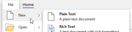
A BarMenuItem with large size showing a popup menu
| Specification | Details |
|---|---|
| Base class | Native MenuItem. |
| Has key | Yes, via the Key property. |
| Has label | Yes, via the Label property. Auto-generated from the Key value if not specified. |
| Has image | Yes, via the SmallImageSource and LargeImageSource properties. |
| Has popup | Yes. |
| Is checkable | No. |
| Variant sizes | None, but has a UseLargeSize property that triggers a large height and displays an extended Description. |
| Command support | Yes, via the PopupOpeningCommand property. |
| Key tip support | Yes, via the KeyTipText property. Auto-generated from the Label value if not specified. |
| Ribbon QAT support | Yes, via the CanCloneToRibbonQuickAccessToolBar property. |
| UI density support | None. |
| MVVM Library VM | BarPopupButtonViewModel class. |
xmlns:bars="http://schemas.actiprosoftware.com/winfx/xaml/bars"
...
<bars:BarContextMenu>
	<!-- Label is auto-generated from Key -->
	<bars:BarMenuItem
		Key="Shapes"
		SmallImageSource="/Images/Shapes16.png">

		<bars:BarMenuItem
			Key="Rectangle"
			Command="{Binding InsertRectangleCommand}"
			/>
	</bars:BarMenuItem>
	...
</bars:BarContextMenu>
Appearance
There are several appearance-related properties that determine how the controls render.
Label
The controls have a string Label that can be set, which is visible in UI.
The Label can be auto-generated based on the control's Key property. For instance, a control with Key of "FormatPainter" will automatically assign "Format Painter" as the Label value. The auto-generated default can be overridden by setting the Label property.
The BarPopupButton.Label is rendered on the button when it is in a Medium or Large variant size. When using a Large variant size button, the label will wrap words to two lines to minimize overall width. In cases where a run of label text should not be broken up into two lines, use a non-breaking space character (ASCII code 160) in place of any whitespace, like this:
xmlns:bars="http://schemas.actiprosoftware.com/winfx/xaml/bars"
...
<bars:BarPopupButton ... Label="Data Set" />
The BarMenuItem.Label is rendered on the menu item as its primary content.
Images
The controls can display images that help identify their function.
All BarPopupButton instances should set a SmallImageSource at a minimum, which is generally used for Small and Medium variants, as well as in the Ribbon Quick Access Toolbar and if the control overflows to a menu. If the button supports a Large variant size, it should also define a LargeImageSource. When the button has a Spacious UI density, it will try to use MediumImageSource.
Tip
See the Control Basics topic for more detail on the fallback logic for button images.
BarMenuItem instances can optionally define a SmallImageSource that appears in the menu's icon column. When UseLargeSize is set to create a large menu item, the LargeImageSource property is used instead.
Description (BarMenuItem only)
When UseLargeSize is set to create a large menu item, the Description property's string value is displayed under the menu item's bold label as an extended description.
Title
An optional string BarPopupButton.Title and BarMenuItem.Title can be specified, which are intended to override the control's Label when displayed in screen tips and customization UI.
Variant Sizes
BarPopupButton supports multiple variant sizes via its VariantSize property. This feature can be used in conjunction with RibbonControlGroup within a ribbon in Classic layout mode to achieve various button layouts as available width changes.
When a ribbon is in Simplified layout mode, the BarPopupButton control will render in a Small variant size by default and will collapse to an overflow menu when necessary. The ToolBarItemVariantBehavior property can be set to All to show a label. Alternatively, the ToolBarItemCollapseBehavior property can be set to Always to always have the button in the overflow menu.
While BarMenuItem doesn't support variant sizes, it does have a UseLargeSize property that can be set to show a large version of the menu item. This large version uses a large image and can display an extended Description.
See the Resizing and Variants topic for more information on ribbon's variant sizing features.
User Interface Density (BarPopupButton only)
The UserInterfaceDensity property can alter the appearance of the button, such as its size, padding, and image used. This property is not generally set on the button instance itself, and is instead meant to be set on the root bar control to inherit down, such as with the Ribbon.UserInterfaceDensity property.
Key Tips
The controls support key tips. When a control's key tip is accessed, the popup menu is opened.
The KeyTipText can be auto-generated based on the control's Label property. For instance, a control with Label of "Copy" will automatically assign "C" as the KeyTipText value. The auto-generated default can be overridden by setting the KeyTipText property.
The BarPopupButton.KeyTipText and BarMenuItem.KeyTipText properties designate the key tip text to use for the control.
See the Key Tips topic for more information on key tips.
Commands and Events
The ICommand in the BarPopupButton.Command property is never executed or used other than to possibly initialize a label.
The ICommand in the BarPopupButton.PopupOpeningCommand property, and similarly the BarMenuItem.PopupOpeningCommand, is executed prior to the popup or sub-menu opening. This command can be handled in a view model, allowing for a MVVM way to update the items on the popup prior to display.
BarPopupButton.PopupOpening and PopupOpened events are raised when the popup is opened. The former event allows you to customize the popup menu prior to display.
The PopupOpeningCommand's can-execute result determines the enabled state of the control.
See the Using Commands topic for more information on commands.
Focus Behavior
In cases where you wish for the button to remain focused after a click on one of its popup menu items, set the BarPopupButton.InvocationFocusBehavior property to Self.
Screen Tips
The controls support screen tips, which are formatted tool tips.
The control's Title is used as the default screen tip header, falling back to Label if no Title is available. The BarPopupButton.ScreenTipHeader and BarMenuItem.ScreenTipHeader properties can override the default screen tip header value if desired.
If the control's ToolTip property is set to a value that doesn't derive from a native ToolTip control, such as a string, the value will be used in the screen tip's content area, with the screen tip header becoming bold. The screen tip's content area is where extended descriptions are displayed.
If the optional BarPopupButton.ScreenTipFooter and BarMenuItem.ScreenTipFooter properties are specified, they will appear in a footer area of the screen tip.
See the Screen Tips topic for more information on screen tips.
MVVM Support
The optional companion MVVM Library defines a BarPopupButtonViewModel class that is intended to be used as a view model for popup buttons.
This view model class maps over to the appropriate view controls described above based on usage context and configures all necessary bindings between the view model and the view control.
Tip
See the MVVM Support topic for more information on how to use the library's view models and view templates to create and manage your application's bars controls with MVVM techniques.