Resizing and Variants
Ribbon is designed to dynamically adjust the layout of controls based on the available width using techniques optimized for either the Simplified or Classic layout modes.
Several controls support multiple variant sizes, where each variant alters the appearance of the control. As the variant size moves from larger to smaller, the change in appearance generally involves a reduction in the amount of information displayed in the control's content to save on overall space usage. For example, a button may display with both an icon and a label when space is available but only display an icon when space is limited.
Each ribbon layout mode uses a different resizing strategy.
See the Layout Modes and Density topic for more details on working with layout modes.
Simplified Layout Strategy
The primary focus of the Simplified layout mode is overflowing controls to a popup menu.
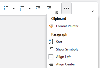
The tab overflow menu displayed
When there is not enough room to display all the controls, the Tab Overflow button will be displayed, and controls are moved one-by-one to a popup menu displayed when clicking the button. A header will be displayed in the popup menu that corresponds to the RibbonGroup.Label of the group where the control is defined, so overflowed controls maintain the same level of organization they had on the ribbon.
By default, controls are overflowed starting from the far side of the ribbon.
See the "Explicit Variant Sizing" section below for more details on controlling the order in which items reduce their variant size.
Group Overflow
An individual group on the ribbon can be configured to define its own Group Overflow button instead of using the default Tab Overflow button. To enable this functionality, set RibbonGroup.ChildOverflowTarget = RibbonGroupChildOverflowTarget.Group as shown in the following example:
xmlns:bars="http://schemas.actiprosoftware.com/winfx/xaml/bars"
...
<bars:RibbonGroup Key="Clipboard" ... ChildOverflowTarget="Group" />
When enabled and controls in a group need to overflow, a Group Overflow button will appear as the last item in the group. Overflowed controls will appear in the popup menu just like they appear in the Tab Overflow menu except there is no need to display the group's label as a header.
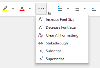
The group overflow menu displayed
Tip
Use Group overflow for important groups where overflowed controls can be kept close to the other controls in the same group.
Variants
As previously mentioned, several controls support multiple variant sizes, where each variant alters the appearance of the control. As the variant size moves from larger to smaller, the change in appearance generally involves a reduction in the amount of information displayed in the control's content to save on overall space usage.
The following VariantSize values are supported by the Simplified layout mode in order from largest to smallest:
| Variant Size | Description |
|---|---|
Medium |
Most controls display as an icon with a label. |
Small (Default) |
Most controls display only as an icon. |
Collapsed |
Controls are moved to the Overflow menu. |
A ribbon will always try to display a control at the largest variant size for the available space.
The VariantSize.Large value has no effect for a ribbon using the Simplified layout mode.
Variant and Overflow Behaviors
Most controls define a ToolBarItemVariantBehavior property (e.g., BarButton.ToolBarItemVariantBehavior) that determines the allowed variant sizes of a control when it is displayed in a ribbon with the Simplified layout mode or a toolbar.
Since the default variant behavior is AlwaysSmall, most controls will appear without a label. By setting ToolBarItemVariantBehavior = All, most controls will use a medium variant to display with a label when space is available and will shrink to a small variant without a label as needed. Use the AlwaysMedium value to require a label and prevent small variant sizes. Note that large variant sizes are unsupported in toolbars.
Most controls define a ToolBarItemCollapseBehavior property (e.g., BarButton.ToolBarItemCollapseBehavior) that determines how a control is allowed to collapse to an Overflow menu when in a ribbon with the Simplified layout mode. The default behavior is to collapse to an Overflow menu as needed. By setting the property to Always, a control can be forced to only ever appear on an Overflow menu, even if space is available. By setting the property to Never, a control will never collapse to an Overflow menu.
The following example shows buttons using the ToolBarItemVariantBehavior and ToolBarItemCollapseBehavior properties in a ribbon using Simplified layout mode:
xmlns:bars="http://schemas.actiprosoftware.com/winfx/xaml/bars"
...

<!-- Will show a label when space is available -->
<bars:BarSplitButton Key="New" ... ToolBarItemVariantBehavior="All" />

<!-- Will always show a label -->
<bars:BarButton Key="Open" ... ToolBarItemVariantBehavior="AlwaysMedium" />

<!-- Will never collapse to overflow -->
<bars:BarToggleButton Key="Bold" ... ToolBarItemCollapseBehavior="Never" />

<!-- Will always collapse to overflow -->
<bars:BarButton Key="IncreaseFontSize" ... ToolBarItemCollapseBehavior="Always" />
Classic Layout Strategy
In the Classic layout mode, controls are generally available in sizes from Large to Small and will render using the largest size possible for the available width. As the ribbon size changes, controls dynamically adapt to the available space and eventually collapse to a popup menu for each group when space is too limited.
By default, controls are collapsed starting from the far side of the ribbon. See the "Explicit Variant Sizing" section below for more details on controlling the order in which items reduce their variant size.
Control Groups
A RibbonControlGroup is used to group multiple controls and resize them together. By grouping them, multiple controls can be arranged together to produce an ideal layout for a variant size.
For example, a BarButton in its Large variant size places a large icon over a label. When shifting to the Medium variant size, it uses a smaller icon with the label to the right. In most cases, this style is actually wider than the Large variant, but the height of each button is greatly reduced. By grouping multiple buttons together in a RibbonControlGroup, two or three shorter buttons can be stacked vertically to reduce the overall width of all the buttons compared to displaying them side-by-side horizontally.
The following defines the layout of a control group at different VariantSize values:
| Variant Size | Description |
|---|---|
Large |
All controls displayed in their respective Large variant style and arranged horizontally. |
Medium |
All controls displayed in their respective Medium variant style and arranged vertically with up to three controls per vertical stack. |
Small |
All controls displayed in their respective Small variant style and arranged vertically with up to three controls per vertical stack. |
By default, a control group will attempt all variant sizes from Large to Small, but the RibbonControlGroup.ItemVariantBehavior property can used to limit the variant sizes which are supported by the group. The following ItemVariantBehavior values are available:
| Item Variant Behavior | Description |
|---|---|
All |
The default behavior allows a group to progress through variant sizes from Large to Medium to Small. |
AlwaysLarge |
The group will always display as the Large variant size. |
AlwaysMedium |
The group will always display as the Medium variant size. |
AlwaysSmall |
The group will always display as the Small variant size. |
NeverLarge |
The group supports variant sizes Medium to Small, skipping the Large size. |
NeverMedium |
The group supports variant sizes Large to Small, skipping the Medium size. |
NeverSmall |
The group supports variant sizes Large to Medium, skipping the Small size. |
The following example defines three buttons that will always appear in a single vertical stack because they are defined in a control group that does not support the Large variant size. Labels will be visible when the control group is Medium, and only icons will display when the control group is Small.
xmlns:bars="http://schemas.actiprosoftware.com/winfx/xaml/bars"
...
<bars:RibbonGroup ... >
	<bars:RibbonControlGroup ItemVariantBehavior="NeverLarge">
		<bars:BarButton Key="Cut" Command="Cut" SmallImageSource="/Images/Cut16.png" />
		<bars:BarButton Key="Copy" Command="Copy" SmallImageSource="/Images/Copy16.png" />
		<bars:BarButton Key="Paste" Command="Paste" SmallImageSource="/Images/Paste16.png" />
	</bars:RibbonControlGroup>
	...
</bars:RibbonGroup>
...
Multi-Row Control Groups
The highest density of commands can be achieved using multi-row layouts where a number of controls in a ribbon group are arranged in either two or three rows using the Small variant of each control. To enable multi-row layouts, add a RibbonMultiRowControlGroup to the RibbonGroup.Items collection, and add child RibbonControlGroup or other controls designed for a toolbar context into the RibbonMultiRowControlGroup.Items collection.
When using multi-row layouts, a RibbonControlGroup is used to group related controls. Control groups will be arranged into two rows at the largest size and adjust to three rows when width is limited.
The same multi-row control group using two rows compared to three rows
When arranged in two rows, control groups are sorted in the order they are defined. In three-row mode, the default behavior will sort groups so each row is as narrow as possible. When desired, the RibbonMultiRowControlGroup.ThreeRowItemSortOrder property is used to set an explicit sort order where the zero-based index of each control group is listed in the preferred sort order, separated by spaces (e.g., "0 1 3 4 2"). The following example demonstrates defining a three-row sort order.
xmlns:bars="http://schemas.actiprosoftware.com/winfx/xaml/bars"
...
<bars:RibbonGroup ... >
	<bars:RibbonMultiRowControlGroup ThreeRowItemSortOrder="0 1 3 4 2">

		<bars:RibbonControlGroup Key="Index0"> ... </bars:RibbonControlGroup>
		<bars:RibbonControlGroup Key="Index1"> ... </bars:RibbonControlGroup>

		<!-- In 3-row layout, this group will sort at the end based on ThreeRowItemSortOrder -->
		<bars:RibbonControlGroup Key="Index2"> ... </bars:RibbonControlGroup>

		<bars:RibbonControlGroup Key="Index3"> ... </bars:RibbonControlGroup>
		<bars:RibbonControlGroup Key="Index4"> ... </bars:RibbonControlGroup>

		...
	</bars:RibbonMultiRowControlGroup>
</bars:RibbonGroup>
...
Separators
Separators can be automatically rendered between neighboring RibbonControlGroup instances based on the current layout of the containing RibbonGroup or RibbonMultiRowControlGroup.
Stacking Layout Separators
By default, separators are not displayed between neighboring control groups in a stacking layout. Some configurations, however, might benefit from displaying separators. For more exact control, the RibbonControlGroup.SeparatorMode property can be set to any of the following RibbonControlGroupSeparatorMode values to control when a separator is displayed:
| Separator Mode | Description |
|---|---|
Default or Never |
Never show surrounding separators. |
Always |
Always show surrounding separators when there are neighbors that allow them. |
StackingNeighborSameVariantSize |
Only show surrounding separators when a neighboring control group has the same variant size. |
StackingNeighborDifferentVariantSize |
Only show surrounding separators when a neighboring control group has a different variant size. |
Note
There are other values defined for the RibbonControlGroupSeparatorMode enumeration that do not apply to stacking layouts. If used in a stacking layout, the value will be treated the same as Default.
The following example defines four buttons, where the last three are part of a control group. The control group is configured to only show a separator when the group of three buttons is the same variant size as the first button (which, since it is not in a control group, will always be Large). A separator will not be displayed if the control group is a Medium or Small variant size.
xmlns:bars="http://schemas.actiprosoftware.com/winfx/xaml/bars"
...
<bars:RibbonGroup ... >
	<bars:BarButton Key="LargeButton" ... />
	<bars:RibbonControlGroup SeparatorMode="StackingNeighborSameVariantSize">
		<bars:BarButton Key="VariantButton1" ... />
		<bars:BarButton Key="VariantButton2" ... />
		<bars:BarButton Key="VariantButton3" ... />
	</bars:RibbonControlGroup>
	...
</bars:RibbonGroup>
Multi-Row Layout Separators
By default, when using a RibbonMultiRowControlGroup, separators are inserted between adjacent control groups on the same row to help visually differentiate the groups. For more exact control, the RibbonControlGroup.SeparatorMode property can be set to any of the following RibbonControlGroupSeparatorMode values to control when a separator is displayed:
| Separator Mode | Description |
|---|---|
Default or Always |
Always show surrounding separators when there are neighbors that allow them. |
Never |
Never show surrounding separators, which is ideal when the control group contains controls with visible borders such as combobox controls. |
MultiRowTwoRowOnly |
Only show surrounding separators when in a RibbonMultiRowControlGroup that currently has a two-row layout. |
MultiRowThreeRowOnly |
Only show surrounding separators when in a RibbonMultiRowControlGroup that currently has a three-row layout. |
Note
There are other values defined for the RibbonControlGroupSeparatorMode enumeration that do not apply to multi-row layouts. If used in a multi-row layout, the value will be treated the same as Default.
Explicit Variant Sizing
If you want more control over variant sizing, you can explicitly define the order in which items collapse for both Simplified and Classic layout modes. Multiple items can even be configured to change their variant size at the same time.
Important
It is good application design to define a prioritized set of variants so that the least used groups/controls shrink and collapse before the more-often used groups/controls do. For instance, Clipboard groups/controls are most often the last item to collapse on a tab since they are highly used.
Understanding Variant Collections
When all items cannot be displayed on the ribbon at the same time, the VariantCollection (when defined) is used to dictate the order in which items will adjust to a smaller variant. The collection is processed starting with the first defined item and includes both SizeVariant and/or VariantSet entries.
A SizeVariant defines a TargetKey property that identifies the Key of the item being affected and a Size property that indicates the VariantSize to be applied to the item. When reducing the size of the ribbon, a SizeVariant defined directly in the VariantCollection will be applied to a single item at a time before moving to the next entry in the collection.
A VariantSet is simply a collection of SizeVariant instances. When reducing the size of the ribbon, a VariantSet will apply each SizeVariant in the set at the same time before moving on to the next entry in the collection. This allows the size of multiple items to be affected in a single step instead of one-by-one.
Applying to Simplified Layout Mode
In the Simplified layout mode, a VariantCollection is assigned to the RibbonTabItem.ControlVariants property. The SizeVariant.TargetKey should identify the Key of a control whose variant size will be applied (e.g., BarButton.Key).
Warning
Be sure to populate the RibbonTabItem.ControlVariants property and not the RibbonTabItem.GroupVariants property used by the Classic layout mode.
Normally, items are overflowed one-by-one starting at the far side of the ribbon, but the following sample explicitly defines the order in which items are initially overflowed:
- Both the
UndoandRedobuttons should collapse first and at the same time. - Two of the buttons from the
Fontgroup (SubscriptandSuperscript) will collapse at the same time, leavingIncreaseFontSizeandDecreaseFontSizein that group. - All buttons in the
Clipboardgroup will collapse at the same time (FormatPainter,Cut,Copy, andPaste). Note that the individual controls must be identified by the SizeVariant.TargetKey, not the ribbon group. - The
Newbutton will change size fromMediumtoSmall. Normally items in the Simplified ribbon start at theSmallsize, but that particular control explicitly set its max size toMedium. - The remaining buttons from the
Fontgroup collapse at the same time (IncreaseFontSizeandDecreaseFontSize). - Once all explicitly defined VariantSet and SizeVariant items are processed, the remaining items are implicitly overflowed one-by-one starting at the far side of the ribbon in the following order:
Italic,Underline,Bold,Save,Open, and finallyNew.
Note
In the Simplified layout mode, VariantSize.Collapsed indicates a control should appear on the appropriate Overflow Menu.
xmlns:bars="http://schemas.actiprosoftware.com/winfx/xaml/bars"
...
<bars:RibbonTabItem ... >

	<!-- Define the ControlVariants -->
	<bars:RibbonTabItem.ControlVariants>
		<bars:VariantCollection>
			<!-- All controls in the Undo group overflow at the same time -->
			<bars:VariantSet>
				<bars:SizeVariant TargetKey="Undo" Size="Collapsed" />
				<bars:SizeVariant TargetKey="Redo" Size="Collapsed" />
			</bars:VariantSet>

			<!-- Subscript and Superscript in the Font group overflow at the same time, other Font controls remain -->
			<bars:VariantSet>
				<bars:SizeVariant TargetKey="Subscript" Size="Collapsed" />
				<bars:SizeVariant TargetKey="Superscript" Size="Collapsed" />
			</bars:VariantSet>

			<!-- All controls in the Clipboard group overflow at the same time -->
			<bars:VariantSet>
				<bars:SizeVariant TargetKey="FormatPainter" Size="Collapsed" />
				<bars:SizeVariant TargetKey="Cut" Size="Collapsed" />
				<bars:SizeVariant TargetKey="Copy" Size="Collapsed" />
				<bars:SizeVariant TargetKey="Paste" Size="Collapsed" />
			</bars:VariantSet>

			<!-- The New button moves from Medium to Small -->
			<bars:SizeVariant TargetKey="New" Size="Small" />

			<!-- All remaining controls in the Font group overflow at the same time -->
			<bars:VariantSet>
				<bars:SizeVariant TargetKey="IncreaseFontSize" Size="Collapsed" />
				<bars:SizeVariant TargetKey="DecreaseFontSize" Size="Collapsed" />
			</bars:VariantSet>

			<!-- All remining controls (those in File and Format groups) will implicitly overflow one-by-one from far side of the ribbon -->

		</bars:VariantCollection>
	</bars:RibbonTabItem.ControlVariants>

	<!-- Define Groups/Controls -->
	<bars:RibbonGroup Label="Undo">
		<bars:BarButton Key="Undo" ... />
		<bars:BarButton Key="Redo" ... />
	</bars:RibbonGroup>
	<bars:RibbonGroup Label="File">
		<bars:BarButton Key="New" ... ToolBarItemVariantBehavior="All" />
		<bars:BarButton Key="Open" ... />
		<bars:BarButton Key="Save" ... />
	</bars:RibbonGroup>
	<bars:RibbonGroup Label="Clipboard" ChildOverflowTarget="Group">
		<bars:RibbonControlGroup>
			<bars:BarButton Key="Cut" ... />
			<bars:BarButton Key="Copy" ... />
			<bars:BarButton Key="Paste" ... />
			<bars:BarButton Key="FormatPainter" ... />
		</bars:RibbonControlGroup>
	</bars:RibbonGroup>
	<bars:RibbonGroup Label="Format">
		<bars:BarButton Key="Bold" ... />
		<bars:BarButton Key="Underline" ... />
		<bars:BarButton Key="Italic" ... />
	</bars:RibbonGroup>
	<bars:RibbonGroup Label="Font">
		<bars:BarButton Key="IncreaseFontSize" ... />
		<bars:BarButton Key="DecreaseFontSize" ... />
		<bars:BarButton Key="Subscript" ... />
		<bars:BarButton Key="Superscript" ... />
	</bars:RibbonGroup>

</bars:RibbonTabItem>
...
Applying to Classic Layout Mode
In the Classic layout mode, a VariantCollection is assigned to the RibbonTabItem.GroupVariants property. The SizeVariant.TargetKey should identify the RibbonGroup.Key of the group whose variant size will be applied.
Warning
Be sure to populate the RibbonTabItem.GroupVariants property and not the RibbonTabItem.ControlVariants property used by the Simplified layout mode.
Normally, group sizes are reduced from Large to Small before collapsing and the variants are applied to groups one-by-one from the far side of the ribbon. The following sample defines a ribbon tab with explicit sizing applied to multiple groups in the tab for complete control over the order in which variant sizes are reduced:
GroupA1andGroupA2both move fromLargetoMediumat the same time.GroupB1moves immediately fromLargetoCollapsed.GroupCmoves fromLargetoSmall, skippingMedium.GroupA1andGroupA2both move fromMediumtoSmallat the same time.GroupA1andGroupA2both move fromSmalltoCollapsedat the same time.GroupCmoves fromSmalltoCollapsed.- Once all explicitly defined VariantSet and SizeVariant items are processed, the remaining groups are implicitly processed one-by-one starting at the far side of the ribbon in the following order:
a.
GroupEmoves fromLargetoMedium. a.GroupDmoves fromLargetoMedium. a.GroupEmoves fromMediumtoSmall. a.GroupDmoves fromMediumtoSmall. a.GroupEmoves fromSmalltoCollapsed. a.GroupDmoves fromSmalltoCollapsed.
xmlns:bars="http://schemas.actiprosoftware.com/winfx/xaml/bars"
...
<bars:RibbonTabItem ... >

	<!-- Define the Group Variants -->
	<bars:RibbonTabItem.GroupVariants>
		<bars:VariantCollection>

			<!-- Both GroupA1 and GroupA2 move to the Medium size at the same time -->
			<bars:VariantSet>
				<bars:SizeVariant TargetKey="GroupA1" Size="Medium" />
				<bars:SizeVariant TargetKey="GroupA2" Size="Medium" />
			</bars:VariantSet>

			<!-- GroupB collapses -->
			<bars:SizeVariant TargetKey="GroupB" Size="Collapsed" />

			<!-- GroupC moves to the Small size -->
			<bars:SizeVariant TargetKey="GroupC" Size="Small" />

			<!-- Both GroupA1 and GroupA2 move to the Small size at the same time -->
			<bars:VariantSet>
				<bars:SizeVariant TargetKey="GroupA1" Size="Small" />
				<bars:SizeVariant TargetKey="GroupA2" Size="Small" />
			</bars:VariantSet>

			<!-- Both GroupA1 and GroupA2 collapse at the same time -->
			<bars:VariantSet>
				<bars:SizeVariant TargetKey="GroupA1" Size="Collapsed" />
				<bars:SizeVariant TargetKey="GroupA2" Size="Collapsed" />
			</bars:VariantSet>

			<!-- GroupC collapses -->
			<bars:SizeVariant TargetKey="GroupC" Size="Collapsed" />

			<!-- All remaining groups (GroupD and GroupE) will implicitly collapse -->

		</bars:VariantCollection>
	</bars:RibbonTabItem.GroupVariants>

	<!-- Define the Groups -->
	<bars:RibbonGroup Key="GroupA1" ... > ... </bars:RibbonGroup>
	<bars:RibbonGroup Key="GroupA2" ... > ... </bars:RibbonGroup>
	<bars:RibbonGroup Key="GroupB" ... > ... </bars:RibbonGroup>
	<bars:RibbonGroup Key="GroupC" ... > ... </bars:RibbonGroup>
	<bars:RibbonGroup Key="GroupD" ... > ... </bars:RibbonGroup>
	<bars:RibbonGroup Key="GroupE" ... > ... </bars:RibbonGroup>

</bars:RibbonTabItem>
...
Implicit Sizing Fallback
The VariantCollection does not have to define sizing for all items. Any item whose key is not explicitly defined by at least one SizeVariant.TargetKey entry will implicitly reduce in size using the default logic (e.g., Large to Medium to Small before collapsing/overflowing).
Any item that is explicitly defined by at least one SizeVariant.TargetKey entry will still implicitly collapse as the next stage (skipping all other variant sizes) even if a Collapsed variant size was not explicitly set. In the Classic layout mode only, this implicit auto-collapse behavior can be prevented by setting RibbonGroup.CanAutoCollapse = false.
RibbonGallery
The RibbonGallery control will, by default, collapse to a popup button when the parent group's VariantSize is Small. It will expand to show a range of items depending on space when the parent group's VariantSize is Medium. Finally, when the parent group's VariantSize is Large, it will expand to fill all remaining space in the tab. All this behavior is completely configurable.
See the Gallery topic for more details on how to define variant behavior.
Tip
See the "Variant Sizing" Bars Ribbon QuickStart of the Sample Browser application for a full demonstration of working with variant sizing.