Textbox
Textbox controls can have text entered into them. A command executes when Enter is pressed, or the text is changed when focus is lost.
Note
This topic extends the Control Basics topic with additional information specific to the control types described below. Please refer to the base topic for more generalized concepts that apply to all controls, including this one.
Control Implementations
There are separate textbox concept control implementations based on the usage context.
Ribbon and Toolbar Contexts
Use the BarTextBox control to implement a textbox within a ribbon or toolbar context.
A BarTextBox example
| Specification | Details |
|---|---|
| Base class | Native TextBox. |
| Has key | Yes, via the Key property. |
| Has label | Yes, via the Label property. Auto-generated from the Key value if not specified. |
| Has image | Yes, via the SmallImageSource property. |
| Has popup | No. |
| Is checkable | No. |
| Variant sizes | None. |
| Command support | Yes, via the Command property. |
| Key tip support | Yes, via the KeyTipText property. Auto-generated from the Label value if not specified. |
| Ribbon QAT support | Yes, via the CanCloneToRibbonQuickAccessToolBar property. |
| UI density support | None. |
| MVVM Library VM | BarTextBoxViewModel class. |
xmlns:bars="http://schemas.actiprosoftware.com/winfx/xaml/bars"
...
<bars:StandaloneToolBar>
	<!-- Label is auto-generated from Key -->
	<bars:TextBox
		Key="Search"
		RequestedWidth="120"
		Command="{Binding SearchCommand}"
		/>
	...
</bars:StandaloneToolBar>
Menu Contexts
Use the BarTextBox control described above to implement a textbox concept within a menu context.
Since BarTextBox is not flagged as a menu control via the BarControlService.IsMenuControlProperty attached property, it will be wrapped by a BarMenuControlWrapper instance when parented by a Bars menu control. BarMenuControlWrapper is a special control that can wrap interactive controls like BarTextBox that are not normally intended for use in a menu. It displays the wrapped control's label externally from the wrapped control itself and applies horizontal margins to align everything with surrounding menu items properly.

A BarTextBox when in a menu, wrapped by BarMenuControlWrapper
xmlns:bars="http://schemas.actiprosoftware.com/winfx/xaml/bars"
...
<bars:BarContextMenu>
	<!-- Label is auto-generated from Key -->
	<bars:BarTextBox
		Key="Search"
		Command="{Binding SearchCommand}"
		/>
	...
</bars:BarContextMenu>
Note
See the Using Custom Controls topic for more information on BarMenuControlWrapper .
Appearance
There are several appearance-related properties that determine how the controls render.
Text
The Text property gets or sets the text that is displayed within the textbox.
Label
The control has a string Label that can be set, which is visible in UI. The label is not rendered by the control itself, but can show externally (such as when in a RibbonControlGroup, or when BarMenuControlWrapper wraps BarTextBox in a menu), in screen tips, or in customization UI.
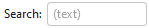
A BarTextBox with an external label
The Label can be auto-generated based on the control's Key property. For instance, a control with Key of "FormatPainter" will automatically assign "Format Painter" as the Label value. The auto-generated default can be overridden by setting the Label property.
Images
The control can display an image via SmallImageSource that helps identify its function. The image is not rendered by the control itself, but can show externally (such as when in a RibbonControlGroup, or when BarMenuControlWrapper wraps BarTextBox in a menu), or in customization UI.
Title
An optional string Title can be specified, which is intended to override the control's Label when displayed in screen tips and customization UI.
Variant Sizes
When a ribbon is in Simplified layout mode, the BarTextBox control will render in a Small variant size by default and will collapse to an overflow menu when necessary. The ToolBarItemCollapseBehavior property can be set to Never to prevent the textbox from ever collapsing to the overflow menu.
See the Resizing and Variants topic for more information on ribbon's variant sizing features.
Requested Width and Star Sizing
It is recommended that textbox controls within ribbon and toolbar contexts specify a width. While the Width property can be set directly, it's better to set the RequestedWidth property. RequestedWidth will ideally measure to the requested width, thereby acting the same as setting Width, but can allow other widths such as in situations like star-sizing. Setting the Width property directly will not allow other possible widths, since it is explicitly forcing a width.
Star-sizing is a handy feature when the control is within a RibbonMultiRowControlGroup. If the BarTextBox.IsStarSizingAllowed property is set to true and the row the BarTextBox is on has some extra width available compared to the other rows, it will expand BarTextBox to fill that width. This makes the overall row widths equal for a more professional appearance. Only one control per row should enable star-sizing.
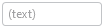
Placeholder Text
Placeholder text is a way to prompt the end user for the type of value that should be entered into the control when no value has been set. For instance, a textbox that is used to search for something might use placeholder text "(search text)".
Placeholder text is faintly rendered when there is no value in the control, and can be designated via the PlaceholderText property.
Key Tips
The controls support key tips. When a control's key tip is accessed, the control is focused.
The KeyTipText can be auto-generated based on the control's Label property. For instance, a control with Label of "Search" will automatically assign "S" as the KeyTipText value. The auto-generated default can be overridden by setting the KeyTipText property.
The KeyTipText properties designate the key tip text to use for the control.
See the Key Tips topic for more information on key tips.
Commands and Events
The ICommand in the Command property is executed when Enter is pressed while the control is focused, or the control's text changes and then focus is lost. This allows the command handler to process a committed text change.
A TextChanged event is raised whenever the control's text changes.
See the Using Commands topic for more information on commands.
Screen Tips
The controls support screen tips, which are formatted tool tips.
The control's Title is used as the default screen tip header, falling back to Label if no Title is available. The ScreenTipHeader property can override the default screen tip header value if desired.
If the control's ToolTip property is set to a value that doesn't derive from a native ToolTip control, such as a string, the value will be used in the screen tip's content area, with the screen tip header becoming bold. The screen tip's content area is where extended descriptions are displayed.
If the optional ScreenTipFooter property is specified, it will appear in a footer area of the screen tip.
See the Screen Tips topic for more information on screen tips.
MVVM Support
The optional companion MVVM Library defines a BarTextBoxViewModel class that is intended to be used as a view models for textboxes.
This view model class maps over to the appropriate view controls described above based on usage context and configure all necessary bindings between the view models and the view controls.
Tip
See the MVVM Support topic for more information on how to use the library's view models and view templates to create and manage your application's bars controls with MVVM techniques.