Overview
Actipro Editors includes a number of pickers that are generally intended to be used within popups. In many cases, the pickers are designed to work with a related edit box of a similar name.
Picker Controls
This table shows the picker controls that are included in the product:
| Name | Description |
|---|---|
|
Allows for the input of a |
|
|
Allows for the input of a |
|
|
Allows for the input of a |
|
|
Allows for the input of a |
|
|
Allows for the input of a |
|
|
Allows for the input of a |
|
|
Allows for the input of a |
|
|
Allows for the input of an |
|
|
Allows for the input of a |
|
|
Allows for the input of an |
|
|
Allows for the input of an |
|
|
Allows for the input of an |
|
|
Allows for the input of an |
|
|
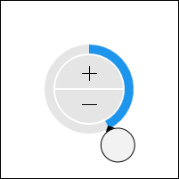
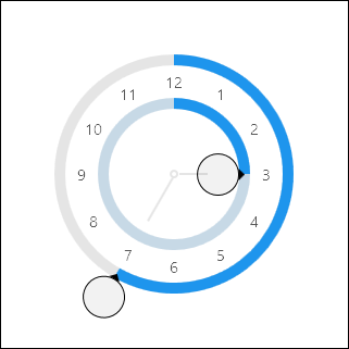
Allows for the input of a |
|
|
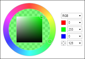
Allows for the input of a color's hue component. |
|
|
Allows for the input of a |
|
|
Allows for the input of a color's saturation and brightness components. |
|
|
Allows for the input of a |
|
|
Allows for the input of a |
|
|
Allows for the input of a |
|
|
Allows for the input of a |
|
|
Allows for the input of a |
|
|
Allows for the input of a |