Application Button
Ribbon supports an application button that can open a menu that is generally populated by application-wide options such as New, Open, and Save.
Either a traditional application menu or more modern backstage can be displayed when the button is clicked. See the respective topics for more details on configuring each style.
The application button can also be hidden if a corresponding menu is not necessary or desired.
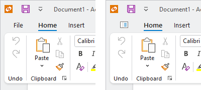
The application button with default and custom content
Defining an Application Button
The application button can be defined in XAML or code-behind by assigning a RibbonApplicationButton control instance to the Ribbon.ApplicationButtonContent property.
Note
See the "MVVM Support" section below for details on alternatively using this property to define the application button via MVVM techniques.
This code sample shows how to define the application button for a ribbon:
xmlns:bars="http://schemas.actiprosoftware.com/winfx/xaml/bars"
...
<bars:RibbonContainerPanel>
	<bars:Ribbon>
		<bars:Ribbon.ApplicationButtonContent>
			<bars:RibbonApplicationButton />
		</bars:Ribbon.ApplicationButtonContent>
	</bars:Ribbon>
</bars:RibbonContainerPanel>
MVVM Support
The application button may also be defined by setting the Ribbon.ApplicationButtonContent property to a view model that generates a RibbonApplicationButton control via the ribbon's ItemContainerTemplateSelector.
The optional companion MVVM Library defines a RibbonApplicationButtonViewModel class that is intended to be used as a view model for a RibbonApplicationButton control, and the BarControlTemplateSelector class in the library generates a RibbonApplicationButton for that view model.
Tip
See the MVVM Support topic for more information on how to use the library's view models and view templates to create and manage your application's bars controls with MVVM techniques.
Customizing the Application Button Style
The RibbonApplicationButton instance can be customized by setting a Style to the Ribbon.ApplicationButtonStyle property. This Style is applied to the control when it is added to the ribbon.
Customizing Default Text
By default, the application button in ribbon will display with the text "File" as its content, which is defined by the string resource UIApplicationButtonText.
String Resource
Changing the UIApplicationButtonText string resource will update the default text of all application button instances used in an application. The key tip for the button is automatically generated from the same string resource, and will typically be the first letter of the text. This code shows how to set a custom value for the string resource:
ActiproSoftware.Products.Bars.SR.SetCustomString(ActiproSoftware.Products.Bars.SRName.UIApplicationButtonText.ToString(), "Home");
See the Customizing String Resources topic for additional details.
Label and KeyTipText Properties
As an alternative to customizing the string resource, the RibbonApplicationButton.Label and RibbonApplicationButton.KeyTipText can be set directly to the desired value as illustrated in the following example:
xmlns:bars="http://schemas.actiprosoftware.com/winfx/xaml/bars"
...
<bars:RibbonContainerPanel>
	<bars:Ribbon>
		<bars:Ribbon.ApplicationButtonContent>
			<bars:RibbonApplicationButton Label="Home" KeyTipText="H" />
		</bars:Ribbon.ApplicationButtonContent>
	</bars:Ribbon>
</bars:RibbonContainerPanel>
Custom Button Content
The RibbonApplicationButton.Content property can be set to any Object which is supported by ContentPresenter, so custom content like an image can easily be used instead of text. The following example shows how to set an image for the content using a DynamicImage:
xmlns:bars="http://schemas.actiprosoftware.com/winfx/xaml/bars"
xmlns:shared="http://schemas.actiprosoftware.com/winfx/xaml/shared"
...
<bars:RibbonContainerPanel>
	<bars:Ribbon>
		<bars:Ribbon.ApplicationButtonContent>
			<bars:RibbonApplicationButton>
				<bars:RibbonApplicationButton.Content>
					<shared:DynamicImage
						Width="16" Height="16"
						Source="/Images/SomeImage.png"
						SnapsToDevicePixels="True"
						Stretch="Uniform" StretchDirection="DownOnly"
						VerticalAlignment="Center"
						/>
				</bars:RibbonApplicationButton.Content>
			</bars:RibbonApplicationButton>
		</bars:Ribbon.ApplicationButtonContent>
	</bars:Ribbon>
</bars:RibbonContainerPanel>
Tip
See the "Application Button" Bars Ribbon QuickStart of the Sample Browser application for a full demonstration of setting the button content.
Hiding the Application Button
If your application does not need an Application Menu or a Backstage, you may want to hide the application button completely by setting the Ribbon.IsApplicationButtonVisible property to false.
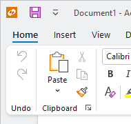
A ribbon with its application button hidden
When hidden, the tabs slide over to fill the space that was previously occupied by the application button.