Application Menu
The application menu is a medium-sized popup that can be displayed when clicking the application button and is generally populated by application-wide menu items such as file operations or printing.
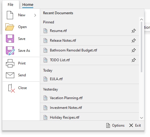
A traditional application menu with optional footer and additional content
A section at the bottom of the application menu is optional and can be used for footer buttons. Generally, buttons for application options and application exiting are displayed there.
Any content can optionally be placed on the far side of the application menu as well. A list of recent documents is commonly displayed there.
See the Backstage topic for details on how to define a more modern alternative to the traditional application menu.
Defining an Application Menu
An application menu is defined by assigning menu items to a RibbonApplicationButton's Items collection and optionally setting other content-based properties.
See the Application Button topic for more details on configuring a ribbon with an application button.
This code sample shows how to define an application menu for a ribbon. Combine it with the code in the following sections to define your application menu and its items.
xmlns:bars="http://schemas.actiprosoftware.com/winfx/xaml/bars"
...
<bars:RibbonContainerPanel>
	<bars:Ribbon>
		<bars:Ribbon.ApplicationButtonContent>
			<bars:RibbonApplicationButton>

				<bars:RibbonApplicationButton.MenuAdditionalContent>
					<!-- Additional content goes here -->
				<bars:RibbonApplicationButton.MenuAdditionalContent>

				<bars:RibbonApplicationButton.MenuFooter>
					<!-- Footer content goes here -->
				<bars:RibbonApplicationButton.MenuFooter>

				<!-- Menu items go here -->

			</bars:RibbonApplicationButton>
		</bars:Ribbon.ApplicationButtonContent>
	</bars:Ribbon>
</bars:RibbonContainerPanel>
Warning
If Ribbon.BackstageContent is assigned, backstage will be used instead of any defined application menu.
Defining Menu Items
Menu items that appear on the near side of the application menu are defined via the RibbonApplicationButton's Items collection.
Common control types that would be used here include: BarMenuItem, BarSplitMenuItem, BarMenuSeparator, and BarMenuHeading.
This code defines the root items for a typical application menu.
xmlns:bars="http://schemas.actiprosoftware.com/winfx/xaml/bars"
...
<bars:RibbonApplicationButton>

	<!-- Menu items -->
	<bars:BarMenuItem Key="New" LargeImageSource="/Images/New32.png" SmallImageSource="/Images/New16.png" UseLargeSize="True">
		<bars:BarMenuItem Key="PlainText" Command="ApplicationCommands.New" CommandParameter="PlainText" LargeImageSource="/Images/BlankPage32.png" SmallImageSource="/Images/BlankPage16.png" UseLargeSize="True" Description="A plain text document" />
		<bars:BarMenuItem Key="RichText" Command="ApplicationCommands.Open" CommandParameter="RichText" LargeImageSource="/Images/RichTextDocument32.png" SmallImageSource="/Images/RichTextDocument16.png" UseLargeSize="True" Description="A text document with rich formatting" />
	</bars:BarMenuItem>
	<bars:BarMenuItem Key="Open" Command="ApplicationCommands.Open" LargeImageSource="/Images/Open32.png" SmallImageSource="/Images/Open16.png" UseLargeSize="True" />
	<bars:BarMenuItem Key="Save" Command="ApplicationCommands.Save" LargeImageSource="/Images/Save32.png" SmallImageSource="/Images/Save16.png" UseLargeSize="True" />
	<bars:BarMenuItem Key="SaveAs" Label="Save As" KeyTipText="A" Command="ApplicationCommands.SaveAs" LargeImageSource="/Images/SaveAs32.png" SmallImageSource="/Images/SaveAs16.png" UseLargeSize="True" />
	<bars:BarMenuSeparator />
	<bars:BarMenuItem Key="Print" Command="ApplicationCommands.Print" LargeImageSource="/Images/Print32.png" SmallImageSource="/Images/Print16.png" UseLargeSize="True" />
	<bars:BarMenuItem Key="Send" KeyTipText="D" Command="ApplicationCommands.NotACommand" LargeImageSource="/Images/Mail32.png" SmallImageSource="/Images/Mail16.png" UseLargeSize="True" />
	<bars:BarMenuSeparator />
	<bars:BarMenuItem Key="Close" Command="ApplicationCommands.Close" LargeImageSource="/Images/Close32.png" SmallImageSource="/Images/Close16.png" UseLargeSize="True" />

</bars:RibbonApplicationButton>
Defining Footer Content
The RibbonApplicationButton.MenuFooter property can be set to any Object which is supported by ContentPresenter.
Since the footer is commonly used to display buttons for configuring options or exiting the application, the following sample demonstrates using a StackPanel as the footer content. Instances of BarButton are used for the buttons so Key Tips are properly supported.
xmlns:bars="http://schemas.actiprosoftware.com/winfx/xaml/bars"
...
<bars:RibbonApplicationButton>

	<bars:RibbonApplicationButton.MenuFooter>
		<StackPanel Margin="0,4" Orientation="Horizontal" HorizontalAlignment="Right">
			<bars:BarButton Key="Options" KeyTipText="I" Command="ApplicationCommands.NotACommand" SmallImageSource="/Images/Options16.png" VariantSize="Medium" />
			<bars:BarButton Key="Exit" KeyTipText="X" Margin="7,0" Command="ApplicationCommands.NotACommand" SmallImageSource="/Images/Exit16.png" VariantSize="Medium" />
		</StackPanel>
	<bars:RibbonApplicationButton.MenuFooter>

</bars:RibbonApplicationButton>
Defining Additional Content (Far Side)
The RibbonApplicationButton.MenuAdditionalContent property can be set to any Object which is supported by ContentPresenter.
This code defines a simple TextBlock as content for the far side of the application menu, but you can create your own complex custom control to fill this space.
xmlns:bars="http://schemas.actiprosoftware.com/winfx/xaml/bars"
...
<bars:RibbonApplicationButton>

	<bars:RibbonApplicationButton.MenuAdditionalContent>
		<TextBlock>My content here...</TextBlock>
	<bars:RibbonApplicationButton.MenuAdditionalContent>

</bars:RibbonApplicationButton>
Many applications will want to place our Recent Documents control into the application menu's additional content. This control displays a list of recently opened documents that can be maintained in code-behind and supports pinning of the documents so that they don't fall off the list when newer documents are opened.
This code defines a Recent Documents list as the application menu's additional content.
xmlns:bars="http://schemas.actiprosoftware.com/winfx/xaml/bars"
...
<bars:RibbonApplicationButton>

	<bars:RibbonApplicationButton.MenuAdditionalContent>
		<DockPanel>
			<TextBlock DockPanel.Dock="Top" Margin="10,6" Text="Recent Documents" FontWeight="SemiBold" />
			<bars:RecentDocumentControl Width="350" Height="350" UseLargeSize="False" />
		</DockPanel>
	<bars:RibbonApplicationButton.MenuAdditionalContent>

</bars:RibbonApplicationButton>
Tip
See the "Application Menu" Bars Ribbon QuickStart of the Sample Browser application for a full demonstration of setting the button content.
Tip
See the "Recent Documents" Bars Ribbon QuickStart of the Sample Browser application for a full demonstration of showing recent files in the application menu.