Backstage
The backstage was introduced in Office 2010 and can be displayed when clicking the application button. It is commonly used for file-based actions like New, Open, and Save. When it is opened, the backstage takes over the entire window. A subtle animation is used when opening/closing to help provide a smooth transition.
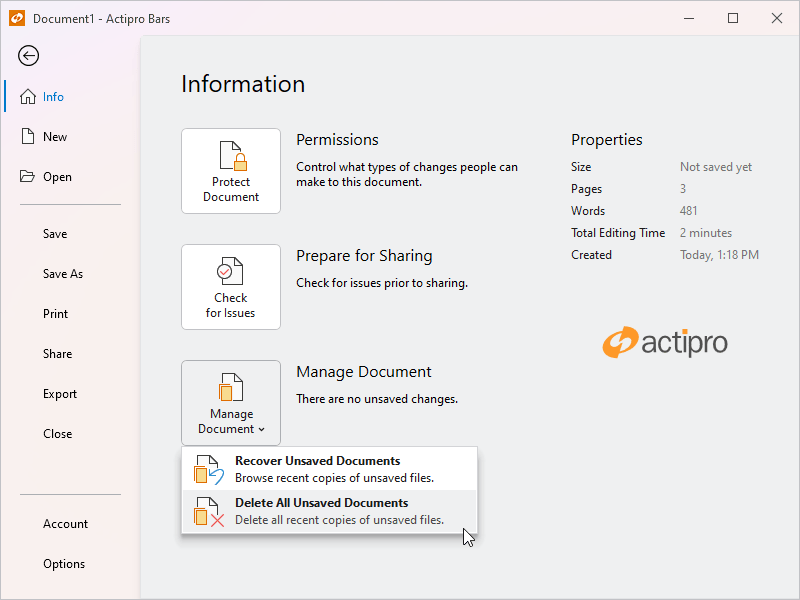
A backstage with styled buttons and backdrop effect
The backstage is organized such that buttons and tabs appear on the near side (the header area) and the selected tab's content appears on the far side (the content area).
Important
A ribbon must be hosted within a RibbonWindow and RibbonContainerPanel to support the backstage taking over the entire window.
Note
See the Application Menu topic for details on how to define a more traditional application menu instead of a backstage.
Defining a Backstage
The backstage can be defined in XAML or code-behind by assigning a RibbonBackstage control instance to the Ribbon.BackstageContent property.
Note
See the "MVVM Support" section below for details on alternatively using this property to define the backstage via MVVM techniques.
This code sample shows how to define a backstage for a ribbon.
xmlns:bars="http://schemas.actiprosoftware.com/winfx/xaml/bars"
...
<bars:RibbonContainerPanel>
	<bars:Ribbon>
		<bars:Ribbon.BackstageContent>
			<bars:RibbonBackstage>

				<!-- Tabs, buttons and separators go here in any order -->

				<bars:RibbonBackstageTabItem Key="Info">
					<!-- Tab content goes here -->
				</bars:RibbonBackstageTabItem>
				<bars:RibbonBackstageHeaderSeparator />
				<bars:RibbonBackstageHeaderButton Key="Save" Command="ApplicationCommands.Save" />

				<!-- The following are aligned to the bottom -->
				<bars:RibbonBackstageHeaderSeparator HeaderAlignment="Bottom" />
				<bars:RibbonBackstageTabItem Key="Options" HeaderAlignment="Bottom">
					<!-- Tab content goes here -->
				</bars:RibbonBackstageTabItem>
				<bars:RibbonBackstageHeaderButton Key="Exit" HeaderAlignment="Bottom" />

			</bars:RibbonBackstage>
		</bars:Ribbon.BackstageContent>
	</bars:Ribbon>

	<!-- Content below the ribbon goes here -->

</bars:RibbonContainerPanel>
Important
The Ribbon that defines a backstage should be a child of a RibbonContainerPanel for the backstage to display properly. When a backstage is opened, it will cover the entire area defined by the RibbonContainerPanel (with additional support when hosted inside a RibbonWindow). See the Control Hierarchy topic for more information on optionally defining the Ribbon inside a ContentControl.
Header Area Transparency
The backstage template is set up to use a transparent background in its tab header area when a system backdrop like Mica (available starting in Windows 11) is enabled on the containing Window's WindowChrome. It is important to use the control hierarchy described above that involves RibbonContainerPanel, as the panel will hide when backstage is open, allowing the system backdrop background to show through to the backstage header area instead of content like a ribbon control that is underneath the backstage.
In a scenario where there is other content outside of the panel that is showing in the backstage header area when backstage is open, it can be hidden in response to the RibbonBackstage.IsOpenChanged event that bubbles up.
When the containing window's chrome is not configured to use a system backdrop, or on pre-Windows 11 systems, the backstage header area will use an opaque background.
See the WindowChrome topic for complete details on the application and operating system requirements necessary to support transparency.
MVVM Support
The backstage may also be defined by setting the Ribbon.BackstageContent property to a view model that generates a RibbonBackstage control via the ribbon's ItemContainerTemplateSelector.
The optional companion MVVM Library defines a RibbonBackstageViewModel class that is intended to be used as a view model for a RibbonBackstage control, and the BarControlTemplateSelector class in the library generates a RibbonBackstage for that view model.
Tip
See the MVVM Support topic for more information on how to use the library's view models and view templates to create and manage your application's bars controls with MVVM techniques.
Customizing the Backstage Style
The RibbonBackstage instance can be customized by setting a Style to the Ribbon.BackstageStyle property. This Style is applied to the control when it is added to the ribbon.
Defining Backstage Items
The RibbonBackstage control can contain these types of controls, which appear vertically in its header area: RibbonBackstageHeaderButton, RibbonBackstageTabItem, and RibbonBackstageHeaderSeparator.
Controls with the same header alignment appear in the order in which they are defined in the RibbonBackstage. This allows you to freely intermix the order of buttons, tabs, and any separators. By default, each item is aligned to the top but setting the control's HeaderAlignment property to RibbonBackstageHeaderAlignment.Bottom will shift the alignment to the bottom.
Buttons
RibbonBackstageHeaderButton controls generally appear at the top and bottom of the backstage header area. They are often set to the most common application commands such as Save, that can be easily executed with one click.
These buttons will close the ancestor RibbonBackstage when they are clicked. This behavior can be disabled by setting the button's CanCloseBackstage property to false.
Tabs
RibbonBackstageTabItem controls can be added when there are multiple configuration possibilities or there is data that needs to be displayed. For instance, an Info tab may provide information and statistics about the current document. A Recent tab might show a Recent Documents control (with its UseLargeSize property set to true) allowing for recent documents to be selected. A New tab might show multiple options for creating new documents.
The Label and optional image (LargeImageSource or SmallImageSource) of the RibbonBackstageTabItem are what is rendered in the backstage header area. The tab's content is displayed in the backstage content area when the tab is selected.
When there are not many tabs or buttons to display in the backstage, the backstage can look empty. This is common, for example, when an application is first launched and no document is open. To help fill the vertical space, the RibbonBackstageTabItem.VariantSize can be set to Large to display tabs that are significantly larger.
Note
The header of a tab is automatically generated, so any content assigned to the RibbonBackstageTabItem.Header property is ignored.
Separators
RibbonBackstageHeaderSeparator can be added to separate buttons or tabs in the header area like separators on a menu. Use separators to visually group related items.
Auto-Selecting a Tab When Backstage Opens
The first tab is auto-selected if no tab is currently selected when the backstage opens or when the RibbonBackstage.CanSelectFirstTabOnOpen property is true, which is that property's default value.
The RibbonBackstage.IsOpen property gets or sets whether the backstage is currently open. A related RibbonBackstage.IsOpenChanged event is raised whenever that property changes. This is an ideal place to initialize the backstage so that a certain tab is always selected when it opens.
The event handler for the RibbonBackstage.IsOpenChanged event can check to see if the backstage is being opened and, if so, ensure the RibbonBackstage.SelectedItem property is set to the desired tab.
Set the RibbonBackstage.CanSelectFirstTabOnOpen property to false if the selected tab will be set programmatically.
TaskTabControl
The TaskTabControl is a styled version of a native TabControl that renders its tabs on the left side. The selected tab's content appears on the right side. This tab control is ideal for use on a RibbonBackstageTabItem since it provides a secondary level of tabs. It can be used externally to backstage as well.
A TaskTabControl with a styled BarButton on the selected tab
The items of a TaskTabControl can be either TaskTabItem or standard Separator controls.
Use the TaskTabItem.Label and TaskTabItem.LargeImageSource properties to define the tab header.
Backstage Button Styles
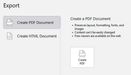
The backstage content area commonly uses large buttons. Both the BarButton and BarPopupButton controls have special styles that can be applied to display as a large button.
Use of those styles results in buttons with an appearance similar to Office's Backstage, and as seen in the TaskTabControl screenshot above. The following example shows how to apply the styles :
xmlns:bars="http://schemas.actiprosoftware.com/winfx/xaml/bars"
xmlns:themes="http://schemas.actiprosoftware.com/winfx/xaml/themes"
...
<bars:BarButton Style="{StaticResource {x:Static themes:BarsResourceKeys.RibbonBackstageButtonStyleKey}}" />
<bars:BarPopupButton Style="{StaticResource {x:Static themes:BarsResourceKeys.RibbonBackstagePopupButtonStyleKey}}" />
Preventing Backstage from Closing
The RibbonBackstage.CanClose property can be set to false which prevents the backstage from closing by hiding the close button and ignoring the Esc key that typically closing backstage.
This is useful in scenarios where you are starting up an application and wish to block end user access to the main window until they create a new document or open a document. These or other actions can be presented on a non-closable backstage.
Tip
See the "Backstage" Bars Ribbon QuickStart of the Sample Browser application for a full demonstration of configuring a backstage.