Tabs, Groups, and Control Groups
Perhaps the most iconic feature of a ribbon is the use of tabs to organize controls that are further organized by groups within a tab.
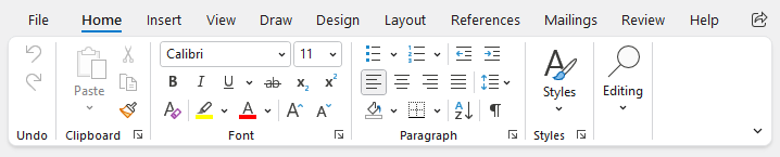
Ribbon tabs, groups, and control groups
Tabs
The Ribbon is an ItemsControl whose item containers are instances of RibbonTabItem. The label of each tab is displayed along the top of the ribbon, and selecting a tab will display the groups of controls configured for that tab.
Label
Tabs have a string Label that can be set, which is visible in UI as the header for the tab.
The Label can be auto-generated based on the tab's Key property. For instance, a tab with Key of "TableDesign" will automatically assign "Table Design" as the Label value. The auto-generated default can be overridden by setting the Label property.
See the Label and Key Tip Generation topic for more information on auto-generated labels.
Key Tips
Tabs support key tips. When a tab's key tip is accessed, the tab is selected and its child key tip scope is activated to further access controls contained within the tab.
The RibbonTabItem.KeyTipText can be auto-generated based on the tab's Label property. For instance, a tab with Label of "Home" will automatically assign "H" as the KeyTipText value. The auto-generated default can be overridden by setting the KeyTipText property.
Tip
Since the Key will auto-generate a Label, and Label will auto-generate KeyTipText, it is often only necessary to specify the Key and allow both the Label and KeyTipText to be auto-generated!
See the Key Tips topic for more information on key tips.
Defining Tabs
The following sample shows a ribbon with Home and View tabs defined using labels and key tips that are auto-generated from the defined key:
xmlns:bars="http://schemas.actiprosoftware.com/winfx/xaml/bars"
...
<bars:RibbonContainerPanel>
	<bars:Ribbon>

		<!-- Other ribbon configuration here -->

		<!-- Define tabs -->
		<bars:RibbonTabItem Key="Home" ... >
			<!-- Tab groups here -->
		</bars:RibbonTabItem>
		<bars:RibbonTabItem Key="View" ... >
			<!-- Tab groups here -->
		</bars:RibbonTabItem>
		...

	</bars:Ribbon>
</bars:RibbonContainerPanel>
See the "MVVM Support" section below for details on alternatively binding the items using MVVM techniques.
MVVM Support
The tabs may also be defined by setting the Ribbon.ItemsSource property to an enumerable of view models that generate RibbonTabItem controls via the ribbon's ItemContainerTemplateSelector.
The optional companion MVVM Library defines a RibbonTabViewModel class that is intended to be used as a view model for a RibbonTabItem control, and the BarControlTemplateSelector class in the library generates a RibbonTabItem for that view model.
Tip
See the MVVM Support topic for more information on how to use the library's view models and view templates to create and manage your application's bars controls with MVVM techniques.
Contextual Tabs
Most ribbon tabs are always visible, but some tabs are only relevant when the application is in a specific state. These are called "contextual tabs".
See the Contextual Tabs topic for more details on that feature.
Hiding Tabs
Some applications with only one ribbon tab may wish to hide the tab row entirely, so that a minimal ribbon is presented. This appearance can be achieved by setting these Ribbon properties:
- AreTabsVisible =
false - IsApplicationButtonVisible =
false - TabRowToolBarContent =
null
Groups
Groups are used to organize related controls within a tab and can have a different effect based on the ribbon's layout mode.
Classic Layout Mode
In the Classic layout mode, groups are prominently displayed in the UI with separators between each group and the label at the bottom. When there is not enough space to display all of the controls in a ribbon, a group may collapse to a single button that will display the group's controls in a popup when accessed.
See the Resizing and Variants topic for more details on how groups impact resizing and how to prevent a group from collapsing.
See the Layout Modes and Density topic for more details on Classic mode.
Simplified Layout Mode
In the Simplified layout mode, controls still visible in the ribbon will render a separator between groups. Any controls that have moved to the Tab Overflow menu will be organized under a header based on the containing group's label. Groups can optionally be configured to overflow to their own menu instead of the common Tab Overflow menu.
See the Resizing and Variants topic for more details on how groups impact resizing and how to configure a Group Overflow menu.
See the Layout Modes and Density topic for more details on Simplified mode.
Label
Groups have a string Label that can be set, which is visible in UI below the group (Classic layout mode) or in the Tab Overflow menu (Simplified layout mode).
The Label can be auto-generated based on the group's Key property. For instance, a group with Key of "FontSettings" will automatically assign "Font Settings" as the Label value. The auto-generated default can be overridden by setting the Label property.
See the Label and Key Tip Generation topic for more information on auto-generated labels.
Label Mode
Group labels only show by default on the ribbon when in Classic layout mode. In scenarios where a ribbon in Simplified layout mode should also show group labels, set the Ribbon.GroupLabelMode property to Always instead of its default value of Default.
Collapsed Button Key Tip (Classic layout mode only)
When a group in the Classic layout mode is collapsed to a button, the collapsed button supports key tips. When the key tip of a group's collapsed button is accessed, the content of the group is displayed in a popup.
Note
A convention used by Office applications is for the key tip of collapsed groups to use two-letter tips that start with "Z". For example, "ZF" might be the key tip for the collapsed button of a Font group.
The RibbonGroup.KeyTipText can be auto-generated based on the group's Label property. Based on the convention noted above, the auto-generated key tip will be prefixed with "Z" to match the convention. For instance, a group with Label of "Font" will automatically assign "ZF" as the CollapsedButtonKeyTipText value. The auto-generated default can be overridden by setting the CollapsedButtonKeyTipText property.
Tip
Since the Key will auto-generate a Label, and Label will auto-generate CollapsedButtonKeyTipText, it is often only necessary to specify the Key and allow both the Label and CollapsedButtonKeyTipText to be auto-generated!
See the Key Tips topic for more information on key tips.
Launcher Button
A RibbonGroup can display a launcher button on the far-bottom corner of the group. This button is defined by assigning an object to the RibbonGroup.LauncherButtonContent property. Typically, this property is set to an instance of RibbonGroupLauncherButton, but can alternatively use a view model as described in "MVVM Support" section below.
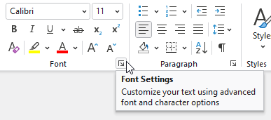
A ribbon group's launcher button
Launcher buttons should be used to display additional UI (e.g., a dialog window or control panel) that contains advanced functionality related to the group that is not available within the ribbon control. For instance, a Font group in the ribbon might display basic controls to select font family and size, but the launcher button could open a dialog with even more font options.
The launcher button is configured in a manner consistent with other Bars button controls including support for common properties like Command, Key, Label (with support to auto-generate from Key), and KeyTipText (with support to auto-generate from Label). Screen Tips are also supported.
Unlike other buttons, however, the SmallImageSource property does not define the button content. Instead, this image is only displayed when the ribbon is using the Simplified layout mode and the launcher button has been moved to an overflow menu. In the overflow menu, the icon will be displayed in the icon column consistent with other menu items.
Defining Groups
The following XAML sample demonstrates how to define a RibbonGroup using labels and key tips that are auto-generated from the defined key:
xmlns:bars="http://schemas.actiprosoftware.com/winfx/xaml/bars"
...
<bars:RibbonTabItem Key="Home" ... >

	<!-- Tab groups here -->
	<bars:RibbonGroup Key="FontSettings">

		<!-- Launcher button -->
		<bars:RibbonGroup.LauncherButtonContent>
			<bars:RibbonGroupLauncherButton
				Key="FontSettingsLauncher"
				Label="Font Settings"
				KeyTipText="FN"
				ToolTip="Customize your text to give it the exact look you want."
				Command="{Binding OpenFontSettingsCommand}" />
		</bars:RibbonGroup.LauncherButtonContent>

		<!-- Define controls and/or control groups here -->
		<bars:BarButton Key="IncreaseFontSize" ... />
		...

	</bars:RibbonGroup>
</bars:RibbonTabItem>
...
See the "MVVM Support" section below for details on alternatively binding the items using MVVM techniques.
MVVM Support
The groups may also be defined by setting the RibbonTabItem.ItemsSource property to an enumerable of view models that generate RibbonGroup controls via the ribbon's ItemContainerTemplateSelector.
A group's launcher button may be defined by setting the RibbonGroup.LauncherButtonContent property to a view model that generates a RibbonGroupLauncherButton control via the ribbon's ItemContainerTemplateSelector.
The optional companion MVVM Library defines a RibbonGroupViewModel class that is intended to be used as a view model for a RibbonGroup control, and the BarControlTemplateSelector class in the library generates a RibbonGroup for that view model. The library also defines a RibbonGroupLauncherButtonViewModel class that is intended to be used as a view model for a RibbonGroupLauncherButton control.
Tip
See the MVVM Support topic for more information on how to use the library's view models and view templates to create and manage your application's bars controls with MVVM techniques.
Control Groups (Classic layout mode only)
A RibbonControlGroup is only relevant when a ribbon is using the Classic layout mode and can be omitted if only the Simplified layout mode is to be supported.
The primary purpose of a RibbonControlGroup is to enable variant sizing of the controls within the group. See the Resizing and Variants topic for more details on resizing.
Defining Control Groups
The following XAML demonstrates how a control group might be used to achieve a result similar to Office's Clipboard group where the Paste control is always a large button and the related Cut, Copy, and Format Painter controls are stacked vertically in a group that never uses the Large variant size:
xmlns:bars="http://schemas.actiprosoftware.com/winfx/xaml/bars"
...
<bars:RibbonTabItem Key="Home" ... >

	<bars:RibbonGroup Key="Clipboard">

		<!-- Large Paste control -->
		<bars:BarSplitButton Key="Paste" ... > ... </bars:BarSplitButton>

		<!-- Group of other clipboard controls -->
		<bars:RibbonControlGroup ItemVariantBehavior="NeverLarge">
			<bars:BarButton Key="Cut" Command="Cut" SmallImageSource="/Images/Cut16.png" />
			<bars:BarButton Key="Copy" Command="Copy" SmallImageSource="/Images/Copy16.png" />
			<bars:BarButton Key="FormatPainter" Command="{Binding FormatPainterCommand}" SmallImageSource="/Images/FormatPainter16.png" />
		</bars:RibbonControlGroup>

	</bars:RibbonGroup>
	...

</bars:RibbonTabItem>
...
See the "MVVM Support" section below for details on alternatively binding the items using MVVM techniques.
MVVM Support
The control groups may also be defined by setting the RibbonGroup.ItemsSource property to an enumerable of view models that generate RibbonControlGroup controls via the ribbon's ItemContainerTemplateSelector.
The optional companion MVVM Library defines a RibbonControlGroupViewModel class that is intended to be used as a view model for a RibbonControlGroup control, and the BarControlTemplateSelector class in the library generates a RibbonControlGroup for that view model.
Tip
See the MVVM Support topic for more information on how to use the library's view models and view templates to create and manage your application's bars controls with MVVM techniques.
Horizontal Alignment
When a RibbonControlGroup is within a RibbonGroup and is vertically stacking its items (Medium or Small variant sizes), the RibbonControlGroup.HorizontalContentAlignment property determines how the items are horizontally aligned. The default value is Left.
In some cases, such as when using ItemVariantBehavior.AlwaysMedium for a set of buttons, it may be preferred to ensure all items are the same width by using the HorizontalAlignment.Stretch option. This can be particularly useful when the items are popup buttons or split buttons since the dropdown arrows will align on the right, even though the buttons have different label lengths.
Multi-Row Control Groups (Classic layout mode only)
A RibbonMultiRowControlGroup is only relevant when a ribbon is using the Classic layout mode and can be omitted if only the Simplified layout mode is to be supported.
The primary purpose of a RibbonMultiRowControlGroup is to display contained controls in two or three rows within the parent ribbon group. See the Resizing and Variants topic for more details on resizing.
Defining Multi-Row Control Groups
The following XAML demonstrates how a multi-row control group might be used to display a set of controls that show in two or three rows, depending on available space:
xmlns:bars="http://schemas.actiprosoftware.com/winfx/xaml/bars"
...
<bars:RibbonTabItem Key="Home" ... >

	<bars:RibbonGroup Key="FontGroup" Label="Font">

		<bars:RibbonMultiRowControlGroup>

			<!-- Don't render separators next to this set of comboboxes -->
			<bars:RibbonControlGroup SeparatorMode="Never">
				<bars:BarComboBox
					x:Name="fontFamilyComboBox"
					IsStarSizingAllowed="True"
					KeyTipText="FF"
					MenuResizeMode="Vertical"
					RequestedWidth="115"
					SelectedValuePath="Value"
					TextPath="Label"
					UseMenuItemAppearance="True"
					/>
				<bars:BarComboBox
					x:Name="fontSizeComboBox"
					KeyTipText="FS"
					MenuResizeMode="Vertical"
					RequestedWidth="40"
					SelectedValuePath="Value"
					TextPath="Label"
					UseMenuItemAppearance="True"
					/>
			</bars:RibbonControlGroup>

			<!-- Larger and smaller font size buttons -->
			<bars:RibbonControlGroup>
				<bars:BarButton Key="Larger" SmallImageSource="/Images/GrowFont16.png" KeyTipText="FG" />
				<bars:BarButton Key="Smaller" SmallImageSource="/Images/ShrinkFont16.png" KeyTipText="FK" />
			</bars:RibbonControlGroup>

			<!-- Bold, italic, and underline buttons -->
			<bars:RibbonControlGroup>
				<bars:BarButton Key="Bold" SmallImageSource="/Images/Bold16.png" KeyTipText="B" />
				<bars:BarButton Key="Italic" SmallImageSource="/Images/Italic16.png" KeyTipText="I" />
				<bars:BarButton Key="Underline" SmallImageSource="/Images/Underline16.png" KeyTipText="U" />
			</bars:RibbonControlGroup>

		</bars:RibbonMultiRowControlGroup>

	</bars:RibbonGroup>
	...

</bars:RibbonTabItem>
...
See the "MVVM Support" section below for details on alternatively binding the items using MVVM techniques.
MVVM Support
A multi-row control group may also be defined by setting the RibbonGroup.ItemsSource property to an enumerable of view models, one of which generates a RibbonMultiRowControlGroup control via the ribbon's ItemContainerTemplateSelector.
The optional companion MVVM Library defines a RibbonMultiRowControlGroupViewModel class that is intended to be used as a view model for a RibbonMultiRowControlGroup control, and the BarControlTemplateSelector class in the library generates a RibbonMultiRowControlGroup for that view model.
Tip
See the MVVM Support topic for more information on how to use the library's view models and view templates to create and manage your application's bars controls with MVVM techniques.