Overview
Actipro Views is a suite of controls and panels that supports fluid animations of the child elements arrangement. The controls offer stunning effects, life like interaction, and are highly configurable. Different animations can be applied to elements entering or leaving the panel, as well as elements simply moving to a new location or changing size. Several built-in animations are provided that allow elements to be smoothly moved, sized, faded, scaled, rotated, or translated.
Several controls are included such as those for building a settings interface (SettingsCard, SettingsExpander, and SettingsGroup), a TaskBoard for visually organizing tasks, Book for presenting a page turning interface, and InertiaScrollViewer for a smoothly animated variation of ScrollViewer.
Animated panels are also provided, including drop-in replacements for Canvas, DockPanel, StackPanel, and WrapPanel. A "switch" panel is also included that delegates the layout of the child elements, which allows for the layout to be dynamically changed during runtime. Custom panels can be created that automatically support animation and can be used in the "switch" panel.
Features
Controls
- Book - An
ItemsControlthat presents the items as pages in a book. - InertiaScrollViewer - A smooth-scrolling
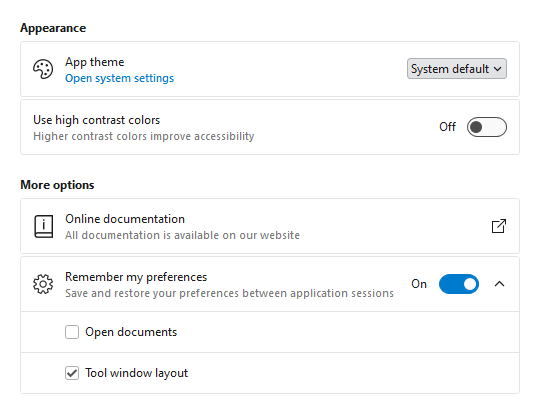
ScrollViewer-like control that reacts to touch and continues gliding to a stop when flicked. - SettingsCard, Settings Expander, and SettingsGroup - A collection of controls used together to organize and present configurable settings.
- TaskBoard - Provides a board of reorderable columns and cards.
Built-in Panels
- AnimatedCanvas - Represents a panel that positions child elements using explicit coordinates that are relative to the panel.
- AnimatedDockPanel - Represents a panel that positions child elements either horizontally or vertically, relative to each other.
- AnimatedStackPanel - Represents a panel that positions child elements in sequential order, either horizontally or vertically.
- AnimatedWrapPanel - Represents a panel that positions child elements in sequential order, breaking content to the next row or column at the edge of the containing box.
- FanPanel - Represents a panel that positions child elements along the z-axis, while keeping a focal item centered in the view.
- MultiColumnPanel - Represents a panel that can arrange child elements in columns based on available width.
- SwitchPanel - Represents a panel that delegates the positioning of the child elements to one or more child panels.
- ZapPanel - Represents a panel that positions child elements in sequential order, while keeping a focal item centered in the view.
General Features
- Several built-in panels can be used as drop-in replacements for native WPF panels.
- Custom panels can be built which automatically support animation and can be used in
AnimatedSwitchPanel. - SwitchPanel can be used to dynamically change the measure/arrange logic without moving child elements.
- AnimatedWrapPanel allows empty space to be evenly distributed along the oriented axis.
Animation Features
- Several built-in animations including moving, sizing, fading, scaling, rotating, translating.
- Supports custom animations which can extend or completely replace built-in animations.
- Different animations can be applied to elements entering, leaving, or updating position in the panel.
- Quickly customize the animation settings, such as setting an acceleration or deceleration ratio.
Layout, Globalization, and Accessibility Features
- Right-to-left support is fully integrated for languages such as Hebrew or Arabic.
- Follows the WPF accessibility model for UI automation.
This product is written in 100% pure C#, and includes detailed documentation and samples.