 Bill Henning (Actipro)
Actipro WPF Controls v2020.1 development is in progress, and the new version’s main goals are to modernize our UI control features/themes, and make theme customization much easier.
In our previous post, we introduced the new WPF Theme Designer application that will come with the v2020.1 WPF Controls and provides a visual way to customize theme definitions.
In today’s post, we’ll take a look at the app’s visual representation of the generated color palette, and some theme definition settings that affect the colors that are generated.
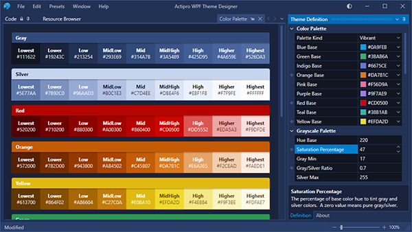
Color Palettes
The Theme Designer app has a Color Palette tab that displays all of the colors that are generated as part of the theme generation process. Each one of these colors is accessible via Brush asset resources that you can reuse in your application. The colors in each ramp are named based on their contrast level relative to the theme intent (light/dark).
The Theme Definition tool window on the right is where we configure the theme definition. You can see it lists various base colors to use for each color ramp. Those base colors translate over to the MidHigh contrast colors in the each ramp. We use a specially-designed algorithm to generate a pleasing ramp of colors around each base color. You can adjust the base color to whatever you need so that the generated color ramp fits with your app’s own branding.
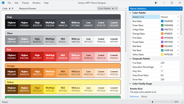
What you see in the screenshot above is the app with a default Light theme. Let’s change it a bit so that we crank up the saturation of the blue hue tint on the grayscale color ramps, and let’s also adjust several of the base colors. The small diamonds next to several theme definition properties indicate the properties that have been changed from the base Light theme preset.
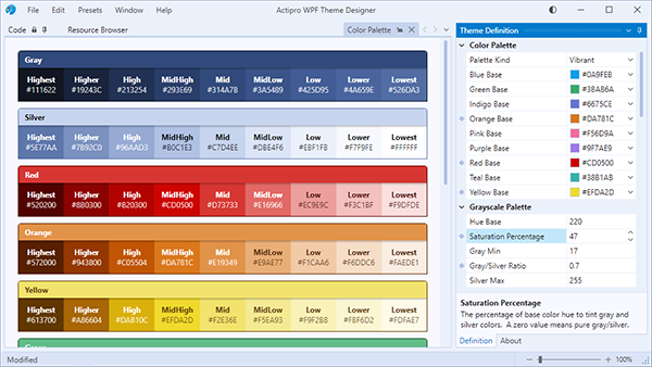
Notice how there is now a blue tint throughout the UI and the color ramps for red, orange, and yellow have altered as well.
Next, we’ll flip to a dark theme intent.
Again, you see how the blue hue permeates through the grayscale portions of UI due to the hue saturation being turned up.
Summary
By changing several properties on the theme definition, we’ve completely altered and customized the look of our app. This same thing will work in your own app since the Theme Designer outputs the code to paste into your App.OnStartup logic to reproduce the same theme.
Post in the comments below with any questions or comments on the WPF Theme Designer application.
Beta Testers Wanted
We are currently beta testing v2020.1 and would love to have more customers involved. If you would like to assist us in testing, please write us at our support address. We would like individuals who are already licensed for the 2019.1 version, are willing to use beta versions of 2020.1 (.NET Core or .NET Framework), and who want to provide feedback, especially in the area of our themes updates.