This version contains an enormous number of updates across the WPF control product line.
See the related announcement post for the detailed list of enhancements and updates.
 Bill Henning (Actipro)
This version contains an enormous number of updates across the WPF control product line.
See the related announcement post for the detailed list of enhancements and updates.
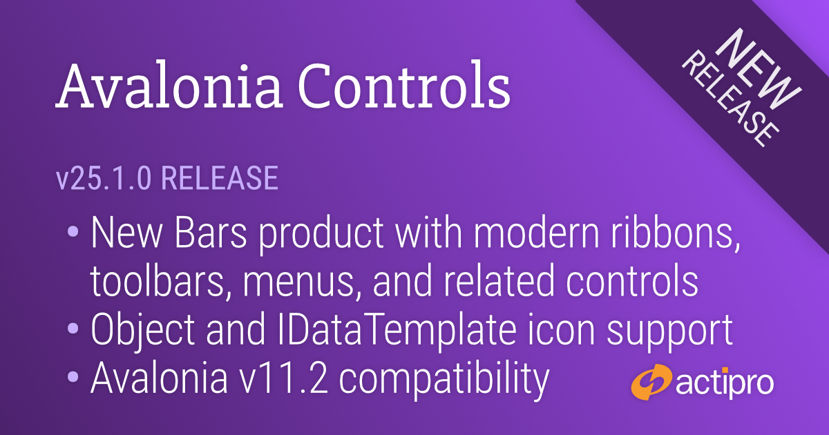
This massive release contains our new Bars product with modern ribbon, toolbar, menu and related control implementations that allow you to replicate Office-like user interfaces, right in your Avalonia applications. Numerous enhancements were made to add support for template-based icons in our controls. And finally, the Actipro native control themes were updated to be compatible with Avalonia v11.2.
See the related announcement post for the detailed list of enhancements and updates.
Here’s a look at some of the new features.
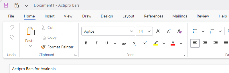
Ribbon consolidates all commands into a single location, which is easy to use and scales well, thereby providing fast access to all commands regardless of window size. The entire layout of child controls can be tailored to ensure the most important commands are prominently available. Through the use of variant layout phases, you can achieve nearly any dynamic layout that you find in Office.
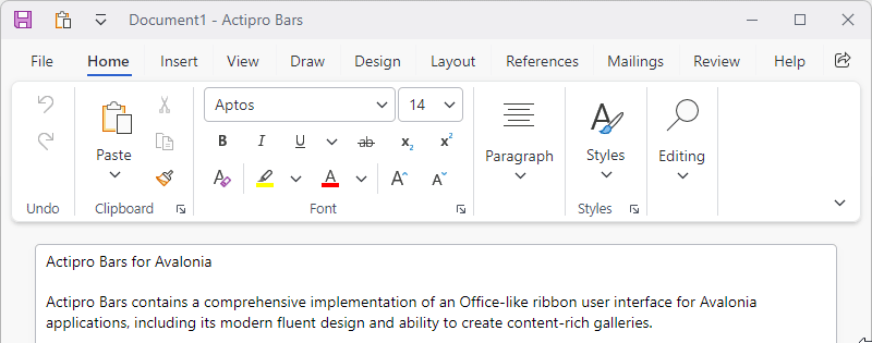
Classic layout mode uses a taller ribbon with a combination of large buttons and multi-row groups of controls and is ideal for large applications with lots of commands. Whereas Simplified layout mode is a modern refinement that uses a single row of controls and supports overflow. Ribbon can instantly toggle between the two modes.
Show color palettes using the many available gallery display options. Colors can be categorized, and color shades can be generated.
Galleries can appear on ribbons or menus, and can custom render items to show anything from bullets or symbols to text styles.
Screen tips are advanced tool tips with a standardized layout for bar controls, and intelligently display below the ribbon.
Key tips provide easy keyboard access to any control on the ribbon or in its popups, even on backstage.
The ribbon File button's backstage consists of application-wide commands such as for file operations and other functionality like printing.
The user interface can switch between compact (seen here), normal, and spacious densities. Spacious densities are more touch friendly.
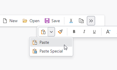
A standalone toolbar control is flexible enough to be used in several contexts and can host any of the galleries or controls that are used in a ribbon. Overflowed controls display in a popup.
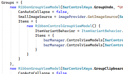
Optionally create the entire ribbon user interface via MVVM. An open-source companion MVVM library is available that provides a full set of view models and related UI bindings for all bar controls.
Avalonia has several icon libraries available where the icons are implemented via an Object and IDataTemplate pair instead of via a single IImage. Using these sorts of icons in our Avalonia controls in the past was difficult due to some of our icon properties being declared as IImage.
We’ve added a new IconPresenter control that is now used in control templates throughout our products. IconPresenter supports Object-based icon data and an IDataTemplate that can render that icon data. This mechanism is customizable so that it can work with any third-party icon library. All our controls have been updated to support these kinds of icons, while still supporting IImage-based icons out of the box.
The recent Avalonia 11.2 version made several breaking changes to their native control templates. The free Actipro Themes for native Avalonia controls have been updated to adapt and be fully compatible with those changes.
 Bill Henning (Actipro)
This version contains an enormous number of updates across the WPF control product line.
See the related announcement post for the detailed list of enhancements and updates.
Here’s a look at some of the major new features.
The QR Code symbology has been updated to support Extended Channel Interpretation (ECI), which allows encoding of all UTF-8 characters.
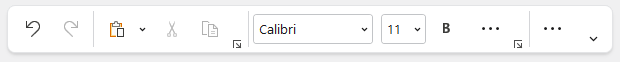
Ribbon group labels are always visible in Classic layout mode and in the past have always been hidden in Simplified layout mode. A new option allows for keeping group labels visible in Simplified layout mode, which provides an interesting new appearance option.
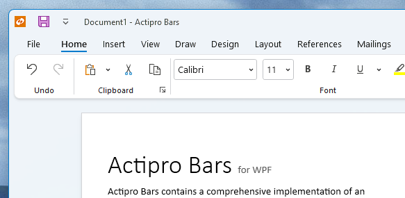
For small ribbons with a single tab and no need of an application button, tabs and the app button can be hidden, saving a row of space.
The combobox control can now optionally show inline images next to the text.
A massive number of updates have been made to various Bars controls and features.
A new Bars Integration sample shows how Ribbon and StandaloneToolBar can be used on a main Window without changing the active docking window when there are floating docking windows.
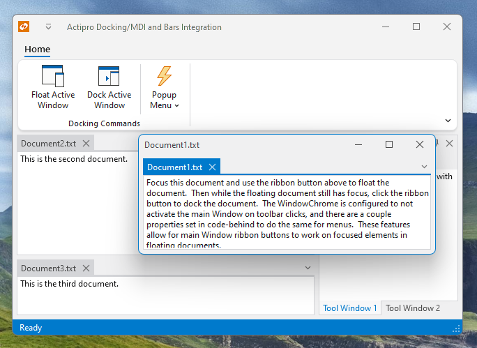
A new option allows for any floating windows with MDI to always remain on top of the main window.
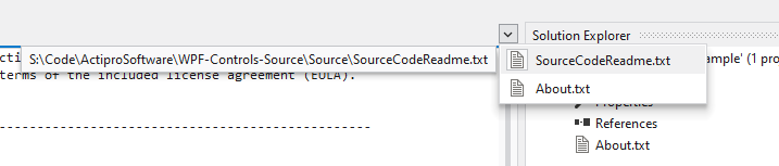
The tabbed MDI open documents menu now includes the document’s path as a tooltip on menu items.
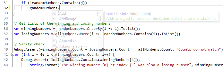
IntelliPrompt tips now include documentation comment remarks sections, if available.
A new WindowChrome option can prevent the containing Window from being activated on click over any toolbar control.
 Bill Henning (Actipro)
This version makes numerous minor updates across the WinForms control product line, including the ability for holding Ctrl key to make SyntaxEditor IntelliPrompt popups semi-transparent.
See the related announcement post for the detailed list of enhancements and updates.
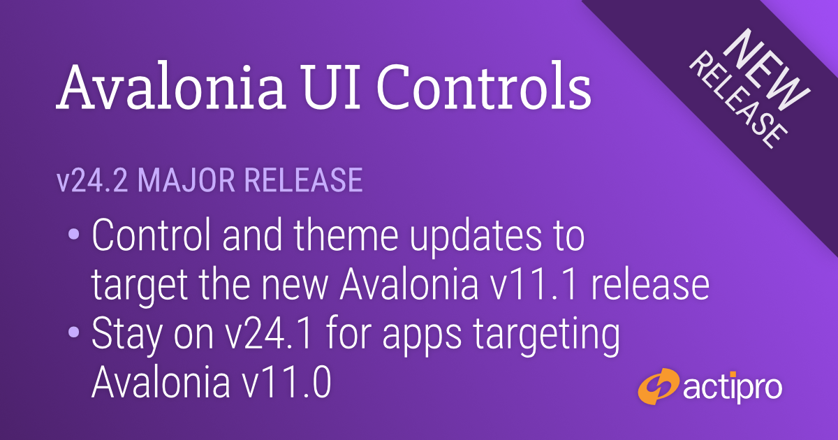
This version upgrades all the Actipro controls and themes to target the recently-released Avalonia 11.1 version.
For customers who wish to continue targeting their applications with Avalonia v11.0 for now, please use the Actipro Avalonia UI Controls 24.1 version, as that targets Avalonia v11.0.
See the related announcement post for the detailed list of enhancements and updates.