New WPF Bars Product - Testers Wanted

by Avatar Bill Henning (Actipro)
Wednesday, March 22, 2023 at 9:28pm

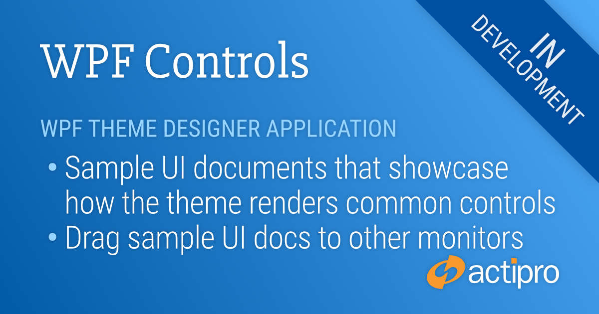
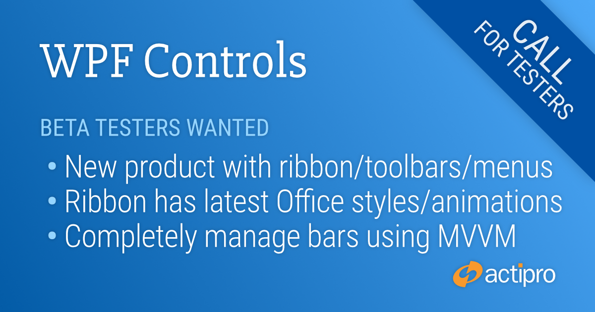
We’ve very excited to announce our new WPF Bars product that has been in development for quite a while now. Bars comes packed with everything you need to implement advanced ribbons, toolbars, and menus in your WPF applications.

The Bars Ribbon in Classic layout mode showing a custom gallery

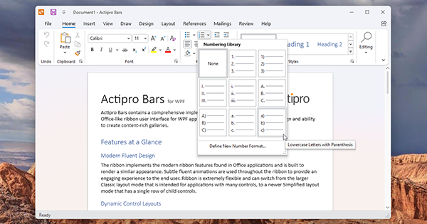
This first beta release of Bars includes a powerful new Ribbon control that has the latest Office appearance with subtle animations, is extremely customizable, and makes it easy to build custom galleries. A StandaloneToolBar control can be used as a window's main toolbar or can be enclosed within a tool window. Future planned updates for Bars will add docking toolbar functionality. Everything from popup/split buttons to comboboxes to galleries can be included anywhere in a ribbon, toolbar, or menu.

An open source Bars MVVM library implements a complete set of view models and related UI views for building a full ribbon hierarchy in code. It also includes multiple examples of building visually stunning galleries that are seen in Office.

The same window but with the Bars Ribbon switched to Simplified layout mode

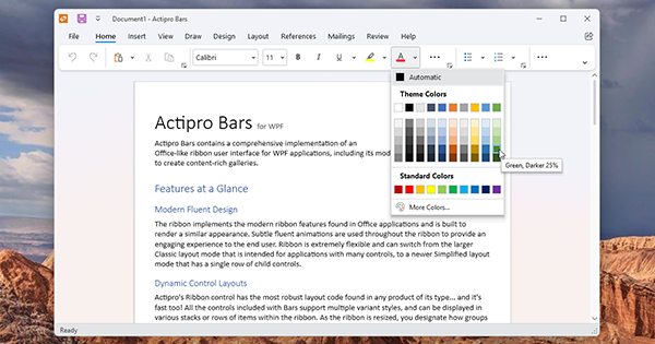
The new Ribbon control implementation in Bars was built from the ground up with WPF best-practices in mind. It supports MVVM usage, has fluent animation throughout, allows instant switching between Classic (three row) and Simplified (modern single row) layout modes, uses simple control variant logic when resizing, has better a control infrastructure, includes a full UIA peer tree, and that’s just scratching the surface.

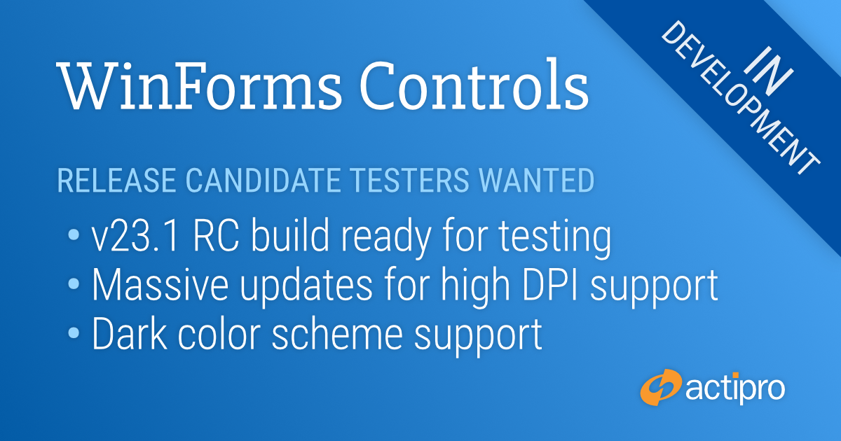
We think you will love using the new Bars product in your WPF applications, and we can use your help. Bars will ship in the WPF Controls v23.1 release and we are nearing release candidate stability for the product. We would like to have additional customers take it for a test drive to provide us feedback.

If you would like to assist in testing a preview build of Bars in v23.1, please write us at our support e-address and describe how you might use Bars in your applications.  We look forward to hearing from you.

WinForms Controls v23.1 Release Preview

by Avatar Bill Henning (Actipro) - 2 comments
Friday, January 6, 2023 at 12:47pm

The WinForms Controls v23.1 release is close to ready, and includes sweeping changes across all products to support high DPI environments and new dark color schemes. We have extensively tested this release internally and have already received positive feedback from beta testers, but we know every customer’s implementation of DPI support can vary greatly and would like to get more exposure before full release.

If you would like to assist with evaluating the release (especially DPI awareness) in your own application and provide feedback on changes before release, please email our support address for access to a release candidate.

How numerous Actipro WinForms Controls render in 200% DPI with the v23.1 updates

DPI Awareness

Historically, high DPI support in WinForms has been a mixed bag. Newer Windows API’s and recent updates to .NET have greatly improved the scenario, but high DPI support is still not free and developers must put in the effort to ensure proper DPI awareness.

With our WinForms Controls v23.1 updates, we’ve done our part to make sure our controls can render correctly in high DPI environments. Some of the changes coming in the next release include:

  • Scale font sizes.
  • Scale control dimensions.
  • Scale glyphs.
  • Scale raster images using optimal technique for the scale factor (e.g., pixel doubling at 200% dpi).
  • Scale built-in dialogs.
  • New vector-based common images for SyntaxEditor IntelliPrompt.
  • New DPI-friendly dock guides for Docking.
  • New DpiHelper class to simplify scaling based on DPI.
  • Updated Sample Browser to be DPI-aware.

Dark Color Scheme

We’ve also revamped how all renderers determine which colors are being used so we can better support a dark color scheme. New “Metro Dark” renderers are available for all our products and can be used to better integrate with dark-themed applications.

Automatic WPF Theme Switching to Match Windows Settings

by Avatar Bill Henning (Actipro)
Wednesday, September 16, 2020 at 2:43pm

Actipro WPF Controls v2020.1 development is in progress, and the new version’s main goals are to modernize our UI control features/themes, and make theme customization much easier.

In our previous post, we showed how the Theme Designer application can display sample UI tabs, allowing you to instantly see how changes to the theme definition affect the rendering of various UI controls.

In today’s post, we’ll take a look at a new feature of ThemeManager that allows an application to automatically change themes based on Windows settings for light/dark and high contrast modes.

Theme Architecture

As a quick review, the Actipro ThemeManager supports dynamically swapping in of ResourceDictionaries containing control Styles and asset resources like Brushes, Thicknesses, etc. that can be used in WPF Styles/Templates.  As seen in previous blog posts, v2020.1 will allow you to design and easily register custom theme definitions with ThemeManager. 

Typically you indicate the theme you wish to load for your application by setting the ThemeManager.CurrentTheme property to the name of a pre-defined theme (created by us) or a custom theme definition that you registered.

Windows Settings for Colors

This all works great.  Now what if we want to have our app’s theme match the current Windows settings for app colors and high-contrast?

Matching Windows Settings

The Windows Settings’ Personalization section’s Colors tab allows the end user to choose whether apps should be light or dark themed.  Some end users might also activate High-Contrast mode from within Windows Settings. 

It is ideal for apps to listen to these end user settings to ensure a consistent user experience.  New features in v2020.1’s ThemeManager allow you to respect these settings and automatically switch themes when appropriate, all with one line of code.

A new ThemeManager.RegisterAutomaticThemes method can be called in your app’s OnStartup logic in place of setting the ThemeManager.CurrentTheme property.  This method allows you to specify the names of a light theme, dark theme, and high-contrast theme.

Here’s some sample code that uses our pre-defined “Light”, “Dark”, and “HighContrast” themes:

ThemeManager.RegisterAutomaticThemes(ThemeNames.Light, ThemeNames.Dark, ThemeNames.HighContrast);

Now when the end user indicates via Windows Settings that apps should be in a dark theme, the app (our Sample Browser in this example) looks like:

Dark theme

When the end user indicates via Windows Settings that apps should be in a light theme, the app looks like:

Light theme

And finally, with high-contrast mode activated via Windows Settings, the app looks like:

High-contrast theme

You can call RegisterAutomaticThemes with any registered theme name.  If you use our Theme Designer application to build your own custom light and dark themes and have registered them with ThemeManager, simply pass those themes’ names to RegisterAutomaticThemes and ThemeManager will pull the correct theme based on the end user’s Windows Settings.

When using RegisterAutomaticThemes, the ThemeManager actively watches for changes to the Windows Settings and switches themes at run-time as appropriate based on new settings.

Summary

This handy one-line call takes all the work out of trying to match an end user’s app preferences.  We’re very excited to deliver this in the upcoming 2020.1 version.

We are currently in final beta testing of v2020.1 and hope to have it released in the next week or two.

Post in the comments below with any questions or comments on our upcoming WPF themes features.

WPF Theme Designer – Sample UI Documents

by Avatar Bill Henning (Actipro) - 2 comments
Friday, August 28, 2020 at 5:28pm

Actipro WPF Controls v2020.1 development is in progress, and the new version’s main goals are to modernize our UI control features/themes, and make theme customization much easier.

In our previous post, we showed how each theme definition has multiple options that control how a rich palette of colors is generated for a theme.

In today’s post, we’ll see how various sample UI tabs are built into the app that let you instantly see how changes to the theme definition affect the rendering of various UI controls.

Sample UI Documents

As we have shown in recent blog posts, the Theme Designer application provides a way to easily alter theme definition properties and it instantly shows a theme preview in the application itself.  That’s great for the controls used in the application, but how can we also preview how the theme renders other controls that aren’t used in the normal application functionality?

The Theme Designer's Window menu

The answer is sample UI documents.  The Theme Designer provides numerous sample UI documents that can be displayed from the Window menu.

Sample UI for buttons

Each sample UI document focuses on displaying a variety of controls related to a certain area.  For instance, in the screenshot above, we see a number of Button, CheckBox, and RadioButton style controls.

Or this screenshot shows another sample UI document for list and grid controls:

Sample UI for lists and grids, with the app theme changed to a Dark theme

By having all these sample UI documents accessible, you can see exactly how altering theme definition properties will affect the rendering of controls throughout your own applications.

The sample UI documents can even be dragged to other monitors for easier viewing.

Summary

It’s important to be able to see how theme definition changes affect UI control rendering, and having a wide variety of sample UI documents available right in the app makes it easy to visualize everything.

Post in the comments below with any questions or comments on the WPF Theme Designer application.

Beta Testers Wanted

We are currently beta testing v2020.1 and would love to have more customers involved. If you would like to assist us in testing, please write us at our support address. We would like individuals who are already licensed for the 2019.1 version, are willing to use beta versions of 2020.1 (.NET Core or .NET Framework), and who want to provide feedback, especially in the area of our themes updates.

WPF Theme Designer - Color Palettes

by Avatar Bill Henning (Actipro)
Friday, August 21, 2020 at 6:43pm

Actipro WPF Controls v2020.1 development is in progress, and the new version’s main goals are to modernize our UI control features/themes, and make theme customization much easier.

In our previous post, we introduced the new WPF Theme Designer application that will come with the v2020.1 WPF Controls and provides a visual way to customize theme definitions.

In today’s post, we’ll take a look at the app’s visual representation of the generated color palette, and some theme definition settings that affect the colors that are generated.

Color Palettes

The Theme Designer app has a Color Palette tab that displays all of the colors that are generated as part of the theme generation process. Each one of these colors is accessible via Brush asset resources that you can reuse in your application.  The colors in each ramp are named based on their contrast level relative to the theme intent (light/dark).

The Theme Definition tool window on the right is where we configure the theme definition. You can see it lists various base colors to use for each color ramp. Those base colors translate over to the MidHigh contrast colors in the each ramp. We use a specially-designed algorithm to generate a pleasing ramp of colors around each base color. You can adjust the base color to whatever you need so that the generated color ramp fits with your app’s own branding.

The default Light preset's color palette

What you see in the screenshot above is the app with a default Light theme. Let’s change it a bit so that we crank up the saturation of the blue hue tint on the grayscale color ramps, and let’s also adjust several of the base colors. The small diamonds next to several theme definition properties indicate the properties that have been changed from the base Light theme preset.

Blue hue saturation applied and other base colors changed

Notice how there is now a blue tint throughout the UI and the color ramps for red, orange, and yellow have altered as well.
Next, we’ll flip to a dark theme intent.

The same tinted hue settings, but applied to a Dark theme intent

Again, you see how the blue hue permeates through the grayscale portions of UI due to the hue saturation being turned up.

Summary

By changing several properties on the theme definition, we’ve completely altered and customized the look of our app. This same thing will work in your own app since the Theme Designer outputs the code to paste into your App.OnStartup logic to reproduce the same theme.

Post in the comments below with any questions or comments on the WPF Theme Designer application.

Beta Testers Wanted

We are currently beta testing v2020.1 and would love to have more customers involved. If you would like to assist us in testing, please write us at our support address. We would like individuals who are already licensed for the 2019.1 version, are willing to use beta versions of 2020.1 (.NET Core or .NET Framework), and who want to provide feedback, especially in the area of our themes updates.