This version contains many small feature enhancements and quality of life improvements.
See the related announcement post for the detailed list of enhancements and updates.
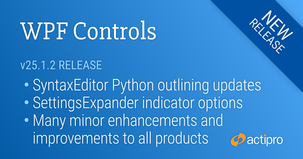
This version contains many small feature enhancements and quality of life improvements.
See the related announcement post for the detailed list of enhancements and updates.
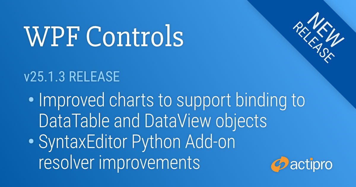
This version makes many small feature enhancements and quality of life improvements in the WPF Controls.
See the related announcement post for the detailed list of enhancements and updates.
 Bill Henning (Actipro)
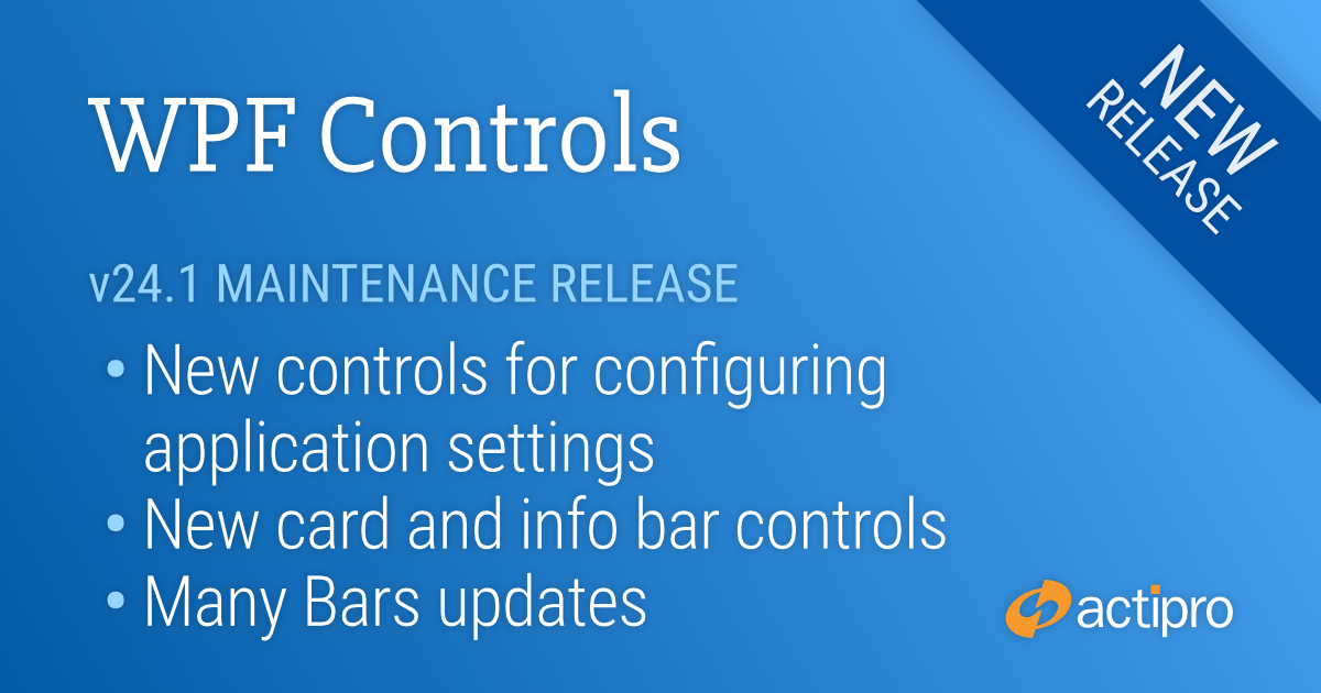
This version adds several great new controls and makes a number of updates across the WPF control product line.
See the related announcement post for the detailed list of enhancements and updates.
Here’s a look at some of the major new features.
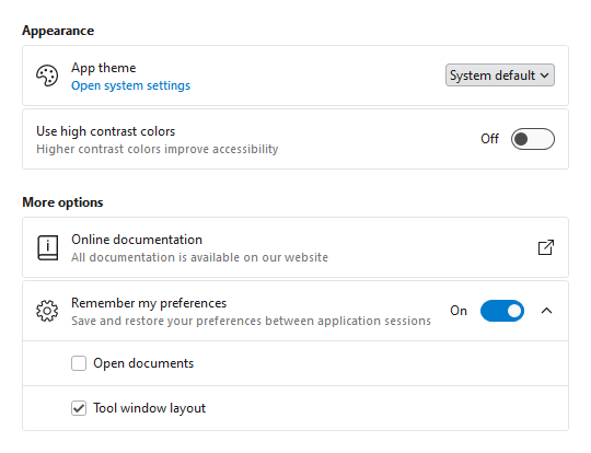
Application settings have never looked so good!
The new Card control presents visually grouped information for a single subject, using optional cover, thumbnail, header, and footer sections.

Cards can optionally be actionable and even support built-in integration with badges.
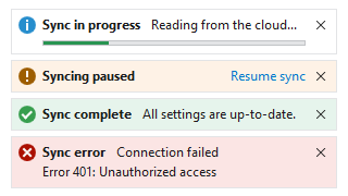
The new InfoBar control displays essential information to a user without disrupting the user flow. Messages can display with optional severity, action, and more.
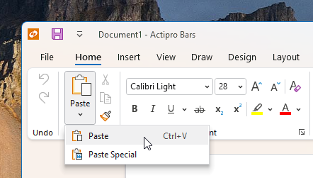
Many updates have been made to the Bars controls to further improve features and functionality.
Bill Henning (Actipro)

We're pleased to announce that our Universal Windows controls have officially been released and are ready for use in your Windows 10 apps! Download a free evaluation today and start building your apps with them.
Let's take a quick glimpse at some of the samples that ship with the product and show off the controls:


The focus of this first release was to port our older WinRT XAML controls up to the Universal Windows platform. Look for plenty more updates and controls added in the future.


Bill Henning (Actipro)

The 2015.1 versions of our WPF, Silverlight, and WinRT/XAML controls were released a couple weeks ago and in today's post I'd like to highlight one of the great new controls that were introduced in that version: TaskBoard.
A task board consists of zero to many columns, each of which can contain zero to many cards. Columns and cards can be dragged and reordered, using pleasing animations. Let's see an example to give you a picture of how it all works.
In the demo below, we have a TaskBoard control that is being utilized for a task planning system, commonly used in project management to help organize the priorities of a team. The columns represent task groupings, and the cards represent individual tasks. Each column has a header and optional footer that surrounds the contained card items.

In this sample, each column header specifies the task grouping name and the column footer contains an "Add a task" button. The footer of the overall TaskBoard control contains an "Add a list" button, which shows at the end of the list of columns.
The entire UI of the task board can be fully customized. The cards can show any custom content as well, or can vary content based on data template selectors.
The TaskBoard control is designed for MVVM usage and makes it easy to fully alter the appearance of the entire layout with properties for column/card spacing, padding, corner radius, etc. Best of all, rich animations are used whenever dragging columns or cards.
TaskBoard also works great with touch input. Use it to create task planning systems on large touchscreen displays.
The full source TaskBoard demo seen above is included in the sample projects that ship with our WPF, Silverlight, and WinRT/XAML controls, and is available for you to check out today.
Let us know what you think after you try it!
