While the final testing of our major Docking/MDI vNext enhancements is ongoing (the result of which will be in the WPF Controls 2016.1 release), we're also working on other new features for the 2016.1 release. Part of these updates will be some adjustments to themes.
For some quick background, our WindowChrome class can be attached to any WPF Window to custom render its chrome, using the Actipro Themes. In the most recent 2015.1 build, we updated the WindowChrome outer shadow to render similar to other Windows 10 apps so that it fits right in with Windows 10.
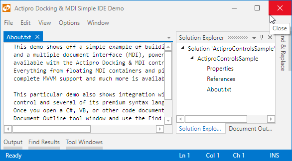
For our upcoming 2016.1 version, we are making more adjustments. Title bar buttons in the Metro themes are now the standard size found in other Windows 10 apps, which are much more touch friendly since they are significantly larger than before. We also have updated the Close button to use red highlights on hover (see screenshot below) and press, similar to Windows 10 buttons.
The new 2016.1 appearance of Metro themed title bar buttons
In 2016.1, the title bar buttons have the fresh new crisp glyphs that match Windows 10 as well. Compare the title bar buttons in the above screenshot to the buttons in the same app in our 2015.1 version:
The 2015.1 appearance of Metro themed title bar buttons
Summary
These sort of UI enhancements to our Metro themes are subtle, yet they really help your app's visual cohesiveness with Windows 10.
The features described above will be available in the 2016.1 version of our WPF controls.


