 Bill Henning (Actipro)
-
Bill Henning (Actipro)
-
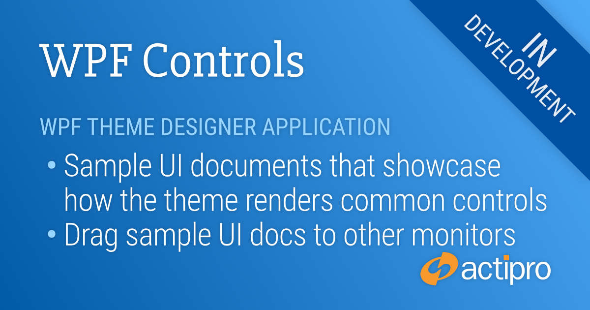
Actipro WPF Controls v2020.1 development is in progress, and the new version’s main goals are to modernize our UI control features/themes, and make theme customization much easier.
In our previous post, we showed how each theme definition has multiple options that control how a rich palette of colors is generated for a theme.
In today’s post, we’ll see how various sample UI tabs are built into the app that let you instantly see how changes to the theme definition affect the rendering of various UI controls.
Sample UI Documents
As we have shown in recent blog posts, the Theme Designer application provides a way to easily alter theme definition properties and it instantly shows a theme preview in the application itself. That’s great for the controls used in the application, but how can we also preview how the theme renders other controls that aren’t used in the normal application functionality?
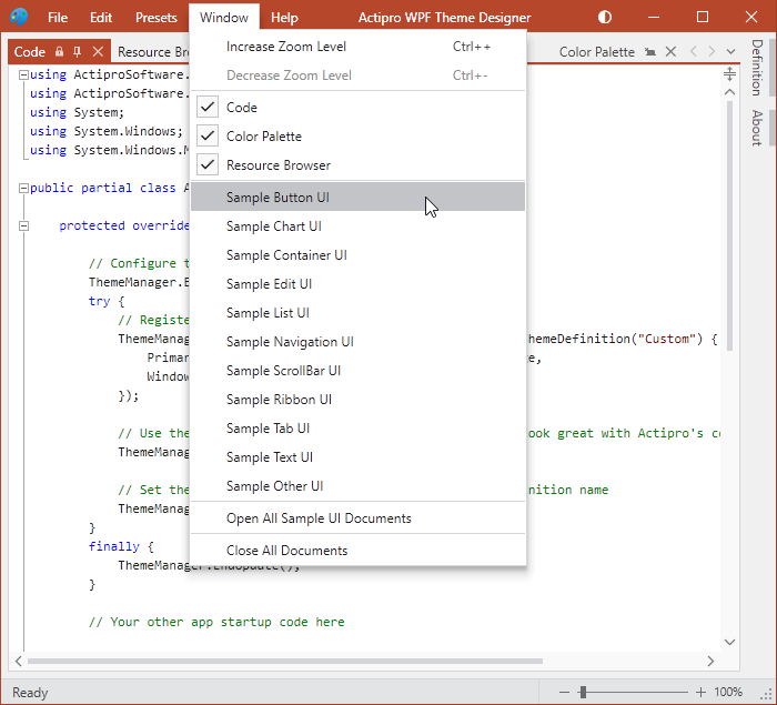
The answer is sample UI documents. The Theme Designer provides numerous sample UI documents that can be displayed from the Window menu.
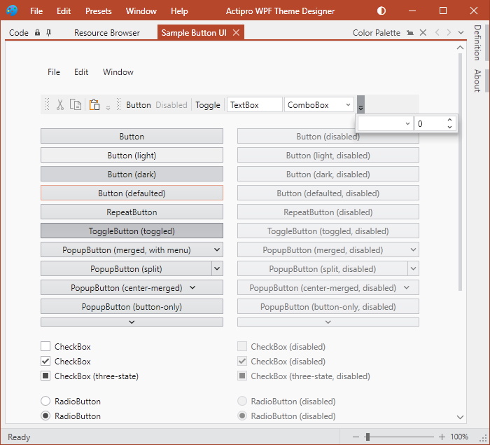
Each sample UI document focuses on displaying a variety of controls related to a certain area. For instance, in the screenshot above, we see a number of Button, CheckBox, and RadioButton style controls.
Or this screenshot shows another sample UI document for list and grid controls:
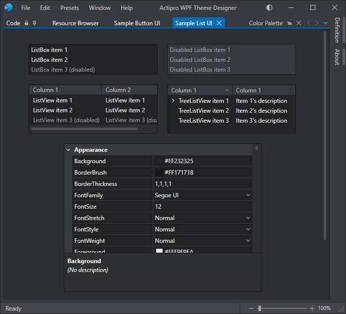
By having all these sample UI documents accessible, you can see exactly how altering theme definition properties will affect the rendering of controls throughout your own applications.
The sample UI documents can even be dragged to other monitors for easier viewing.
Summary
It’s important to be able to see how theme definition changes affect UI control rendering, and having a wide variety of sample UI documents available right in the app makes it easy to visualize everything.
Post in the comments below with any questions or comments on the WPF Theme Designer application.
Beta Testers Wanted
We are currently beta testing v2020.1 and would love to have more customers involved. If you would like to assist us in testing, please write us at our support address. We would like individuals who are already licensed for the 2019.1 version, are willing to use beta versions of 2020.1 (.NET Core or .NET Framework), and who want to provide feedback, especially in the area of our themes updates.