Heat Maps Part 1 - Color Changing Behavior

by Avatar Bill Henning (Actipro)
Wednesday, July 18, 2012 at 8:21am

BlogPostBanner

In our previous multi-part series on our new Micro Charts product, we walked through all the features included in the product for the first WPF and Silverlight releases.  In today's post, we're going to start a new series on an additional control being added to the product in the next maintenance release, one for constructing great-looking heat maps.

Color-Based Heat Maps

The new MicroHeatMapPresenter control is designed to be a single cell in a larger heat map.  A heat map is a type of chart that displays data values through varying colors. The colors of the different cells change over a gradient with some colors representing higher values than others.  In our control you can completely customize this gradient to use whatever colors best suit your needs.

HeatMap

In the example above, fifteen separate MicroHeatMapPresenters have been organized in a grid layout to create a heat map displaying the temperatures of three servers over the course of a day.  Each control has been customized to be given the same color gradient, minimum, and maximum values.  Each control also has a unique value that it uses with the minimum and maximum values to find which color along the gradient it should render with as its background color.

Summary

Heat maps are a great way to visualize data in a way that is easy to understand. They can be used to highlight outliers with stronger colors and direct attention toward them, or to display changing trends with a flowing color scheme. With the freedom to choose any colors in any sequence to create a gradient, you can customize the MicroHeatMapPresenters to create a heat map that displays the data exactly how you want. Just bind some properties and our control takes care of the rest.

UPDATE: Heat maps are now available as of the latest WPF and Silverlight maintenance releases.

In the next post of this series, we'll take a look at the control's size changing abilities.

TaskDownload TaskLiveDemo TaskBuyNow

SyntaxEditor Navigable Symbol Selector Part 2

by Avatar Bill Henning (Actipro)
Wednesday, July 11, 2012 at 8:51am

BlogPostBanner

In our previous post, we talked about the new NavigableSymbolSelector control being added to the next 2012.1 builds of SyntaxEditor for WPF and Silverlight.

To sum up, the control implements drop-down lists that can be wired up to a SyntaxEditor and will list available symbols within the document.  As the caret moves, the drop-down selection is updated.  The end user can select a symbol from a drop-down and the editor caret will navigate to that symbol.  All of this functionality is very similar to the type/member drop-downs found in Visual Studio. 

Best of all, this functionality can easily be implemented for any custom language.  The last post showed an example of using the control for a custom language.  In this post, we'll take a look at the built-in implementation for the C# and VB languages found in the .NET Languages Add-on.

Screenshots

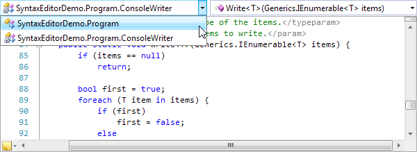
Here's how the NavigableSymbolSelector control looks when bound to a SyntaxEditor that has the .NET Languages Add-on's C# language loaded:

NavigableSymbolSelector1

There are two drop-downs present.  The one on the left shows the types and the one on the right shows the members within the currently-selected type. 

NavigableSymbolSelector2

As we move the caret around, the drop-downs update their selections.  In this screenshot we can see the members that are defined in the ConsoleWriter class, which is being edited in the SyntaxEditor.  Note how the members render their representations using C# syntax.

Next, let's look at the Visual Basic language's implementation:

NavigableSymbolSelector3

Here you can see the drop-down selections are tracking the caret's location and are rendering their content in VB syntax. 

This screenshot also shows a special feature only found in the WPF implementation.  If the caret is outside of a symbol, the text will appear grayed out.  Note how the caret is inside the Program class declaration but is outside of the Main method declaration.  Thus the Main symbol is grayed out.  This helps the end user visualize better whether they are actually within, or just near, a symbol.

Summary

These new features will be in the next 2012.1 builds of our WPF and Silverlight controls.

TaskDownload TaskLiveDemo TaskBuyNow

SyntaxEditor Navigable Symbol Selector Part 1

by Avatar Bill Henning (Actipro)
Monday, July 9, 2012 at 1:09pm

BlogPostBanner

Our next 2012.1 builds of SyntaxEditor for WPF and Silverlight will be adding a new ancillary control to the SyntaxEditor product:  NavigableSymbolSelector.

Navigable Symbols

Navigable symbols are symbols declared within a document to which the end user may wish to move their caret.  For instance in a language such as C#, navigable symbols would be things like type and member declarations.

A new language service has been added that can optionally be implemented.  Its only task is to return navigable symbols for a document that uses the language.  It's implemented in such a way that a multi-level hierarchy of navigable symbols can be created.

This sort of feature can be used to help drive the UI of external controls such as a type/member drop-down or even a document outline treeview.  These sort of external controls can help the end user visualize a document's structure, and the content for each item in the controls can fully utilize rich markup (images, colors, etc.).

NavigableSymbolSelector Control

The new NavigableSymbolSelector control is our implementation of a control similar to Visual Studio's type/member drop-downs.  It attaches to a SyntaxEditor instance and checks to see if the language supports the new INavigableSymbolProvider service.  If so, it uses that service to populate its drop-down(s).

A "Simple" Language Sample

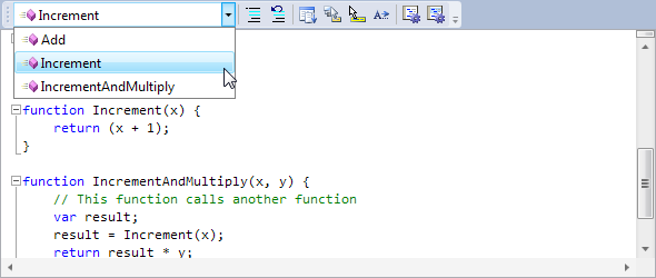
Let's see how this looks in our "Simple" language sample.  We've updated one of our Getting Started series samples to implement this new service and show drop-down UI (via NavigableSymbolSelector) within a toolbar:

NavigableSymbolSelectorSimple

For our "Simple" language, we've told the NavigableSymbolSelector to show a single drop-down, which will render the list of functions declared in the editor.

Run-Time Functionality

Basically if we do these simple tasks:

  • Add a NavigableSymbolSelector control to the UI.
  • Bind it to a SyntaxEditor instance.
  • Implement the INavigableSymbolProvider language service on the current language.

We get all this functionality for free from the NavigableSymbolSelector control:

  • Automatic display of all symbols defined in the current document, that updates as document changes occur.
  • Symbols are sorted alphabetically within the drop-down.
  • As the editor caret moves, the selected symbol in the drop-down is automatically updated to be the closest enclosing or nearby symbol.
  • When the end user clicks on a different symbol in the drop-down, the caret navigates to that symbol declaration.
  • When the caret is not directly within a symbol's declaration but is near one, it will appear grayed out.  This helps the end user visualize whether they are actually in a valid symbol declaration or not.  (WPF only)

We've designed this control to work directly with the new INavigableSymbolProvider language service.  This allows any custom language to fully support the control.

Summary

These new features will be in the next 2012.1 builds of our WPF and Silverlight controls.

By default the control displays two drop-downs, and we'll show this in our next blog post, where we demonstrate the implementation of the INavigableSymbolProvider language service and usage of the new NavigableSymbolSelector control with our .NET Languages Add-on's languages.

TaskDownload TaskLiveDemo TaskBuyNow

Actipro Blog 2012 Q2 Posting Summary

by Avatar Bill Henning (Actipro)
Monday, July 2, 2012 at 10:07am

PostBannerBlogPostSummary

What We Accomplished

In this quarter we released the 2012.1 version of our WPF and Silverlight controls.  This version updated our WPF products to target .NET 4.0 or later, and updated our Docking/MDI's Prism integration add-on to work with the latest Prism v4.1. 

The 2012.1 versions introduced a new Micro Charts product that is a set of charts that visualize quantitative data and are designed to render clearly in compact spaces.  They are extremely useful for data display within dashboards, reports, and grids.

SyntaxEditor also saw a lot of updates including highlighting style borders, IntelliPrompt code snippet support, current line highlight enhancements, .NET Languages Add-on automated LINQ IntelliPrompt, and overall memory usage reductions.

What’s Coming Next

SyntaxEditor has a new control being added soon that allows you to easily add VS type/member drop-down functionality for your own languages, with built-in support for our .NET Languages Add-on.  Micro Charts has a new control being added for heat map generation.  We'll detail both of these in upcoming posts.

We will be continuing to work on development of our Micro Charts product for the WinRT (Windows 8 "Metro" style) platform, and have some other new features and controls for all platforms in the works as well.

Blog Post List

Here is a quick categorized list of useful blog postings made in this quarter.

Product Development

Micro Charts Series

Product Releases and Purchase Options