 Bill Henning (Actipro)
-
Bill Henning (Actipro)
-

In the 2012.2 version of our WPF Controls, we added two Metro themes. The Metro Light theme renders similar to VS 2012's gray window, and the Metro White theme renders similar to an Office 2013 window.
We've had several requests for a dark theme, and we've delivered one for the upcoming 2013.1 version of our WPF Controls!
Sample Screenshots

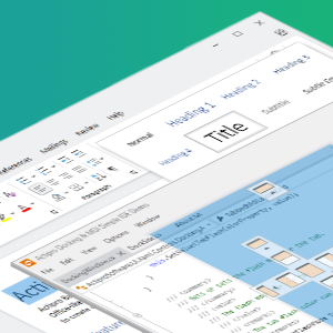
Here is the main SyntaxEditor demo with the Metro Dark theme active. We updated the Sample Browser to show off use of dark SyntaxEditor highlighting styles for some common languages when the Metro Dark theme is activated.

In this screen, we show a mail app using the dark theme. Just like in the prior screen, it is a regular WPF Window but we've applied our WindowChrome on it to enable the full Metro appearance.

All of the Actipro and native controls support the new theme. Here we see a Wizard with various text, links, and buttons all fully themed.
Easily Theme Your Entire App
Actipro has a very robust theming system that allows you to fully theme your entire WPF application with several lines of code. We include over 10 built-in themes and they can optionally apply themed styles to native WPF controls as well. Each theme involves almost 900 distinct resource assets, such as brushes and thicknesses, specifically designed for the theme.
In addition, our WindowChrome class lets you instantly transform a normal WPF Window to a chromed window that matches the theme.
The end result is that your windows, native WPF controls, and Actipro controls all blend well together and provide a consistent user interface for your customers.
Summary
This new Metro Dark theme will be included in the 2013.1 version, due in the next several weeks.