 Bill Henning (Actipro)
-
Bill Henning (Actipro)
-

Last month we posted that we were beginning development of a new TreeView replacement control that addressed the many shortcomings of the native WPF TreeView, and were asking for input at that time. We've been working on this control for both WPF and UWP and have made very good progress.
Feature Progress
Thus far these features have been completed:
- Fully customize the appearance of each node.
- UI virtualization, allowing for hundreds of thousands of nodes to be loaded into a tree very quickly.
- No scrollbar jumpiness as seen in other virtualized tree controls when scrolling vertically.
- Use your own custom data models as the source for the tree, with no dependencies on UI or our interfaces. An adapter class is used (and can be fully customized to fit your model) to communicate between the UI and the model for things like expansion state, getting children, etc.
- The adapter can be coded with bindings in XAML (convenient, yet can be slow in very large trees) or via method overrides (slightly more work but lightning fast).
- Events for expansion.
- Events for selection.
- Single or multi-selection, with Ctrl and Shift-based selection options.
- Filter selection such as only allowing sibling nodes to be multi-selected, or nodes of the same depth.
- All common tree hotkeys supported including special ones for expanding and collapsing entire branches.
- Select or ensure nodes are visible by path.
- Double-click and Return key default action handling.
- Optional checkboxes within the data templates.
- Intelligent text searching so when you start typing while the control has focus, it will auto-focus the item that matches the typed text.
Sample Usage
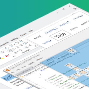
Here's a screenshot of a recent sample being put together for the control:

In this sample, we have two levels of nodes. The top-most level is folders (whose icons actually toggle with the expand/collapse state), while the inner level has checkboxes and buttons that allow for a dialog to be displayed when clicked for further configuration.
Double-clicking a folder item will toggle its expansion state, while double-clicking a checkable node will toggle its checked state. This sample also shows usage of a DataTemplateSelector to pick which DataTemplate to use for each node.
Summary
The control is coming along really nicely and our goal is to match general features found in the VS Solution Explorer. The features above are implemented for both WPF and UWP. We still have more features planned before we open up a beta.
If you have any other suggestions, please either write our support address with your feedback or join our Slack discussion on the topic and chat right with us. The benefit of the chat option is that we are posting screenshots and asking for feature input right during development. It gives you an opportunity to give direct feedback and help guide features.