In the last blog post on our TreeListBox control development, we announced that the TreeListBox control was ready for closed alpha testing. TreeListBox is a new control that has much of the same functionality as the tree control found in the Visual Studio Solution Explorer.
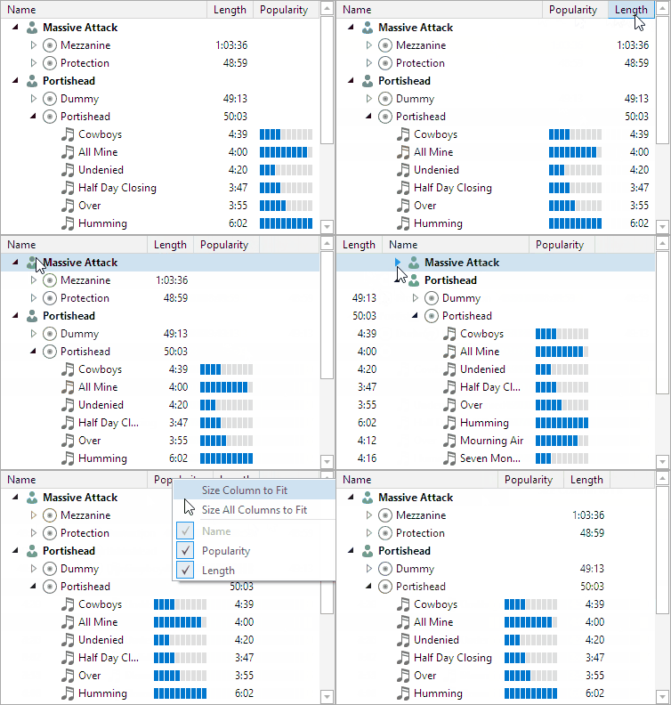
In today's post, I'd like to announce a new TreeListView control that is now also ready for alpha testing. The TreeListView control is a multi-column variant of the TreeListBox control that renders similar to a standard ListView but has all the tree and advanced features found in TreeListBox.
The animation above shows several of the features found in this new control such as node expansion, column resizing, column reordering, column header context menus, and more.
Feature Progress
Thus far these TreeListView features have been completed:
- All features found in TreeListBox.
- Templates, template selectors, or text property bindings used to specify custom content for each cell.
- Column width can be a specific pixel value, auto (size to header, cells, or both), or star-sized.
- Optional minimum and maximum widths for column auto/star-sizing modes.
- Columns can optionally be resized, reordered, and have visibility toggled by the end user.
- Frozen columns that don't scroll horizontally.
- Set which column renders the indentation and expander buttons.
- Column headers have a built-in context menu, and the headers themselves can be hidden.
- Size columns to fit contents.
- Optional grid line display.
- Numerous events for column resizing, reordering, visibility changes, and header menu requests.
Summary
If you would like to start working with either of the controls and provide us with feedback, please write our support address or chat with us on Slack to sign up for testing. Now is the time to contribute your additional feature ideas and report bugs. Anyone who has a WPF Studio license is fully licensed to use the control in their apps.


