 Bill Henning (Actipro)
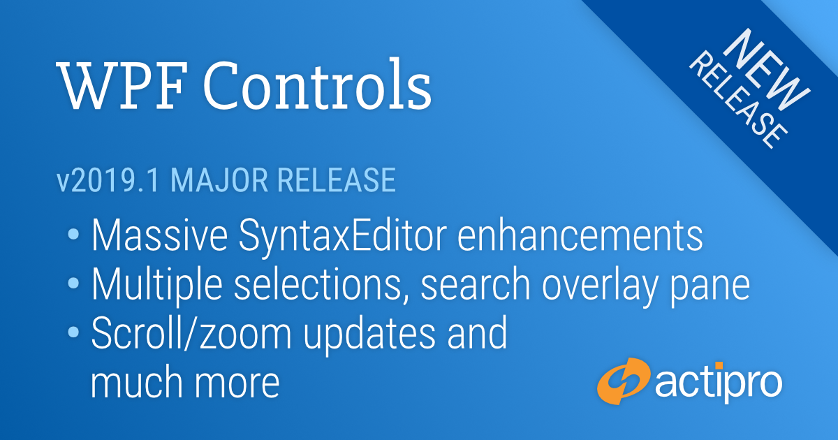
We are pleased to announce the release of the 2019.1 version of our WPF Controls. This version includes the massive SyntaxEditor enhancements and updates we’ve been working on that have previously been described as “SyntaxEditor vNext” in the blog.
This announcement post contains the detailed list of updates.
Let’s dig in and see a handful of the larger SyntaxEditor updates.
Cross-Platform Design
The internals of SyntaxEditor have been heavily refactored to support a cross-platform API across the WPF, UWP, and WinForms platforms. This allows SyntaxEditor features for the three platforms to be kept in sync moving forward. The 2019.1 UWP and WinForms versions of SyntaxEditor will follow later this year.
Carets and Selection
Multiple Selections
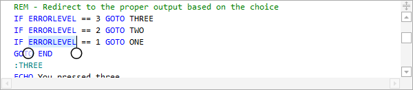
Multiple selections, each with their own caret, are now supported. A new selection can be added by holding the Ctrl key when clicking in the text area or clicking on the selection or line number margins. Most edit actions have been refactored to fully support multiple selections. For instance, pressing Shift+Right Arrow will extend all of the selections by one character.
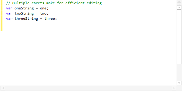
Copying text from multiple selections unions the selected text, joining each range's text with a line terminator. Pasting multi-line text into a view with the same number of selections as text lines being pasted will replace each selection with a related line from the pasted text.
Touch Selection Grippers
Selection grippers will show for the primary selection when touch input is used.
Caret Movement
Carets now support movement at both the start and end of word wrapped lines.
Virtual space is now supported at the end of lines when a new option is enabled. Block selections can be made in virtual space at the end of lines, even without line end virtual space being enabled. This prevents the caret from snapping to an offset when making a block selection, which can sometimes be problematic.
Search Overlay Pane
A new search overlay pane displays over the upper-right of the active editor view when Ctrl+F (find mode) or Ctrl+H (replace mode) are pressed in a multi-line editor. A toggle mode button on the search overlay pane switches between find and replace modes, and all common search options are supported via toggle buttons and other controls. The search overlay pane can be closed by clicking the X button or by pressing Esc.
Ctrl+F3 will open the search overlay pane without focusing it, and will search forward for the currently-selected text. Ctrl+Shift+F3 will do the same but will search backwards.
F3 will search for the next match of the previously-used search options. Shift+F3 will search for the previous match of the previously-used search options.
If the SyntaxEditor.IsSearchResultHighlightingEnabled property is true, the search results can be highlighted while the search overlay pane is open. Closing the search overlay pane, clears the search result highlights.
IntelliPrompt
Vector Images
The Metro Light and Metro Dark common image sets are now in vector form and render beautifully in high DPI.
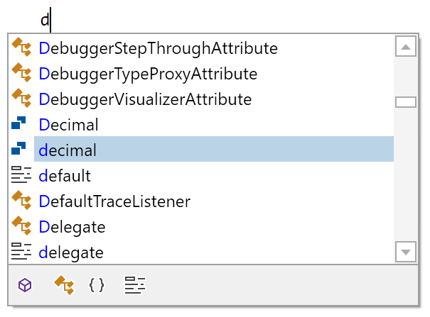
Completion Filters
Completion filters have been updated so when there are multiple active filters with the same ICompletionFilter.GroupName, any one of those filters can includes an item. Toggle button completion filters were changed to appear unchecked when they aren't active, which is more natural.
Ctrl Key Opacity Changes
The logic for making IntelliPrompt popups and the new search overlay pane semi-transparent when the Ctrl key is held has been refactored and improved. A brief delay was added before the opacity change occurs.
Splitting
The scrollbar splitter button now has a larger appearance.
The view splitter can be dragged to the bottom of the view to remove the split and keep the top view.
Scrolling and Zooming
Touch Scrolling
Smooth inertia-based touch scrolling has been added.
Auto ScrollBar Visibility
The horizontal and vertical scrollbars now support an Auto visibility option that will only display then when necessary.
Horizontal Scrolling
Editor views can be scrolled horizontally with Shift+MouseWheel
Better logic was implemented for managing horizontal scroll maximums, especially when scrolling vertically.
Scroll API
New programmatic scroll methods were added that allow for aligning an anchor line to the top/center/bottom of a view with a specified pixel displacement, or scrolling by pixels.
Margins
Line Number Customization
A new line number provider language service was added that allows for complete customization of how line numbers are rendered in the line number margin. In addition, a property was added to the document that sets the line number for the first line in the document, defaulting to one.
Indicator Glyphs
The rendering of built-in indicator glyphs was improved.
Text Rendering
The text rendering of long lines was improved.
.NET Languages Add-on
IntelliPrompt completion list toggle button filters were added for the various kinds of items displayed in the list. The IntelliPrompt completion filter UI (toggle buttons and tabs) only shows based on the available items in the unfiltered list. For instance, if there are no types in the list, no 'Types' toggle button filter is visible.
Roslyn Add-on
The optional Roslyn add-on was updated to use Roslyn v3.0.0.
Python Language Add-on
IntelliPrompt completion list toggle button filters were added for the various kinds of items displayed in the list. The IntelliPrompt completion filter UI (toggle buttons and tabs) only shows based on the available items in the unfiltered list. For instance, if there are no classes in the list, no 'Classes' toggle button filter is visible.
ANTLR Add-on
The ANTLR add-on was updated to use ANTLR v3.5.1.
Irony Add-on
The Irony add-on was updated to use Irony v1.1.