 Bill Henning (Actipro)
-
Bill Henning (Actipro)
-
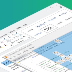
Actipro WPF Controls v2020.1 development is in progress, and the new version’s main goals are to modernize our UI control features/themes, and make theme customization much easier.
In our previous post, we talked about how we will be bringing .NET Core builds of our WPF Controls in v2020.1, along with publishing NuGet packages.
In today’s post, we’ll start to dive into one of the largest areas of the themes-related updates for this version, which is the new theme generation system.
Generated Themes
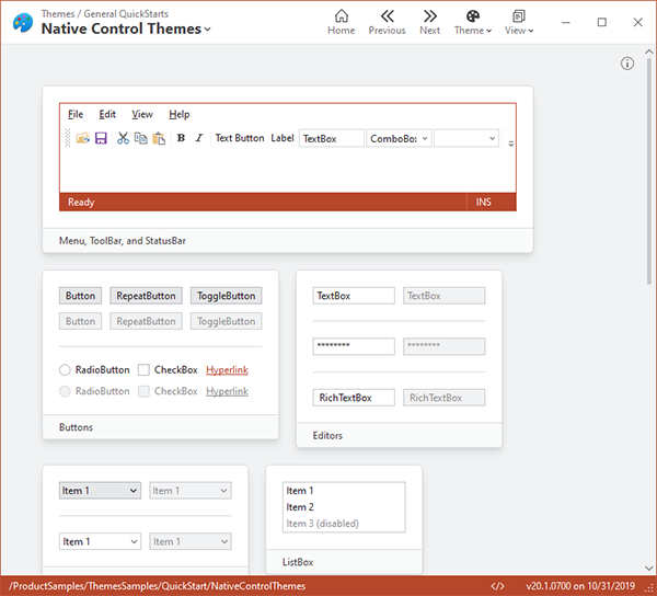
The Actipro WPF controls provide numerous complete pre-defined themes that render similar to various Windows and Office versions. These themes apply to Actipro and optionally native WPF controls as well so that there is consistency throughout your application’s appearance. While this system has always worked well, the current pre-defined themes are somewhat difficult to customize.
We wanted to take themes to the next level for the new version, and we have truly built something fantastic.
What we came up with is a framework where you can configure numerous options on a theme definition object. When you register that theme definition with our ThemeManager, you then can apply that theme at any time with a single line of code. Multiple theme definitions can be registered, allowing you to register “light” and “dark” themes (or any other variant you like) and instantly toggle between them at run-time.
When a theme definition is applied, instead of simply merging pre-defined resource assets (brushes, thicknesses, etc.) into the Application.Resources as before, we dynamically construct hundreds of resource assets very quickly and merge them into Application.Resources. The resource assets that are created are based on the options in the theme definition, and are generated in a fraction of a second.
Like now, we still provide themes that render similar to Windows and Office. We register theme definitions for those, among others, by default with the ThemeManager so they can be applied at any time with a single line of code.
Customizing Themes
Say that you love our Office Colorful Indigo theme (Word-like appearance), but you don’t like how it has grayscale background state hover/pressed effects for toolbar and menu items. In the past, this would be difficult to change... but not any more. You can get the default theme definition we provide for this theme, adjust an option on it to use accent colors for toolbar/menu state backgrounds, and when the new theme definition is applied, you’ll see the adjusted appearance in action.
What happens behind the scenes is that our theme generation logic adheres to the options you specify, and the brush resource assets that it creates for toolbar/menu state backgrounds are generated with accent color values instead of grayscale color values.
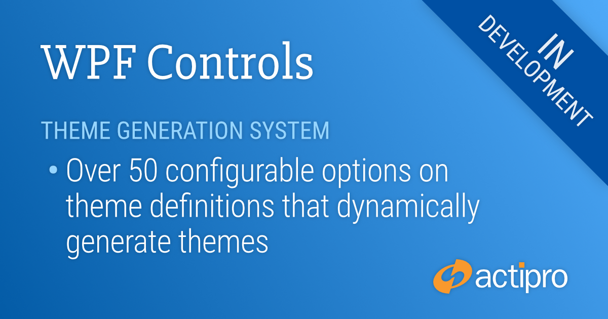
Theme Definition Options
How many options are there for theme definitions? At the time of this writing, we have well over 50 options so far and are adding more as we work towards wrapping up the first beta build of v2020.1.
You can control all kinds of things with theme definitions options, including color palette, border contrast, bullet appearance, font size, corner radius, window appearance, and much more.
Beta Testers Wanted
We are approaching a point where we’re like to start collecting a list of beta testers for the 2020.1 version, who can start working with the new features soon. If you would like to assist us in testing, please write us at our support address. We would like individuals who are already licensed for the 2019.1 version, are willing to use beta versions of 2020.1 (.NET Core or .NET Framework), and who want to provide feedback, especially in the area of our themes updates.
Summary
We’re just scratching the surface here of what you can do with the new theme definitions. We haven’t even shown off the new Theme Designer app yet. We’ll continue to dive into the area of theme generation in upcoming blog posts. Stay tuned!
Post in the comments below with any questions or comments on theme generation.