In today's post, I'd like to give an overview of how edit boxes in our new WinRT/XAML Editors product work, and why we created them.
What Are Edit Boxes?
Edit boxes are controls that allow for the editing/selection of common data type values. Unlike many other third party editor controls, the Actipro Editors have been specifically designed to work great for whichever form of input (keyboard, mouse, or touch) is utilized by the end user.
They are designed to visually fit right in with the standard Windows Store and Windows Phone controls. Each editor's main appearance is similar to a standard TextBox, where the value can be typed in via a keyboard for maximum efficiency. Certain keyboard keys and the mouse wheel can often be used to increment/cycle values. Custom validation and conversion logic between text and real object values can even be injected.
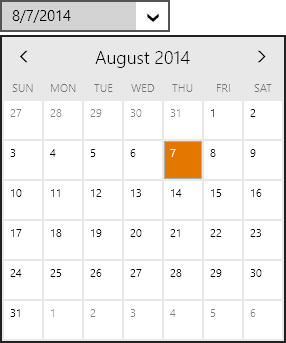
Most editors also contain a default popup picker that is geared for mouse and touch-based input. The popup can easily be invoked by tapping the edit box's drop-down button.
Controls List
ColorEditBox - Allows for the input of a Color value.
CornerRadiusEditBox - Allows for the input of a CornerRadius (top-left, top-right, bottom-right, bottom-left) value.
DateEditBox - Allows for the input of a DateTime value's date component.
DateTimeEditBox - Allows for the input of a DateTime value.
DoubleEditBox - Allows for the input of a Double (floating-point number) value.
EnumEditBox - Allows for the input of a Enum (flags and non-flags enumeration) value.
GuidEditBox - Allows for the input of a Guid (unique ID) value.
Int32EditBox - Allows for the input of an Int32 (integer) value.
PointEditBox - Allows for the input of a Point (X, Y) value.
RectEditBox - Allows for the input of a Rect (X, Y, width, height) value.
SizeEditBox - Allows for the input of a Size (width, height) value.
ThicknessEditBox - Allows for the input of a Thickness (left, top, right, bottom) value.
TimeEditBox - Allows for the input of a DateTime value's time component.
Options Galore
Edit boxes all support nullable values, meaning that a DateEditBox for example returns a value of Nullable<DateTime>. An option can be set to require that a non-null value is set.
The editors can be set to provide read-only display of data. When not read-only and if nulls are allowed, a clear button appears when the control has focus.
The popups for the edit boxes can be fully customized. Each editor also supports placeholder text and optional header content.
Summary
This is just an introduction to what the edit boxes can do. In our next series of posts, we'll take a look at each edit box control and its related popup picker in detail.


